
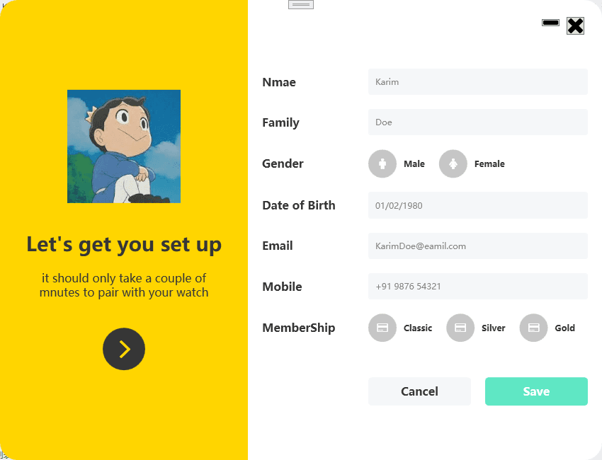
1. 实现效果
相关注释已写在代码中:
1.1 静态图
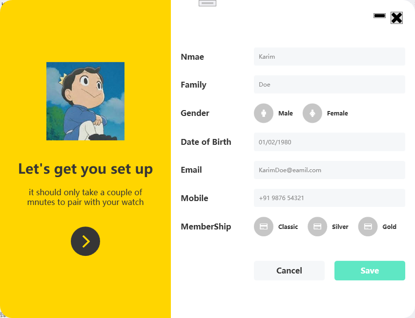
1.2 动态图

2. 代码实现
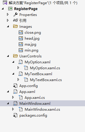
2.1 文件结构
2.2 MainWindow.xaml 代码
<Window x:Class="RegisterPage.MainWindow"
        xmlns="http://schemas.microsoft.com/winfx/2006/xaml/presentation"
        xmlns:x="http://schemas.microsoft.com/winfx/2006/xaml"
        xmlns:d="http://schemas.microsoft.com/expression/blend/2008"
        xmlns:mc="http://schemas.openxmlformats.org/markup-compatibility/2006"
        xmlns:fa="http://schemas.fontawesome.io/icons/"
        xmlns:uc="clr-namespace:RegisterPage.UserControls"
        mc:Ignorable="d"
        Title="MainWindow" Height="650" Width="850" Background="Transparent" WindowStyle="None"
        WindowStartupLocation="CenterScreen" AllowsTransparency="True"><!-- WindowStyle="None"取消默认样式,AllowsTransparency="True"允许窗体透明;WindowStartupLocation="CenterScreen"表示使该窗口在屏幕中心启动-->
    <Grid>
        <!--设置两列-->
        <Grid.ColumnDefinitions>
            <ColumnDefinition Width="350"/>
            <ColumnDefinition Width="1*"/><!--使用*号就表示启用百分比方式来设置高宽-->
        </Grid.ColumnDefinitions>

        <!--左边部分-->
        <Border Grid.Column="0" Background="#ffd500" Padding="30" CornerRadius="25 0 0 25"> <!--CornerRadius设置的是圆角属性,四个参数的顺序是:左上、右上、右下、左下-->
            <StackPanel VerticalAlignment="Center">
                <Image Source="/Images/head.jpg" Width="160" Height="160" Margin="0 0 0 40"/>
                <TextBlock Text="Let's get you set up" TextAlignment="Center" FontWeight="SemiBold"  FontSize="28" Foreground="#363636"/><!--FontWeight代表字体加粗-->
                <TextBlock TextWrapping="Wrap"  FontSize="16" TextAlignment="Center" Foreground="#363636" Margin="0 20 0 20" Text="it should only take a couple of mnutes to pair with your watch"/><!--TextWrapping="Wrap"表示换行-->
                <Button Style="{StaticResource buttonBlack}"><!--引用定义在APP.xaml中的样式-->
                    <fa:ImageAwesome Icon="AngleRight" Width="25" Height="25" Foreground="#ffd500" Margin="3 0 0 0"/><!--fa:ImageAwesome Icon="AngleRight"表示引用库中图标-->
                </Button>
            </StackPanel>
        </Border>

        <!--输入部分-->
        <Border Grid.Column="1" Padding="20" Background="#ffffff" CornerRadius="0 25 25 0" MouseDown="Border_MouseDown">
            <Grid>
                <Button  Width="25" Margin="0 4 5 0" Style="{StaticResource iconApp}">
                    <fa:ImageAwesome Icon="Close" />
                </Button>
                <Button   Width="25" Margin="0 7  40 0" Style="{StaticResource iconApp}">
                    <fa:ImageAwesome Icon="Minus" />
                </Button>
                <Grid  VerticalAlignment="Center" HorizontalAlignment="Center" Margin="0 10 0 0">
                    <Grid.ColumnDefinitions>
                        <ColumnDefinition Width="150"/>
                        <ColumnDefinition Width="*"/>
                    </Grid.ColumnDefinitions>
                    <Grid.RowDefinitions>
                        <RowDefinition Height="auto"/>
                        <RowDefinition Height="auto"/>
                        <RowDefinition Height="auto"/>
                        <RowDefinition Height="auto"/>
                        <RowDefinition Height="auto"/>
                        <RowDefinition Height="auto"/>
                        <RowDefinition Height="auto"/>
                        <RowDefinition Height="auto"/>
                    </Grid.RowDefinitions>
                    <TextBlock Grid.Row="0" Text="Nmae" Style="{StaticResource text}"/>
                    <TextBlock Grid.Row="1" Text="Family" Style="{StaticResource text}"/>
                    <TextBlock Grid.Row="2" Text="Gender" Style="{StaticResource text}"/>
                    <TextBlock Grid.Row="3" Text="Date of Birth" Style="{StaticResource text}"/>
                    <TextBlock Grid.Row="4" Text="Email" Style="{StaticResource text}"/>
                    <TextBlock Grid.Row="5" Text="Mobile" Style="{StaticResource text}"/>
                    <TextBlock Grid.Row="6" Text="MemberShip" Style="{StaticResource text}"/>
                    <uc:MyTextBox Grid.Column="1" Grid.Row="0" Hint="Karim"/>
                    <uc:MyTextBox Grid.Column="1" Grid.Row="1" Hint="Doe"/>
                    <uc:MyTextBox Grid.Column="1" Grid.Row="3" Hint="01/02/1980"/>
                    <uc:MyTextBox Grid.Column="1" Grid.Row="4" Hint="KarimDoe@eamil.com"/>
                    <uc:MyTextBox Grid.Column="1" Grid.Row="5" Hint="+91 9876 54321"/>
                    <StackPanel Orientation="Horizontal" Grid.Row="2" Grid.Column="1" Margin="0 10">
                        <uc:MyOption Icon="Male" Text="Male"/>
                        <uc:MyOption Icon="Female" Text="Female"/>
                    </StackPanel>
                    <StackPanel Orientation="Horizontal" Grid.Row="6" Grid.Column="1" Margin="0 10">
                        <uc:MyOption Icon="CreditCard" Text="Classic"/>
                        <uc:MyOption Icon="CreditCard" Text="Silver"/>
                        <uc:MyOption Icon="CreditCard" Text="Gold"/>
                    </StackPanel>
                    <Grid Grid.Row="7" Grid.Column="1" Margin="0 40 0 0 ">
                        <Grid.ColumnDefinitions>
                            <ColumnDefinition Width="*"/>
                            <ColumnDefinition Width="*"/>
                        </Grid.ColumnDefinitions>
                        <Button Content="Cancel" Margin="0 0 10 0" Grid.Column="0" Style="{StaticResource buttonMain}"/>
                        <Button Content="Save" Margin="10 0 0 0" Grid.Column="1" Style="{StaticResource buttonMainGreen}"/>
                    </Grid>
                </Grid>
            </Grid>
        </Border>

    </Grid>
</Window>
2.3 MainWindow.xaml.cs 代码
using System.Windows;
using System.Windows.Input;

namespace RegisterPage
{
    /// <summary>
    /// MainWindow.xaml 的交互逻辑
    /// </summary>
    public partial class MainWindow : Window
    {
        public MainWindow()
        {
            InitializeComponent();
        }

        private void Border_MouseDown(object sender, MouseButtonEventArgs e)
        {
            if (e.ChangedButton == MouseButton.Left)//如果按下了鼠标左键
            {
                this.DragMove();//允许拖动该窗口
            }
        }
    }
}
2.4 App.xaml 代码
<Application x:Class="RegisterPage.App"
             xmlns="http://schemas.microsoft.com/winfx/2006/xaml/presentation"
             xmlns:x="http://schemas.microsoft.com/winfx/2006/xaml"
             StartupUri="MainWindow.xaml">
    <Application.Resources>

        <!--该App.xaml文件定义了一些样式-->

        <!--左部分黑色按钮样式-->
        <Style x:Key="buttonBlack" TargetType="Button">
            <Setter Property="Background" Value="#363636"/>
            <Setter Property="BorderThickness" Value="2"/>
            <Setter Property="Width" Value="60"/>
            <Setter Property="Height" Value="60"/>
            <Setter Property="Margin" Value="0 20 0 0"/>
            <Setter Property="Template">
                <!--设置模板样式-->
                <Setter.Value>
                    <ControlTemplate TargetType="Button">
                        <Border Background="{TemplateBinding Background}" CornerRadius="50" Padding="5">
                            <ContentPresenter /><!--ContentPresenter是一个基础控件,其他的控件可以继承他,主要作用是实现内容的显示,可以是任何内容-->
                        </Border>
                    </ControlTemplate>
                </Setter.Value>
            </Setter>
            <Style.Triggers>
                <Trigger Property="IsMouseOver" Value="True">
                    <Setter Property="Background" Value="#000000"/>
                </Trigger>
            </Style.Triggers>
        </Style>

        <Style x:Key="iconApp" TargetType="Button"><!--最小化、关闭按钮的样式-->
            <Setter Property="VerticalAlignment" Value="Top"/>
            <Setter Property="HorizontalAlignment" Value="Right"/>
            <Style.Triggers>
                <Trigger Property="IsMouseOver" Value="True">
                    <Setter Property="RenderTransform">
                        <Setter.Value>
                            <ScaleTransform ScaleX="1.2" ScaleY="1.2"/><!--ScaleTransform表示缩放;ScaleX表示X轴缩小值,正常为1;ScaleY表示Y轴缩小值,正常为1 -->
                        </Setter.Value>
                    </Setter>
                </Trigger>
            </Style.Triggers>
        </Style>

        <Style x:Key="text" TargetType="TextBlock">
            <Setter Property="Foreground" Value="#363636"/>
            <Setter Property="FontWeight" Value="SemiBold"/>
            <Setter Property="FontSize" Value="16"/>
            <Setter Property="VerticalAlignment" Value="Center"/>
        </Style>

        <Style TargetType="TextBox">
            <Setter Property="Background" Value="#f5f7f9"/>
            <Setter Property="Foreground" Value="#767676"/>
            <Setter Property="BorderThickness" Value="1"/>
            <Setter Property="BorderBrush" Value="#f5f7f9"/>
            <Setter Property="FontSize" Value="12"/>
            <Setter Property="Padding" Value="10"/>
            <Setter Property="Margin" Value="0 10"/>
            <Setter Property="VerticalAlignment" Value="Center"/>
            <Setter Property="Template">
                <Setter.Value>
                    <ControlTemplate TargetType="{x:Type TextBoxBase}">
                        <Border x:Name="border" CornerRadius="3" Background="{TemplateBinding Background}" BorderThickness="{TemplateBinding BorderThickness}" BorderBrush="{TemplateBinding BorderBrush}" SnapsToDevicePixels="True">
                            <ScrollViewer x:Name="PART_ContentHost" Focusable="False" HorizontalScrollBarVisibility="Hidden" VerticalScrollBarVisibility="Hidden"/>
                        </Border>
                        <ControlTemplate.Triggers>
                            <Trigger Property="IsMouseOver" Value="True">
                                <Setter Property="BorderBrush" Value="#d9d9d9" TargetName="border"/>
                            </Trigger>
                            <Trigger Property="IsKeyboardFocused" Value="True">
                                <Setter Property="BorderBrush" Value="#d9d9d9" TargetName="border"/>
                            </Trigger>
                        </ControlTemplate.Triggers>
                    </ControlTemplate>
                </Setter.Value>
            </Setter>
        </Style>

        <Style x:Key="button" TargetType="Button">
            <Setter Property="Background" Value="#c6c6c6"/>
            <Setter Property="BorderThickness" Value="0"/>
            <Setter Property="Width" Value="40"/>
            <Setter Property="Height" Value="40"/>
            <Setter Property="Template">
                <Setter.Value>
                    <ControlTemplate TargetType="Button">
                        <Border Background="{TemplateBinding Background}" CornerRadius="50" Padding="5">
                            <ContentPresenter HorizontalAlignment="Center" VerticalAlignment="Center"/>
                        </Border>
                    </ControlTemplate>
                </Setter.Value>
            </Setter>
            <Style.Triggers>
                <Trigger Property="IsMouseOver" Value="True">
                    <Setter Property="Background" Value="#363636"/>
                </Trigger>
                <Trigger Property="IsMouseCaptured" Value="True">
                    <Setter Property="Background" Value="#161616"/>
                </Trigger>
            </Style.Triggers>
        </Style>

        <Style x:Key="buttonMain" TargetType="Button">
            <Setter Property="Background" Value="#f5f7f9"/>
            <Setter Property="Foreground" Value="#363636"/>
            <Setter Property="BorderThickness" Value="0"/>
            <Setter Property="Height" Value="40"/>
            <Setter Property="FontSize" Value="16"/>
            <Setter Property="FontWeight" Value="SemiBold"/>
            <Setter Property="Template">
                <Setter.Value>
                    <ControlTemplate TargetType="Button">
                        <Border Background="{TemplateBinding Background}" CornerRadius="5" Padding="5">
                            <ContentPresenter HorizontalAlignment="Center" VerticalAlignment="Center"/>
                        </Border>
                    </ControlTemplate>
                </Setter.Value>
            </Setter>

            <Style.Triggers>
                <Trigger Property="IsMouseOver" Value="True">
                    <Setter Property="Background" Value="#c9c9c9"/>
                    <Setter Property="Foreground" Value="#161616"/>
                </Trigger>
            </Style.Triggers>
        </Style><!--Cancel按钮样式表-->

        <Style x:Key="buttonMainGreen" TargetType="Button" BasedOn="{StaticResource buttonMain}"><!--Save按钮样式表-->
            <Setter Property="Background" Value="#5fe7c4"/>
            <Setter Property="Foreground" Value="#ffffff"/>
            <Style.Triggers>
                <Trigger Property="IsMouseOver" Value="True">
                    <Setter Property="Background" Value="#4ec7a8"/>
                    <Setter Property="Foreground" Value="#ffffff"/>
                </Trigger>
            </Style.Triggers>
        </Style>

    </Application.Resources>
</Application>
2.5 App.xaml.cs 代码
using System;
using System.Collections.Generic;
using System.Configuration;
using System.Data;
using System.Linq;
using System.Threading.Tasks;
using System.Windows;

namespace RegisterPage
{
    /// <summary>
    /// App.xaml 的交互逻辑
    /// </summary>
    public partial class App : Application
    {
    }
}
2.6 MyOption.xaml 代码
<UserControl x:Class="RegisterPage.UserControls.MyOption"
             xmlns="http://schemas.microsoft.com/winfx/2006/xaml/presentation"
             xmlns:x="http://schemas.microsoft.com/winfx/2006/xaml"
             xmlns:mc="http://schemas.openxmlformats.org/markup-compatibility/2006"
             xmlns:d="http://schemas.microsoft.com/expression/blend/2008"
             xmlns:fa="http://schemas.fontawesome.io/icons/"
             mc:Ignorable="d" Name="myOption">
    <StackPanel Orientation="Horizontal">
        <Button Style="{StaticResource button}"><!--引用定义在APP.xaml中的样式-->
            <fa:ImageAwesome Icon="{Binding Path=Icon,ElementName=myOption}" Width="15" Height="15" Foreground="White"/>
        </Button>
        <TextBlock Text="{Binding Path=Text,ElementName=myOption}" Foreground="#363636" VerticalAlignment="Center" Margin="10 0 20 0" FontWeight="SemiBold"/>
    </StackPanel>
</UserControl>
2.7 MyOption.xaml.cs 代码
using System.Windows;
using System.Windows.Controls;


namespace RegisterPage.UserControls
{
    /// <summary>
    /// MyOption.xaml 的交互逻辑
    /// </summary>
    public partial class MyOption : UserControl
    {
        public MyOption()
        {
            InitializeComponent();
        }

        public string Text
        {
            get { return (string)GetValue(TextProperty); }
            set { SetValue(TextProperty, value); }
        }
        //DependencyProperty.Register方法:第一个参数是依赖属性的名字;第二个参数是依赖属性的类型;第三个参数是依赖属性所属的类名,也就是所有者类名;第四个参数是该属性的默认值
        public static readonly DependencyProperty TextProperty = DependencyProperty.Register("Text", typeof(string), typeof(MyOption));

        public FontAwesome.WPF.FontAwesomeIcon Icon
        {
            get { return (FontAwesome.WPF.FontAwesomeIcon)GetValue(IconProperty); }
            set { SetValue(IconProperty, value); }
        }
        //DependencyProperty.Register方法:第一个参数是依赖属性的名字;第二个参数是依赖属性的类型;第三个参数是依赖属性所属的类名,也就是所有者类名;第四个参数是该属性的默认值
        public static readonly DependencyProperty IconProperty = DependencyProperty.Register("Icon", typeof(FontAwesome.WPF.FontAwesomeIcon), typeof(MyOption));
    }

}
2.8 MyTextBox.xaml 代码
<UserControl x:Class="RegisterPage.UserControls.MyTextBox"
             xmlns="http://schemas.microsoft.com/winfx/2006/xaml/presentation"
             xmlns:x="http://schemas.microsoft.com/winfx/2006/xaml"
             xmlns:mc="http://schemas.openxmlformats.org/markup-compatibility/2006"
             xmlns:d="http://schemas.microsoft.com/expression/blend/2008"
             mc:Ignorable="d"
             Name="myTextBox">
    <UserControl.Resources>
        <BooleanToVisibilityConverter x:Key="boolToVis"/>
    </UserControl.Resources>
    <Grid>
        <TextBlock  Foreground="#868686" Margin="10 0" VerticalAlignment="Center" Panel.ZIndex="1" IsHitTestVisible="False"
                    Text="{Binding Path=Hint,ElementName=myTextBox}"
                    Visibility="{Binding ElementName=textBox,Path=Text.IsEmpty,Converter={StaticResource boolToVis}}"/>
        <TextBox x:Name="textBox"/><!--IsHitTestVisible表示设置/获取控件是否接受输入事件,Visibility表示设置/获取控件是否可见-->
    </Grid>
</UserControl>
2.9 MyTextBox.xaml.cs 代码
using System.Windows;
using System.Windows.Controls;

namespace RegisterPage.UserControls
{
    /// <summary>
    /// MyTextBox.xaml 的交互逻辑
    /// </summary>
    public partial class MyTextBox : UserControl
    {
        public MyTextBox()
        {
            InitializeComponent();
        }
        public string Hint
        {
            get { return (string)GetValue(HintProperty); }
            set { SetValue(HintProperty, value); }
        }
        //DependencyProperty.Register方法:第一个参数是依赖属性的名字;第二个参数是依赖属性的类型;第三个参数是依赖属性所属的类名,也就是所有者类名;第四个参数是该属性的默认值
        public static readonly DependencyProperty HintProperty = DependencyProperty.Register("Hint", typeof(string), typeof(MyTextBox));
    }
}