
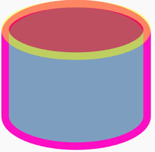
本文将简单介绍如何仅使用 Rectangle 实现圆柱形进度条,成果如上图所示。
圆柱形进度条不难实现,不过有趣的是它完全由代表矩形的 Rectangle 组成,这稍微有点反直觉。
首先我们需要重温一些基础知识:Rectangle 显示带圆角的矩形。用 RadiusX 和 RadiusY 可分别指定用于使矩形的角变圆的椭圆的 X 轴和 Y 轴半径。
如下面这个例子,可以看到 RadiusX="50" RadiusY="20" 的 Rectangle 的圆角和 Width="100" Height="40" 的 Ellipse (X 轴半径 50,Y 轴半径 20 )完全重合在一起。
<Rectangle
  Height="100"
  Width="100"
  Fill="#FF7E9EC0"
  Stroke="#FFFF0EC4"
  StrokeThickness="5"
  RadiusX="50"
  RadiusY="20"
/>
<Ellipse
  HorizontalAlignment="Left"
  VerticalAlignment="Top"
  StrokeThickness="5"
  Stroke="Yellow"
  Fill="Red"
  Width="100"
  Height="40"
  Opacity="0.5"
/>
现在我们把上面的 Rectangle 拉长,就成了圆柱的基本形状;反过来将它压扁,就成了圆柱的截面。再把它们设置成半透明的,就成了圆柱形进度条的背景:

<Grid.Resources>
  <style TargetType="Rectangle">
    <Setter Property="Fill" Value="#36a8e2" />
    <Setter Property="RadiusX" Value="25" />
    <Setter Property="RadiusY" Value="5" />
  </style>
</Grid.Resources>
<Rectangle Opacity="0.2" />
<Rectangle Height="10" VerticalAlignment="Top" Opacity="0.1" />
再在下面加上一个不透明的 Rectangle:
<Rectangle Height="100" VerticalAlignment="Bottom" />

看着很像进度条了,但是完全没有立体效果,所以还要再叠加一个半透明并且渐变的 Rectangle:
<Rectangle Opacity="0.6">
  <Rectangle.Fill>
    <LinearGradientBrush StartPoint="0,0.5" EndPoint="1,.5">
      <GradientStop Color="Black" />
      <GradientStop Offset="1" Color="Transparent" />
      <GradientStop Offset="0.6" Color="#41000000" />
    </LinearGradientBrush>
  </Rectangle.Fill>
</Rectangle>

很接近了,可是上面的截面不明显,最后还需要再加一个代表截面的 Rectangle:
<Grid Height="100" VerticalAlignment="Bottom">
  <Rectangle Height="10" VerticalAlignment="Top" />
</Grid>
现在看着像那么一回事了。不过这些只是 UI 方面的基础概念,要将它转换成 ProgressBar 还是需要做得复杂一些,具体代码可见这个项目:
原文作者:dino.c
原文链接:https://www.cnblogs.com/dino623/p/wpf_column_progress_bar.html