
前言
历经 3 个白天 2 个黑夜(至凌晨 2 点),Dotnet9 小编经过反复修改、润色,终于完成此文编写(本文略长,手机党请考虑流量),只能说小编我不容易呀不容易。
完成此文编写后,小编我能想象到《HandyControl》控件库作者及众多贡献者们,当初没日没夜码砖编写此控件库的各种研究、容错的场景,他们是一群多么负有激情、多么乐于分享的一群人啊,谢谢你们分享这么一套优秀的控件库给 WPF 从业者。
由于本文略长,建议读者查看以下导航目录,根据读者个人关注点点击阅读,也可按住 Ctrl + F 组合键搜索常用控件名字进行搜索阅读,当然小编是希望读者都能按文章顺序阅读啦,哈哈。
一、写在文章最前面的话
应博客园园友 @郭达·斯坦森 推荐,Dotnet9 小编本文介绍开源 C# WPF 控件库《HandyControl》,希望大家能够喜欢,同时亦欢迎大家推荐优秀开源 WPF 控件库给小编,小编在此谢谢大家对 dotnet 技术的关注和支持。
评论在此文第 51 楼:《《Dotnet9》系列-开源 C# WPF 控件库 2《Panuon.UI.Silver》强力推荐》

说点本文之前两篇控件库推荐文章的影响:
继前两篇开源 C# WPF 控件库(库 1,库 2)受广大网友推荐后,Dotnet9 小编备受鼓舞,让小编仿佛看到了 dotnet 蓬勃发展的 200 几年。
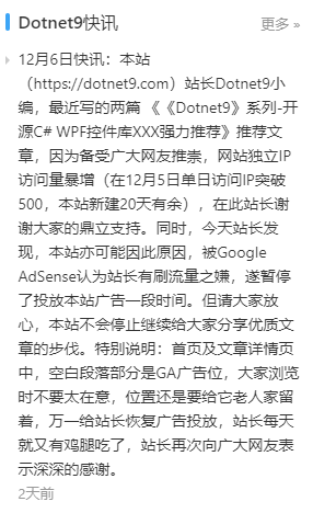
谢谢大家在博客园的大力推荐和留下的数十条文末评论,使小编我坚定了继续写优质 C# WPF 分享文章的信念,下面是近期博客园首页文章推荐截图:博客园。

本站单日 IP 访问量又突破新高,达到了 500 访问量,又上一个新台阶,谢谢广大网友。

另外,亦是由于两篇文章大火,Dotnet9 小编的个人博客站点出了点小插曲,以下是本站最新快讯:
但本站不会因该小插曲而停止继续给大家分享优质文章的步伐,以上是站长的声明,谢谢大家继续支持本站站长 Dotnet9 小编。
二、关于控件库《HandyControl》
2.1 交流社区
github 地址:https://github.com/HandyOrg/HandyControl 。
贡献者:NaBian、yanchao891012、ghost1372、guanguanchuangyu、noctwolf、DingpingZhang、xianyun666、M0n7y5、gitter-badger、afunc233 等等。
作者推荐的 C#及 WPF 学习博客链接:纳边、林德熙、吕毅、DinoChan、玩命夜狼 等等。
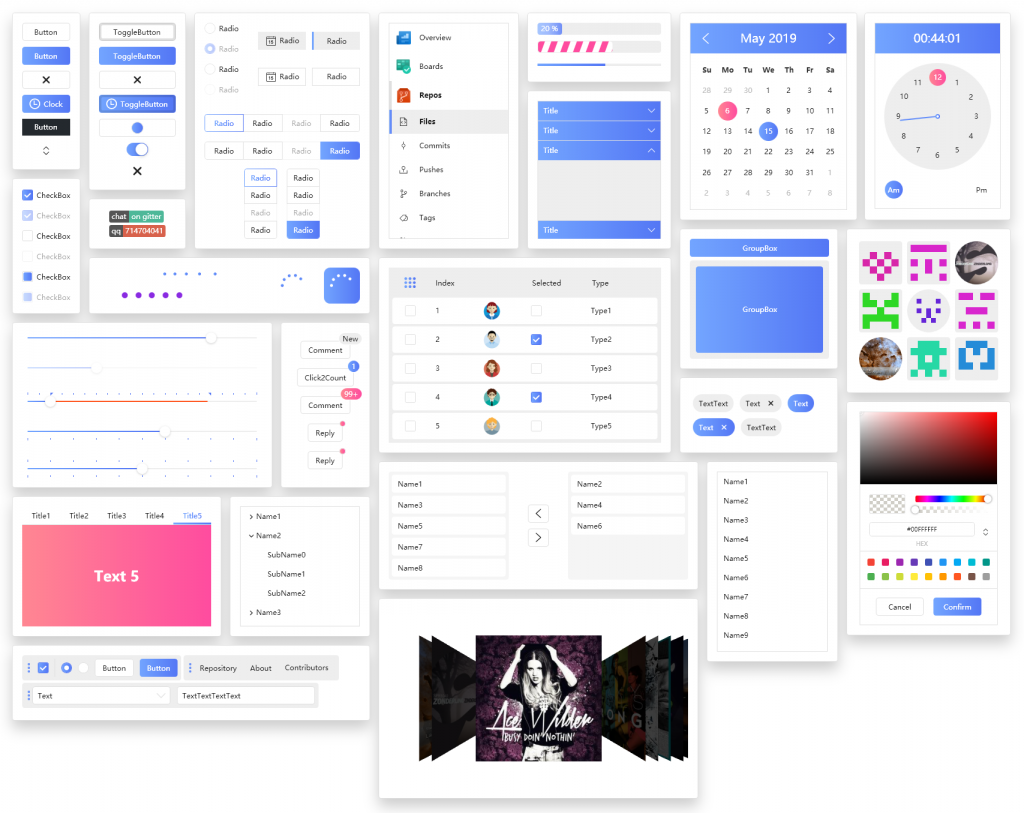
以下是两种主题控件库概览,先给大家一个大致印象,然后我开始介绍该控件库经典案例及详细控件介绍,希望大家喜欢我这样的介绍风格。
2.2 白色主题
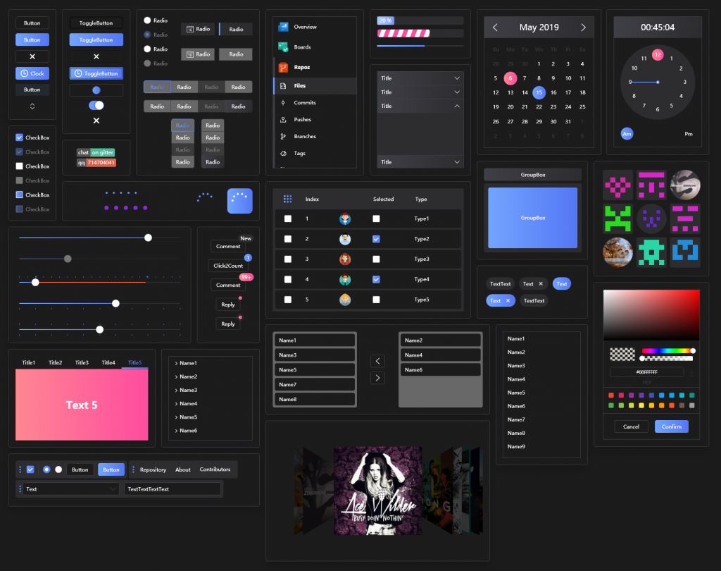
2.3 黑色主题
三、基于控件库衍生的经典 Case 案例
优秀的控件库肯定就有一群志同道合的小伙伴追随,从控件库作者建立的两个 QQ 群人数即可看出,使用此控件库的朋友很多,Dotnet9 小编就和控件库作者从中遴选出几个比较典型的项目举例,读者朋友可以看看,《HandyControl》控件库是不是非常适合您的项目?
3.1 Case 案例 1
软件名:phpEnv,浏览地址:https://www.phpenv.cn/ 。
软件简介:phpEnv 是运行在 Windows 系统上的完全绿色的 PHP 集成环境,集成了 Apache、Nginx 等 Web 组件,支持不同 PHP 版本共存,支持自定义 PHP 版本,自定义 MySQL 版本。主打开发环境,也可以用作服务器环境。拥有清除 PHP 环境阻碍、解除端口占用、支持切换 MySQL 版本、修改 MySQL 密码,兼容其他集成环境,内置 Redis、MemCache 等其他服务,内置 Composer 和功能强大的 CMD 命令行、TCP 端口进程列表等工具和实用功能。
3.2 Case 案例 2
软件名:AutomnBox,浏览地址:https://github.com/zsh2401/AutumnBox 。
AutumnBox 是什么?一个对 Google Adb 工具包进行 GUI 封装的桌面程序,方便小白,帮助老鸟。
AutumnBox 能干什么?
- 为您的设备刷入第三方 Recovery
- 向设备推送文件
- 一键激活黑域服务
- 一键激活冰箱
- 解锁 System,获取完整 root 控制权
- 以拓展模块为中心的功能开发思想,将来将会支持越来越多的功能
- …
四、特色控件详细介绍
介绍控件肯定少不了特色控件截图和文字描述,编写本文时,Dotnet9 小编不用再自己截图、录制 gif 动画了等素材了,因为 《HandyControl》控件库作者非常优秀,本文大部分图片素材来自控件库作者 github 仓库,读者您可以直接访问此地址查看:https://github.com/HandyOrg/HandyControl 。
下面 Dotnet9 小编介绍 HC(后文作者使用此简写表示 HandyControl)控件时,会加上自己的使用体验及观点,如有不同观点或建议,请在文末留言和小编讨论,或者加作者 QQ 交流群切磋交流,大家以技术会友,共同成长。
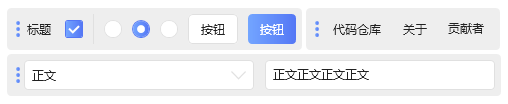
4.1 各式按钮
界面开发首先想到的就是按钮,下面是《HandyControl》设计的几类按钮,是否有您中意的一款?
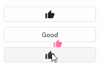
4.1.1 普通按钮(Button)
普通按钮(Button),一般桌面开发中,以下样式的按钮应该已经够用了,当然也可以根据自家公司设计师的要求,在作者样式基础上加以扩展修改也是极方便的。

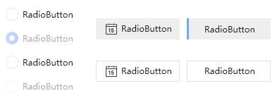
4.1.2 单选按钮 (RadioButton)
单选按钮 (RadioButton) ,也是挺漂亮,美化界面也必不可少。
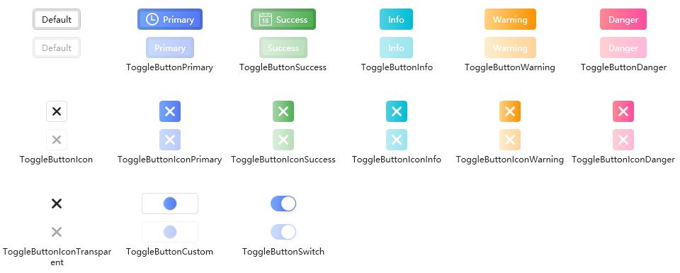
4.1.3 切换按钮 (ToggleButton)
切换按钮 (ToggleButton) ,HC 作者设计有数种样式,方便使得吧?
4.1.4 分割按钮 (SplitButton)
分割按钮 (SplitButton),可用于点击按钮弹出菜单业务场景下使用。

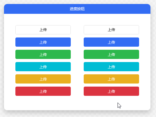
4.1.5 进度按钮 (ProgressButton)
进度按钮 (ProgressButton) ,在按钮上显示进度作者也挺有想法的,点击上传文件时,在界面空间比较紧凑时使用很方便。
4.1.6 按钮分组 (ButtonGroup)
按钮分组 (ButtonGroup),该控件可替换常规菜单使得,即只有一级菜单的情形,或相关操作比较类似。

4.1.7 Shield
Shield,Shield 标记用于显示即时状态统计时很直观。
4.1.8 Pagination
Pagination ,表格等常用的分页封装控件,大数据分页展示使用很方便,分页控件样式也是比较流行。

4.2 标签类控件
提供的标签类控件较多,和 Label 类似或扩展的控件,Dotnet9 小编把它们归为一类。
4.2.1 Label 标签
Label 标签,常用的 Label 标签,漂亮吧?常规使用是 Label 搭配 TextBox 作为表单使用。

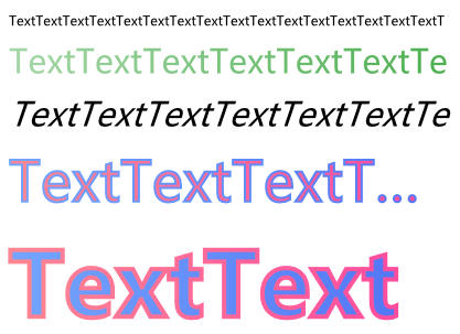
4.2.2 OutlineText
OutlineText 轮廓文本,添加各种字体后,Text 也可以这么好看的。
4.2.3 Tag
Tag 标签,用于搜索,可将常用搜索条件作为 Tag 标签,方便快速过滤得到用户想要的结果,这个用户体验大大提高了吧,用户都会表扬你的。

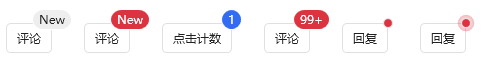
4.2.4 Badge
Badge 徽章,网站中常用此样式显示库版本及比较明显的信息展示,很醒目有没有?赶紧在自己的项目中使用吧。

4.2.5 Poptip
Poptip,气泡提示类控件,自定义提示就是这么方便。
4.3 各式 Block 块控件
各式 Block 块控件,常见的是 TextBlock,TextBlock 与 Label 标签功能类似,下面是各式 Block 块控件展示:
4.3.1 TextBlock 文本块
TextBlock 文本块,常用文本展示。

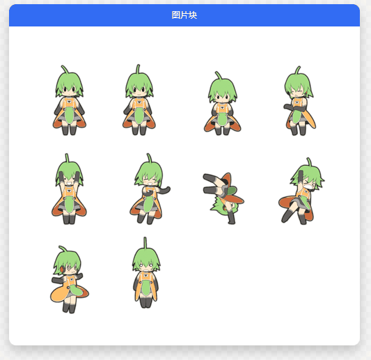
4.3.2ImageBlock
ImageBlock,图片块展示。
4.3.3 FloatingBlock
FloatingBlock,看见这个控件想到了什么?是不是想到看直播时一直给主播点赞送小花的情景?
4.3.4 RunningBlock
RunningBlock 滚动块,跑马灯式效果,用于桌面软件打滚动广告还是很好的,如果你是做视频播放类软件,用于弹幕也是很方便的。
4.4 输入编辑类控件
作者提供的输入编辑类控件也着实不少,比如文本框、密码框等等。
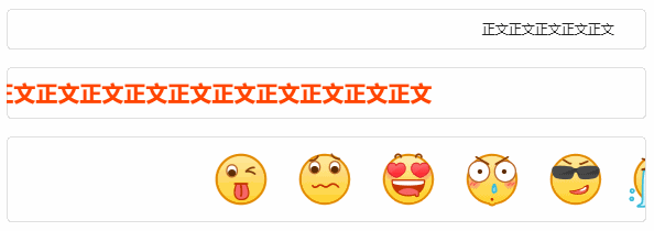
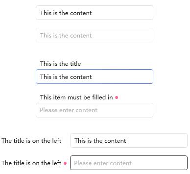
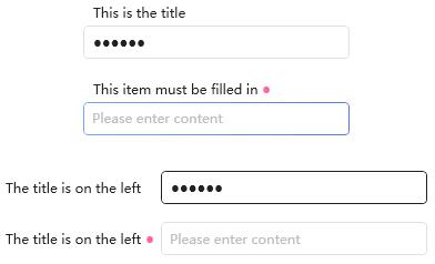
4.4.1 TextBox
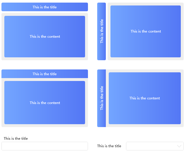
TextBox,是比较常规的输入文本框控件,作者将标签与文本框封装成一个控件“组合框”,方便快速使用布局。
4.4.2 RichTextBox
RichTextBox 富文本框控件,比较常见。
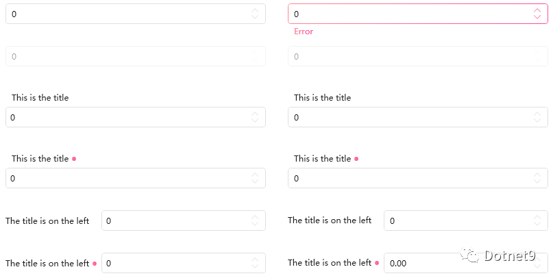
4.4.3 NumericUpdown
NumericUpdown 数值选择控件,方便数字输入或选择验证,本控件也可以归为选择类控件。
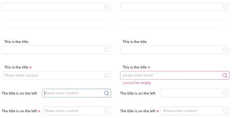
4.4.4 SearchBar
SearchBar 搜索栏,提供数种样式选择,您平时开发是不是也有这种界面设计,直接使用吧,提高您的开发效率。
4.4.5 PasswordBox
Dotnet9 习惯将 PasswordBox 密码框归类为文本框一类,下面是 HC 密码框。
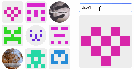
4.4.6 Gravatar
HandyControl》Gravatar,这个控件比较好玩,动态生成头像,喜不喜欢?很有意思的一个控件。
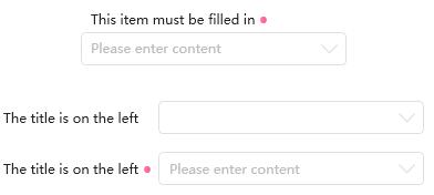
4.4.7 ComboBox
ComboBox 下拉框,比原生下拉框好看多了,非常清爽。

4.5 选择类控件
Dotnet9 小编将下拉框、复选框、单选框等统一归为选择类控件,各控件见下图:
4.5.1 Divider
Divider 分割线控件,方便实用。

4.5.2 《HandyContronl》ComboBox
《HandyContronl》ComboBox 下拉框,其实小编已将此控件划归为输入编辑类控件,但此控件也属于选择类控件,此控件由文本框及列表控件组合而成,具体的代码小编还未细看,小编猜测是这样的,不知道作者是不是这样做的?
4.5.3 Rate
Rate,评分控件,这控件看着熟悉吧,给文章或者资源评分时经常使用到,这个非常不错,Dotnet9 小编很喜欢。

4.5.4 Slider
Slider 范围滑块,配色黑色主题显示很好看哟。
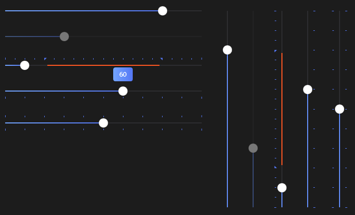
4.5.5 PrevieweSlider
PrevieweSlider 预览滑块,控件如其名,实时显示拖动值。

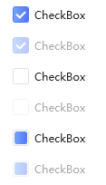
4.5.6 CheckBox
CheckBox 复选框 ,样式还是比较专业的。
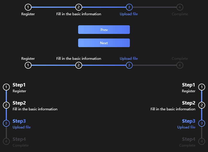
4.5.7 StepBar
StepBar 步骤条 ,有流程相关业务时,使用这个控件是非常方便的,我们常见的就是找回密码,让你一步一步的输入验证。
4.5.8 ColorPicker
ColorPicker 拾色器,方便颜色选择,是个好东西。

4.6 时间类控件
Dotnet9 小编把时间相关的控件也归为一类,作者实现了较多的类似控件,非常优秀,十分方便大家选择使用。
4.6.1 FlipClock
FlipClock 翻页时钟,这个控件酷吧?像不像挂历?篮球比赛等记分牌有印象没?

4.6.2 TimeBar
TimeBar 时间条,可以扩展到自制甘特图使用。

4.6.3 Calendar
Calendar 日期控件,比较常规。

4.6.4 Clock
Clock 时钟控件,也比较常规。

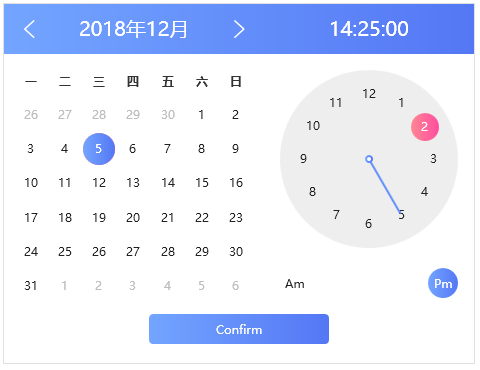
4.6.5 CalendarWithClock
CalendarWithClock 日期与时钟组合控件,这个比较好,好用。
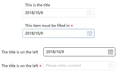
4.6.6 DatePicker
DatePicker 日期选择控件,比较常用的控件。
4.6.7 TimePicker
TimePicker 时间选择控件,也比较常用。

4.6.8 DateTimePicker
DateTimePicker 日期时间选择控件,这个组合选择比较完美,小编以后的项目中有此场景,一定会尝试使用。

4.7 菜单类控件
Dotnet9 小编将菜单类、任务栏类统一归为菜单类控件,方便读者阅读查找。
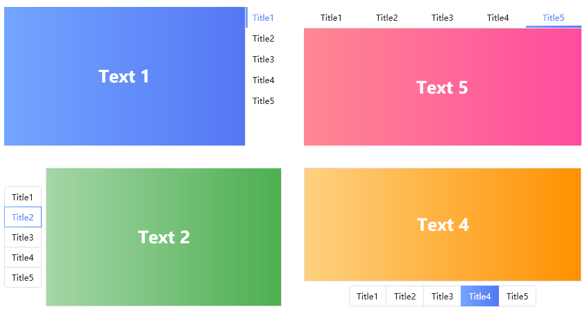
4.7.1 SideMenu
SideMenu,侧边栏菜单,这种菜单也是比较常见的类型,十分受用。
4.7.2 ContextMenu
ContextMenu 上下文菜单,这种素色,Dotnet9 小编原来自己常用,比较朴素,很清爽。
4.7.3 ToolBar
ToolBar,工具栏常搭配导航菜单使用,经典组合。
4.7.4 CirclePanel
CirclePanel 圆形布局,Dotnet9 小编喜欢叫它圆形菜单,手机上用的比较多,桌面上不多,如果您的项目或者产品加上此控件,用户体验上升一个档次,当然看具体业务情况哈,也不能乱加。

4.7.5 NotifyIcon
NotifyIcon,即原 Windows 系统托盘图标升级版:
支持托盘图标闪烁:
该控件方便扩展,可做成 360 安全卫士类似的托盘菜单,这就很考验读者编码功底了,下图就是 360 安全卫士的系统托盘菜单,漂亮吧?Dotnet9 小编见过不少软件都在模仿 360 设计,当然小编自己也算在内,哈哈,注意这不是 HC 控件哈,需要读者自己实现,其实也不难的。

4.8 布局及图片类控件
作者实现了数个有意思的布局容器,这一切都是为了用户体验啊,用心良苦。
图片相关展示控件与布局控件类似,所以 Dotnet9 小编将这些控件归为一类,当然也是为了方便读者查找、阅读啦。
4.8.1 Border
Border 边框,图形化展示图片时非常好看的。
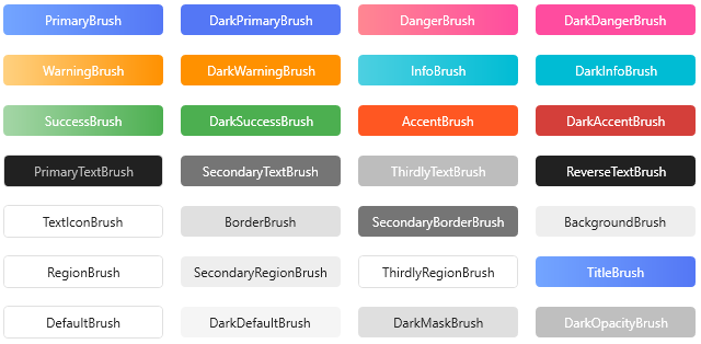
4.8.2 Brush
Brush 画刷,提供 28 种常用画刷,业界良心呀,受用了。
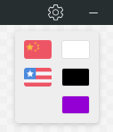
4.8.3 SwitchConfig
SwitchConfig 选择配置,常用于界面国际化语言选择,方便吧。
4.8.4 Expander
Expander,常规控件。

4.8.5GroupBox
GroupBox 组合框,常规控件。
4.8.6 ScrollViewer
ScrollViewer 滚动视图,也比较常用。

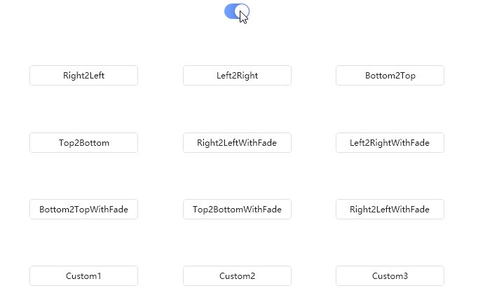
4.8.7 TransitioningContentControl
TransitioningContentControl 内容过渡控件,效果不错吧。
4.8.8 TabControl1
TabControl1 选项卡控件样式一。
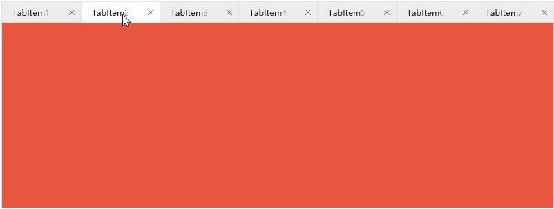
4.8.9 TabControl2
TabControl2 选项卡控件样式二。
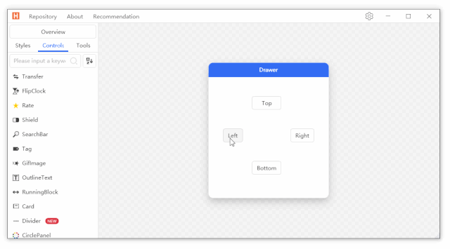
4.8.10 Drawer
Drawer,抽屉类布局控件,对空间有要求的业务场景很是有用。
4.8.11 HoneycombPanel
HoneycombPanel 蜂窝布局,有意思的布局控件。

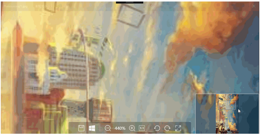
4.8.12 Magnifier
Magnifier 放大镜控件,京东、淘宝购物时,鼠标移动到物品图片上可以放大查看,很方便使用的控件。

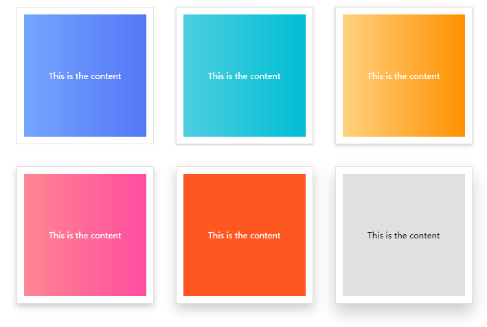
4.8.13 Card

4.8.14 Grid
Grid 栅格布局。
4.8.15 AnimationPath
AnimationPath 动画路径,比较酷炫。

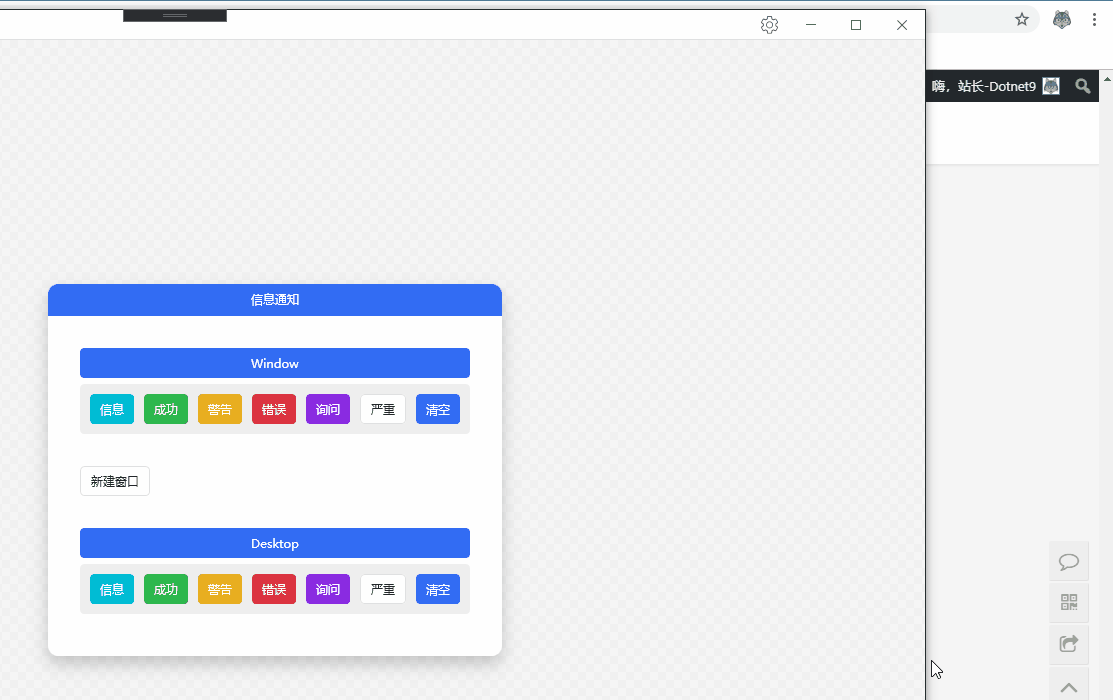
4.8.16 Growl
Growl 信息通知,有用的提示控件,比如做监控类软件,有重要信息报警时,信息通知可用在软件界面内弹出提示,也可在软件不在桌面最顶端时,直接在操作系统桌面弹出,非常灵活。
4.8.17 GoToTop
4.8.18 Transfer
Transfer 穿梭框,多个列表项移动时着实有用。

4.8.19 CoverFlow
CoverFlow 封面流,图片浏览的一种形式。

4.8.20 CoverView
CoverView 封面视图。
4.8.21 Carousel
Carousel 轮播,广告自动播放。

4.8.22 CompareSlider-h
CompareSlider-h 水平对比滑块。
4.8.23 CompareSlider-v
CompareSlider-v 竖直对比滑块。

4.8.24 ImageBrowser
ImageBrowser,图片浏览控件,这个很强大了,通常展现图片以卡片的形式展现缩略图,当用户以为某图比较有用时,使用此控件查看很是方便,因为此控件录制的 gif 大于 9MB,小编就不显示动图了,你们能够本身下载自行体验。
4.8.25 WaterfallPanel
WaterfallPanel 瀑布流布局。

4.9 Loading\进度条相关控件
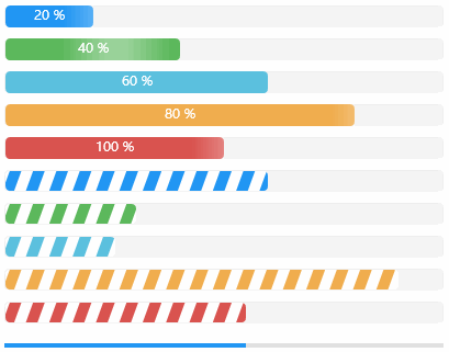
4.9.1 ProgressBar
ProgressBar 进度条,下面的几种样式都很好看,任君选择使用。
4.9.2 WaveProgressBar
WaveProgressBar 水波进度条,酷炫吧。

4.9.3 CircleProgressBar
CircleProgressBar 圆形进度条。

4.9.4 Loading
Loading 加载条,界面响应数据等待时使用,让用户干等,不如让他看看小小动画吧,不要让人觉得界面卡死了没反应。

4.10 WPF 扩展控件
有很多功能 C# WPF 未实现,比较 gif 图片动态展示,默认使用 Image 控件是显示的第一帧图片,很好的实现了这一功能,值得推崇。
4.10.1 GeometryAnimation,几何动画

4.10.2 GifImage
GifImage,gif 图片播放,微软目前也没有自带实现此功能,只能靠开源社区自己实现了,HC 作者实现的不错,内存占用率较低。

4.11 数据展示类控件
4.11.1 ListBox
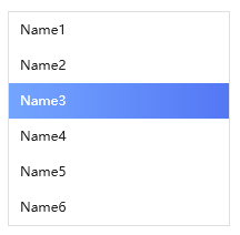
4.11.2 ListView

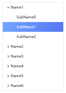
4.11.3 TreeView
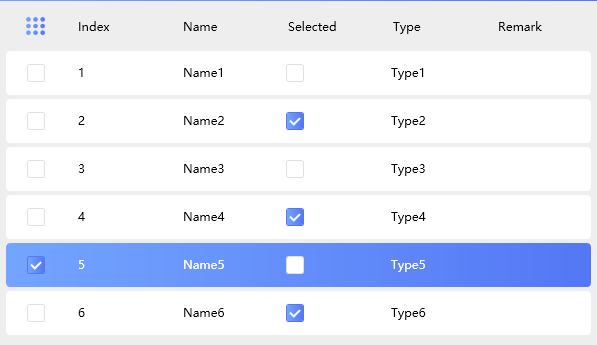
4.11.4 DataGrid
4.11.5 DarkTheme

4.12 窗体类控件
Dotnet9 小编将自定义窗体、消息提示框等归为窗体类。
4.12.1 BlurWindow
BlurWindow 各种窗体供君选择使用。
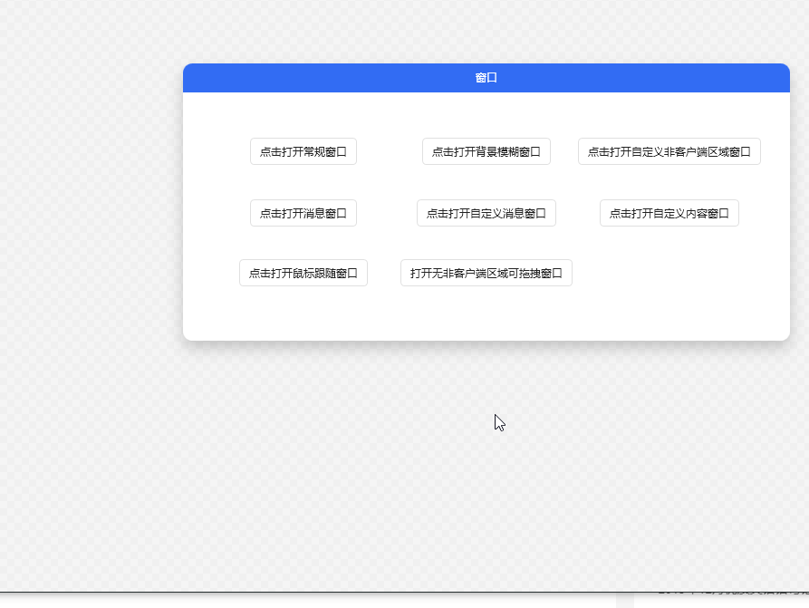
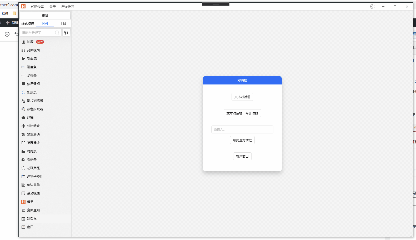
4.12.2 Dialog
Dialog 对话框,Web 样式遮罩显示,可区分父窗体与应用程序主窗体遮罩,可灵活控制。
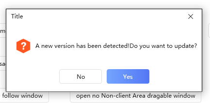
4.12.3 MessageBox
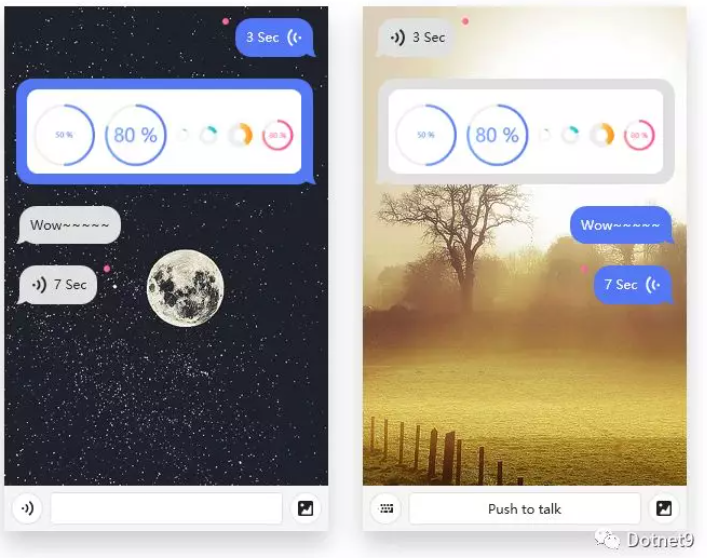
4.12.4 ChatBubble
ChatBubble 聊天气泡,做 IM 软件非常实用。
以下是小编自己模拟与 HC 控件库作者之间的简短问候:

五、写在文章最后的话
这是 Dotnet9 小编写的第三篇介绍 C# WPF 开源控件库的文章,在写文章的过程中,小编亲自下载、编译、调试了《HandyControl》控件库,并反复鼓捣此控件库和了解源于该控件库的经典案例,相信不会让大家失望的。
小编把玩 HC 控件库数天,并通过对 90 张左右的控件库图片整理、分类,自认为对该控件库还是算比较了解了,此控件库包含的控件种类十分的丰富,该有的控件都有了,平时工作中见过的几乎也都包含了,向大家推荐在工作中使用不会错的 (本文所有图片共 97 张,加起来接近 30MB,手机浏览此文的读者您破费了,希望您有所收获) 。
以上只是《HandyControl》的部分控件样例介绍,该控件库作者及广大贡献者也在时常更新该控件库仓库,比如新增有精灵等等控件,有关更多的控件样例请大家移步到 github 仓库下载研究、学习: https://github.com/HandyOrg/HandyControl 。
如对文中控件使用有所疑问,或者其他建议,请在本文评论区留言,小编定会及时回复;如若打算使用此控件库,可下载 github 仓库自行编译研究学习,另可加 HC 控件库作者创建的 QQ 交流群交流讨论,群号见文中:2.1 《HandyControl》交流社区。