
原文:https://github.com/benruehl/adonis-ui
翻译:沙漠尽头的狼(谷歌翻译加持)
用于 WPF 应用程序的轻量级 UI 工具包,提供经典和增强的 Windows 视觉效果:
仓库信息
有哪些内容?
- 几乎所有 WPF 控件的默认样式和模板
- 可根据需要使用的其他样式以方便使用
- 两种配色方案(浅色和深色)也可用于自定义样式
- 支持在运行时更改配色方案
- 支持其他自定义配色方案
- 内置控件的扩展,提供水印等功能
- 常见用例的自定义控件很少
设计原则
- 保持接近 WPF 的原始外观
- 不需要任何配置,但为想要控制全局和个人行为的人提供选项
- 支持 WPF 对创建新控件的内置控件的扩展,以便成为现有应用程序的直接替代品
文档
使用文档地址:https://benruehl.github.io/adonis-ui/docs/getting-started/introduction/
开始吧
Install-Package AdonisUI.ClassicTheme -Version 1.17.1
- 像这样将资源添加到您的应用程序
App.xaml中:
<Application xmlns:adonisUi="clr-namespace:AdonisUI;assembly=AdonisUI">
    <Application.Resources>
        <ResourceDictionary>
            <ResourceDictionary.MergedDictionaries>
                <ResourceDictionary Source="pack://application:,,,/AdonisUI;component/ColorSchemes/Light.xaml"/>
                <ResourceDictionary Source="pack://application:,,,/AdonisUI.ClassicTheme;component/Resources.xaml"/>
            </ResourceDictionary.MergedDictionaries>
        </ResourceDictionary>
    </Application.Resources>
</Application>
- 从 Adonis UI 的默认样式派生窗口样式,如下所示:
<Window.Style>
    <Style TargetType="Window" BasedOn="{StaticResource {x:Type Window}}"/>
</Window.Style>
控件特色
在运行时切换配色方案
Adonis UI 带有浅色和深色配色方案。可以不受限制地添加自定义配色方案。
| 浅色方案 | 深色方案 Scheme |
|---|---|
 |
 |
要在运行时切换配色方案,ResourceDictionary需要从应用程序资源中删除包含方案的所有颜色和画笔,以便可以添加不同的配色方案。这可以使用内置ResourceLocator类来完成,例如在单击事件处理程序中。
AdonisUI.ResourceLocator.SetColorScheme(Application.Current.Resources, ResourceLocator.DarkColorScheme);
第一个参数必须是对 ResourceDictionary 包含配色方案的引用,作为其MergedDictionaries。 第二个参数是应添加的配色方案的 Uri。
强调色
在依赖于背景区域和边框的统一颜色的同时,强调色可用于视觉突出重要点。默认情况下,两种配色方案都使用蓝色作为强调色。这可以通过覆盖强调色值来改变。一组样式有助于在强调色上显示按钮等控件。
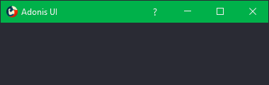
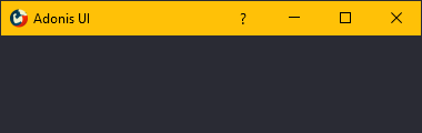
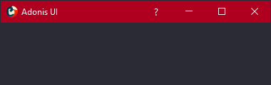
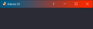
自定义窗口标题栏
Adonis UI 带来了一个自定义窗口标题栏,默认情况下看起来与 Windows 10 标题栏一模一样,但有几个优点。首先,它尊重当前的配色方案,因此在切换到深色配色方案时它会变暗。其次,它的颜色也可以独立于颜色方案设置,例如通过绑定和触发器。第三,它的内容可以很容易地定制,例如通过隐藏图标、添加额外的按钮或在其中放置标签。派生您的窗口AdonisWindow以接收这些功能。
 |
 |
 |
 |
光标聚光灯悬停效果(Cursor Spotlight hover effect)
依赖交互的 UI 控件(如按钮、文本框、组合框、列表框等)在此处使用称为 Cursor Spotlight 的悬停效果。当将鼠标悬停在隐藏的控件上时,它会使光标周围的图层可见。它适用于两种配色方案。
| 浅色方案 | 深色方案 Scheme |
|---|---|
 |
 |
因为它与OpacityMasks一起作用不仅限于照亮 UI 控件。它可以用来隐藏几乎所有可以用 WPF 渲染的东西。
连锁反应(Ripple effect)
默认情况下,按钮和 ContextMenuItem 在单击时会显示涟漪效果。ListBoxItems 也支持它,但默认情况下禁用它。
| 浅色方案 | 深色方案 Scheme |
|---|---|
 |
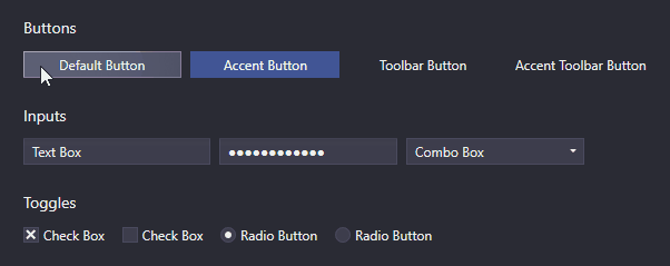 |
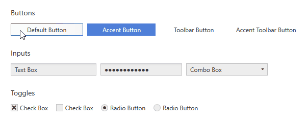
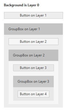
图层
在 UI 设计中,容器将属于一起的项目分组是很常见的。例如,在 WPF 中,这可以使用 GroupBoxes 轻松实现。如果容器分配了不同的背景颜色以更好地区分分组项目及其周围环境,则颜色对比可能会成为问题。灰色按钮最初在白色应用程序背景上可能看起来不错,但是当它们被移动到也具有灰色背景的 GroupBox 中时,它们可能会失去可见性。
这就是为什么 Adonis UI 引入了一个简单的分层系统,它可以根据 UI 控件所属的层自动调整 UI 控件的颜色。默认情况下,所有样式的 Adonis UI 都会自动适应系统,但也可以禁用它。
| 浅色方案 | 深色方案 Scheme |
|---|---|
 |
 |
这些图像显示了一个由 Buttons 和 GroupBoxes 组成的简单布局。所有控件都使用它们的默认样式,除了它们的内容之外没有设置任何属性。分层系统负责稍微调整每层按钮的颜色和 GroupBoxes 的背景。它确保容器的背景和容器中控件的背景始终存在差异。如果没有系统,所有按钮都将具有完全相同的背景颜色。
该系统是完全可定制的。当然,它适用于所有控件,而不仅仅是按钮。每个控件都可以配置为为其子级增加层,但默认情况下已经为某些控件(如 GroupBoxes)启用它。控件也可以强制驻留在特定层上。
数据验证支持
WPF 的数据验证机制提供了验证属性值并在它们无效时分配错误消息的能力。在 Adonis UI 中,如果控件绑定到无效属性,则错误会在控件模板中由红色边框和错误图标指示。当控件获得键盘焦点或用户将鼠标悬停在图标上时,错误消息将显示为弹出窗口。要设置验证错误,可以使用接口IDataErrorInfo或WPF。
| 浅色方案 | 深色方案 Scheme |
|---|---|
 |
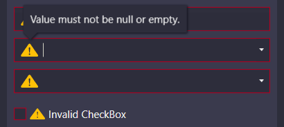 |
默认情况下,错误消息弹出窗口显示在键盘焦点和鼠标悬停上。两者都可以单独禁用。
ComponentResourceKeys
Adonis UI 提供的资源具有分配的 ComponentResourceKey,以便以简单的方式使用它们。资源存在于颜色、画笔、尺寸、样式、模板和图标等类别中。例如,当前配色方案的前景画笔可以通过引用其资源键来使用,如Foreground="{DynamicResource {x:Static adonisUi:Brushes.ForegroundBrush}}"。 ComponentResourceKeys 允许使用 IntelliSense 自动完成,这在探索可用资源时会派上用场。
Space
控件之间的 Space 通常由边距、填充和网格行和列控制。为了确保每个位置的 Space 一致,可以选择一个固定的大小,在任何地方都使用(或它的倍数)。Adonis UI 提供了一个支持您这样做的系统。默认情况下,空间的基值为8,但可以分别针对水平和垂直空间进行调整。
可以像这样应用空间:
<RowDefinition Height="{adonisUi:Space 1}"/> <!-- equals Height="8" -->
<RowDefinition Height="{adonisUi:Space 2.5}"/> <!-- equals Height="20" -->
<RowDefinition Height="{adonisUi:Space 2.5+1}"/> <!-- equals Height="21" -->
<RowDefinition Height="{adonisUi:Space 2.5-1}"/> <!-- equals Height="19" -->
同样适用于边距和填充等厚度:
<Button Margin="{adonisUi:Space 1}"/> <!-- equals Margin="8,8,8,8" -->
<Button Margin="{adonisUi:Space 1, 2}"/> <!-- equals Margin="8,16,8,16" -->
<Button Margin="{adonisUi:Space 1, 1+2, 2, 3}"/> <!-- equals Margin="8,10,16,24" -->
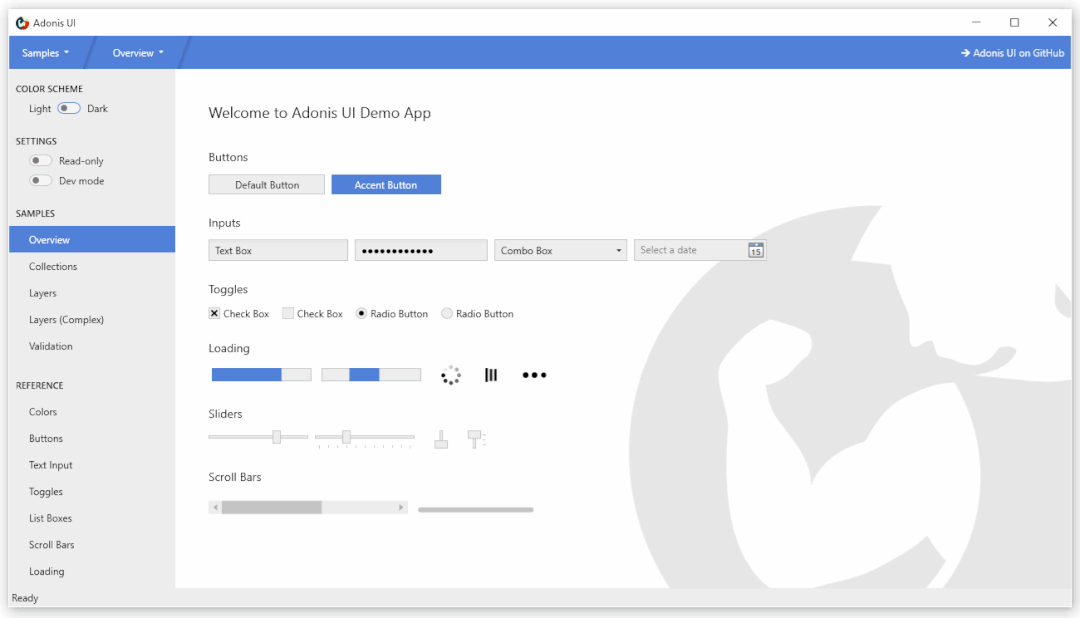
演示
板上有一个 WPF 演示应用程序,它显示了 Adonis UI 的大部分功能。请不要犹豫,试一试。
License
MIT © Benjamin Rühl