
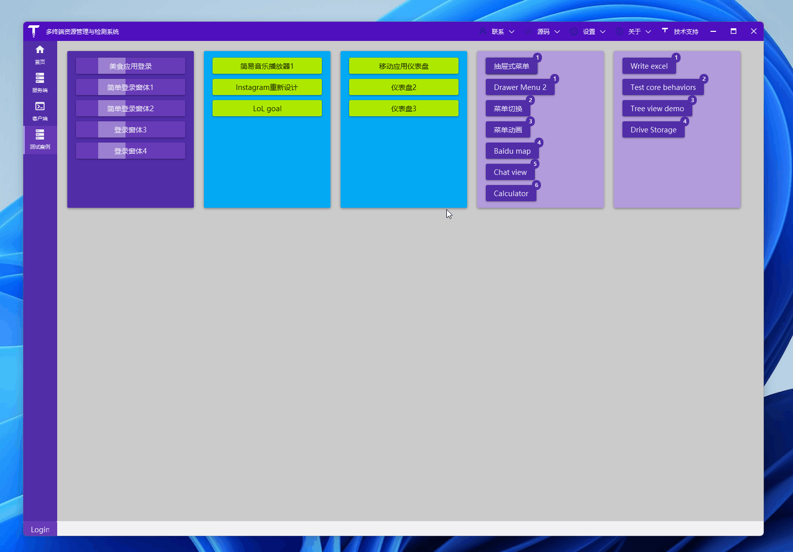
1. effect display
Let's first directly appreciate the effect:
2. ready
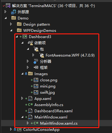
创建一个 WPF 工程,比如站长使用 .NET 7 创建名为 Dashboard3 的 WPF 项目,添加一些图片资源,项目目录如下:
2.1 picture resource
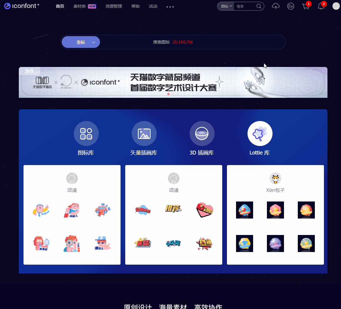
可在网站 iconfont 下载 关闭、最小化 图标,用于窗口右上角显示:
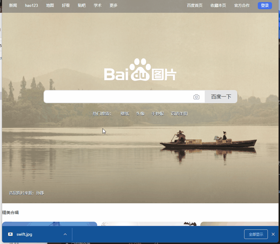
Have you seen pictures of beautiful women? Download on Baidu Images or Google Images, such as Taylor Swift, which is used to display a person's avatar in the interface:
2.2 Font icon NuGet package: FontAwesome.WPF, which provides some icon fonts:
<PackageReference Include="FontAwesome.WPF" Version="4.7.0.9" />
When compiling, this package has the following prompts:
已使用“.NETFramework,Version=v4.6.1, .NETFramework,Version=v4.6.2, .NETFramework,Version=v4.7, .NETFramework,Version=v4.7.1, .NETFramework,Version=v4.7.2, .NETFramework,Version=v4.8”而不是项目目标框架“net7.0-windows7.0”还原包“FontAwesome.WPF 4.7.0.9”。此包可能与项目不完全兼容。
Are there any recommended font icon libraries for the. NET Core version? You can leave a message below, thank you, it will not affect your use here.
3. brief introduction
Several aspects of the interface are highlighted:
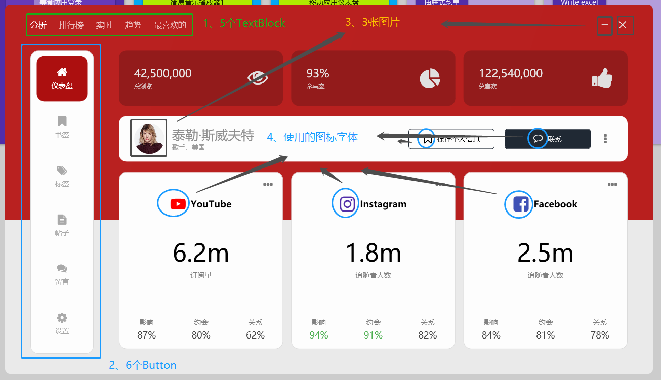
3.1 horizontal menu

As shown in the above figure, the horizontal menu is several TextBlox tabs. The transparency of the font is set to 0.7 by default, and it is set to 1 when the mouse is floating:
<StackPanel Orientation="Horizontal" HorizontalAlignment="Left">
    <TextBlock Text="分析" Opacity="1" Style="{StaticResource menuTitle}" />
    <TextBlock Text="排行榜" Style="{StaticResource menuTitle}" />
    <TextBlock Text="实时" Style="{StaticResource menuTitle}" />
    <TextBlock Text="趋势" Style="{StaticResource menuTitle}" />
    <TextBlock Text="最喜欢的" Style="{StaticResource menuTitle}" />
</StackPanel>
<Style x:Key="menuTitle" TargetType="TextBlock">
    <Setter Property="Margin" Value="0 0 25 0" />
    <Setter Property="FontSize" Value="16" />
    <Setter Property="Opacity" Value="0.7" />
    <Setter Property="Foreground" Value="#FFFFFF" />
    <Style.Triggers>
        <Trigger Property="IsMouseOver" Value="True">
            <Setter Property="Opacity" Value="1" />
        </Trigger>
    </Style.Triggers>
</Style>
3.2 Vertical menu
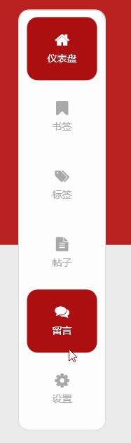
As shown above, the vertical menu is a few buttons, the button content is filled with font icons and text, and some effect styles are set:
<Button Style="{StaticResource menuButton}" Margin="0 10 0 0" Background="#AC0F0F" Foreground="#FFFFFF">
    <StackPanel>
        <fa:ImageAwesome Icon="Home" Style="{StaticResource menuButtonIcon}" />
        <TextBlock Text="仪表盘" Style="{StaticResource menuButtonText}" />
    </StackPanel>
</Button>
<Style x:Key="menuButton" TargetType="{x:Type Button}">
    <Setter Property="Margin" Value="0 7 0 0" />
    <Setter Property="FontSize" Value="14" />
    <Setter Property="Width" Value="100" />
    <Setter Property="Height" Value="90" />
    <Setter Property="Background" Value="Transparent" />
    <Setter Property="Foreground" Value="#a9a9a9" />
    <Setter Property="FocusVisualStyle" Value="{x:Null}" />
    <Setter Property="Template">
        <Setter.Value>
            <ControlTemplate TargetType="{x:Type Button}">
                <Border Background="{TemplateBinding Background}" CornerRadius="15" Padding="15">
                    <ContentPresenter HorizontalAlignment="Center" VerticalAlignment="Center" />
                </Border>
            </ControlTemplate>
        </Setter.Value>
    </Setter>
    <Style.Triggers>
        <Trigger Property="IsMouseOver" Value="True">
            <Setter Property="Background" Value="#AC0F0F" />
            <Setter Property="Foreground" Value="#FFFFFF" />
        </Trigger>
        <Trigger Property="IsMouseCaptured" Value="True">
            <Setter Property="Background" Value="#921C1B" />
            <Setter Property="Foreground" Value="#FFFFFF" />
        </Trigger>
    </Style.Triggers>
</Style>


<Style x:Key="menuButtonIcon" TargetType="fa:ImageAwesome">
    <Setter Property="Foreground" Value="{Binding Path=Foreground, RelativeSource={RelativeSource FindAncestor, AncestorType={x:Type Button}}}" />
    <Setter Property="Width" Value="20" />
    <Setter Property="Height" Value="20" />
</Style>


<Style x:Key="menuButtonText" TargetType="TextBlock">
    <Setter Property="Margin" Value="0 7 0 0" />
</Style>
3.3 Some pictures and font icons
Not much to say about this, the code above also uses font icons.
4. end
这个面板的效果个人感觉很漂亮,由基本的TextBlock、Button、字体图标、图片等组合、排版布局就能做到很多效果,有兴趣可以看看作者视频(非常推荐),以及下方给出的源码仓库链接:
** Reference: **
- 油管视频作者:C# WPF UI Academy
- 油管视频:C# WPF UI | How to Design Beautiful Social Media Info Dashboard in WPF
- 参考代码:WPF-Social-Media-Info-Dashboard
本文代码:Dashboard3