
阅读导航
- 前言
- 案例一
- 案例二
- 案例三(本文介绍的方式)
- 如何使用?
- 控件如何开发的?
- 总结
1. 前言
案例一
站长分享过 眾尋 大佬的一篇 WPF 简易新手引导 一文,新手引导的效果挺不错的,如下图:
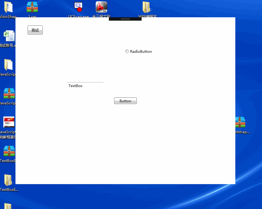
该文给出的代码未使用 MVVM 的开发方式,提示框使用的用户控件、蒙版窗体样式与后台代码未分离,但给大家分享了开发新手引导功能的一个参考。
案例二
开源项目 AIStudio.Wpf.Controls,它的新手引导效果如下:
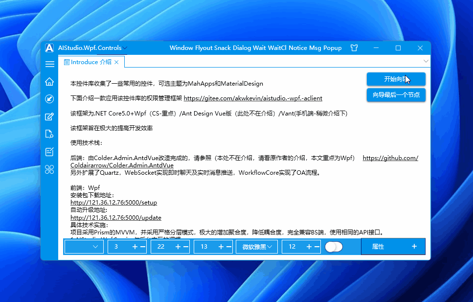
此开源项目也有参考上文(WPF 简易新手引导),并且重构为 MVVM 版本,方便绑定使用。
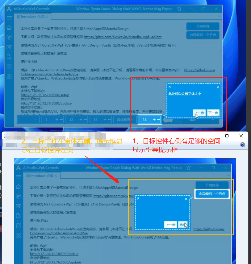
并且提示框显示的位置还跟随目标控件在主窗体中的位置灵活变换,不至于显示在蒙版窗体之外,如下图所示:
当目标控件右侧空间足够显示引导提示框时,引导提示框就显示在目标控件右侧;在右侧空间不足时,则将引导提示框显示在目标控件左侧:
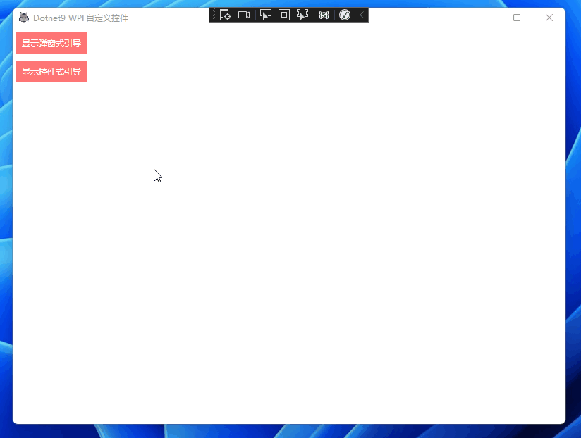
案例三(本文介绍的方式)
站长根据上面的开源项目 AIStudio.Wpf.Controls 做了一个自己的版本 Dotnet9WPFControls,去掉了上一步按钮、增加标题绑定、下一步按钮内容绑定、提示框样式修改等,效果如下:
后面段落就介绍 怎么使用 Dotnet9WPFControls 添加新手引导功能,并简单提及这个自定义控件的开发细节,主要原理还是看上文 WPF 简易新手引导 哈。
希望对有需要给自己的项目添加新手引导功能的朋友有一定帮助,通过此文你也能修改出满足自己需求的效果。
2. 如何使用?
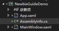
2.1 创建一个 WPF 项目
使用 .NET 6|7 创建一个名为 "NewbieGuideDemo" 的 WPF 解决方案:
2.2 引入 nuget 包
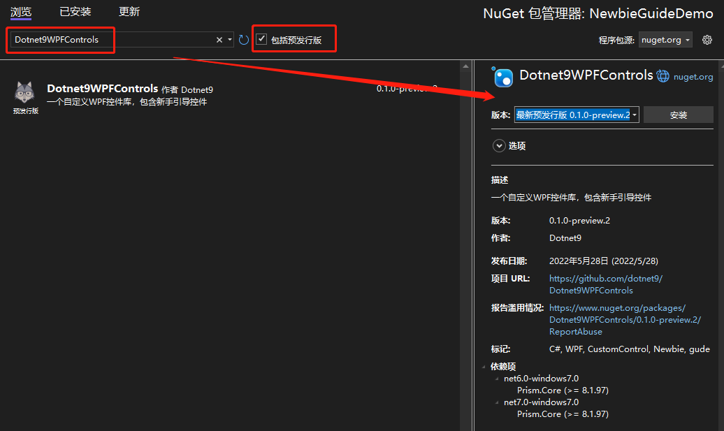
- 添加 NuGet 包 1: Dotnet9WPFControls
该包提供引导控件及其样式,记得勾选“包括预发行版”,然后点击安装。
- 添加 NuGet 包 2:Prism.DryIoc
使用该包,主要是使用 Prism 封装的一些 MVVM、IOC 功能,方便协助开发。
添加上述两个 NuGet 包后,项目工程文件定义如下:
<Project Sdk="Microsoft.NET.Sdk">

  <PropertyGroup>
    <OutputType>WinExe</OutputType>
    <TargetFramework>net6.0-windows</TargetFramework>
    <Nullable>enable</Nullable>
    <UseWPF>true</UseWPF>
  </PropertyGroup>

  <ItemGroup>
    <PackageReference Include="Dotnet9WPFControls" Version="0.1.0-preview.2" />
    <PackageReference Include="Prism.DryIoc" Version="8.1.97" />
  </ItemGroup>

</Project>
2.3 添加样式文件
打开 App.xaml 文件,引入 Dotnet9WPFControls 默认主题文件:
<prism:PrismApplication
    x:Class="NewbieGuideDemo.App"
    xmlns="http://schemas.microsoft.com/winfx/2006/xaml/presentation"
    xmlns:x="http://schemas.microsoft.com/winfx/2006/xaml"
    xmlns:prism="http://prismlibrary.com/">
    <prism:PrismApplication.Resources>

        <ResourceDictionary>
            <ResourceDictionary.MergedDictionaries>
                <ResourceDictionary Source="pack://application:,,,/Dotnet9WPFControls;component/Themes/Dotnet9WPFControls.xaml" />
            </ResourceDictionary.MergedDictionaries>
        </ResourceDictionary>
    </prism:PrismApplication.Resources>
</prism:PrismApplication>
注意上面的根节点 <prism:PrismApplication />,同时修改App.xaml.cs文件,这里不做过多说明,具体使用请参考 Prism:
using Prism.DryIoc;
using Prism.Ioc;
using System.Windows;

namespace NewbieGuideDemo
{
    public partial class App : PrismApplication
    {
        protected override void RegisterTypes(IContainerRegistry containerRegistry)
        {
        }

        protected override Window CreateShell()
        {
            return Container.Resolve<MainWindow>();
        }
    }
}
2.4 定义引导信息
给主窗体 MainWindow 添加一个 ViewModel 类:MainWindowViewModel.cs:
using Dotnet9WPFControls.Controls;
using Prism.Mvvm;
using System.Collections.Generic;

namespace NewbieGuideDemo
{
    public class MainWindowViewModel : BindableBase
    {
        private GuideInfo? _guide;

        public GuideInfo Guide =>
            _guide ??= new GuideInfo("快速添加新手引导", "这样添加新手引导,或许比较优雅");

        public List<GuideInfo> Guides => new() {Guide};
    }
}
在上面的 ViewModel 中,定义了一个引导属性 Guide,这个属性是与提示框绑定展示:
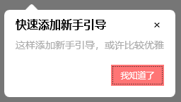
- 第一个参数定义了引导提示框的标题
“快速添加新手引导” - 第二个参数定义了引导提示框的提示内容
“这样添加新手引导,或许比较优雅”
第二个属性 Guides, 是一个引导信息列表,可绑定多个引导信息,点击按钮即会查看下一个引导,本示例为了演示,只写了一个引导。
2.5 界面绑定引导信息
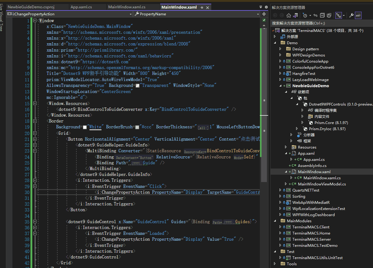
先贴上 MainWindow.xaml 所有代码:
<Window
    x:Class="NewbieGuideDemo.MainWindow"
    xmlns="http://schemas.microsoft.com/winfx/2006/xaml/presentation"
    xmlns:x="http://schemas.microsoft.com/winfx/2006/xaml"
    xmlns:d="http://schemas.microsoft.com/expression/blend/2008"
    xmlns:prism="http://prismlibrary.com/"
    xmlns:i="http://schemas.microsoft.com/xaml/behaviors"
    xmlns:dotnet9="https://dotnet9.com"
    xmlns:mc="http://schemas.openxmlformats.org/markup-compatibility/2006"
    Title="Dotnet9 WPF新手引导功能" Width="800" Height="450"
    prism:ViewModelLocator.AutoWireViewModel="True"
    AllowsTransparency="True" Background="Transparent" WindowStyle="None"
    WindowStartupLocation="CenterScreen"
    mc:Ignorable="d">
    <Window.Resources>
        <dotnet9:BindControlToGuideConverter x:Key="BindControlToGuideConverter" />
    </Window.Resources>
    <Border
        Background="White" BorderBrush="#ccc" BorderThickness="1" MouseLeftButtonDown="Border_MouseDown">
        <Grid>
            <Button HorizontalAlignment="Center" VerticalAlignment="Center" Content="点击测试新手引导">
                <dotnet9:GuideHelper.GuideInfo>
                    <MultiBinding Converter="{StaticResource BindControlToGuideConverter}">
                        <Binding RelativeSource="{RelativeSource Self}" />
                        <Binding Path="Guide" />
                    </MultiBinding>
                </dotnet9:GuideHelper.GuideInfo>
                <i:Interaction.Triggers>
                    <i:EventTrigger EventName="Click">
                        <i:ChangePropertyAction PropertyName="Display" TargetName="GuideControl" Value="True" />
                    </i:EventTrigger>
                </i:Interaction.Triggers>
            </Button>

            <dotnet9:GuideControl x:Name="GuideControl" Guides="{Binding Guides}">
                <i:Interaction.Triggers>
                    <i:EventTrigger EventName="Loaded">
                        <i:ChangePropertyAction PropertyName="Display" Value="True" />
                    </i:EventTrigger>
                </i:Interaction.Triggers>
            </dotnet9:GuideControl>
        </Grid>
    </Border>
</Window>
下面快速过一遍。
2.5.1 引入的命名空间说明
看上面的代码,引入了 dotnet9 和 prism、i三个命名空间:
dotnet9命名空间
引入引导控件 GuideControl 及 转换器 BindControlToGuideConverter。
prism命名空间
主要用途在 prism:ViewModelLocator.AutoWireViewModel="True" 这句代码,将视图 MainWindow.xaml 与 MainWindowViewModel.cs进行绑定,有兴趣可以看 Prism 源码,了解视图是如何发现 ViewModel 的约定规则。
i命名空间
主要用此命名空间下的触发器,事件触发属性更改。
2.5.2 几处关键代码简单说明
上面代码贴的是引导控件(自定义控件)的使用方式(站长注:Dotnet9WPFControls 中还有引导窗体的方式,本文不做说明,要不然太占篇幅了,请查看控件 Demo GuideWindowView)。
a: 将引导控件加到容器最上层
先关注后面的几行代码:
<Grid>
    <!--这里省略业务控件布局-->
    <dotnet9:GuideControl x:Name="GuideControl" Guides="{Binding Guides}">
        <i:Interaction.Triggers>
            <i:EventTrigger EventName="Loaded">
                <i:ChangePropertyAction PropertyName="Display" Value="True" />
            </i:EventTrigger>
        </i:Interaction.Triggers>
    </dotnet9:GuideControl>
</Grid>
- 将引导控件加到
Grid容器最后,意图是让引导控件显示在所有控件的最上层(同一层级添加了多个控件,如果位置重叠,那么后加入的控件会显示在先添加的控件上方,呈现遮挡效果); - 绑定了前面
MainWindowViewModel中定义的引导信息列表Guides,点击下一步按钮(本文显示为我知道了)时,会按列表添加顺序切换引导信息; - 使用
i:Interaction.Triggers实现控件加载完成时,自动显示引导提示信息,见上面的 示例三效果;
b:绑定目标控件与引导属性
目标控件的引导属性与目标控件引用绑定,引导界面显示时通过目标控件计算出目标控件的位置和大小,准确将目标控件标识出来,引导提示框定位也才能正确设置:
<dotnet9:BindControlToGuideConverter x:Key="BindControlToGuideConverter" />
<Button HorizontalAlignment="Center" VerticalAlignment="Center" Content="点击测试新手引导">
    <dotnet9:GuideHelper.GuideInfo>
        <MultiBinding Converter="{StaticResource BindControlToGuideConverter}">
            <Binding RelativeSource="{RelativeSource Self}" />
            <Binding Path="Guide" />
        </MultiBinding>
    </dotnet9:GuideHelper.GuideInfo>
    <i:Interaction.Triggers>
        <i:EventTrigger EventName="Click">
            <i:ChangePropertyAction PropertyName="Display" TargetName="GuideControl" Value="True" />
        </i:EventTrigger>
    </i:Interaction.Triggers>
</Button>
如上代码引入 BindControlToGuideConverter 转换器, 该转换器是个黏合类,将目标控件的引用添加到引导对象上,转换器具体定义如下:
public class BindControlToGuideConverter : IMultiValueConverter
{
    public object? Convert(object[] values, Type targetType, object parameter, CultureInfo culture)
    {
        if (values.Length < 2)
        {
            return null;
        }

        var element = values[0] as FrameworkElement;
        var guide = values[1] as GuideInfo;
        if (guide != null)
        {
            guide.TargetControl = element;
        }

        return guide;
    }

    public object[] ConvertBack(object value, Type[] targetTypes, object parameter, CultureInfo culture)
    {
        throw new NotImplementedException();
    }
}
目标控件的引用赋值给引导对象的 TargetControl 属性。
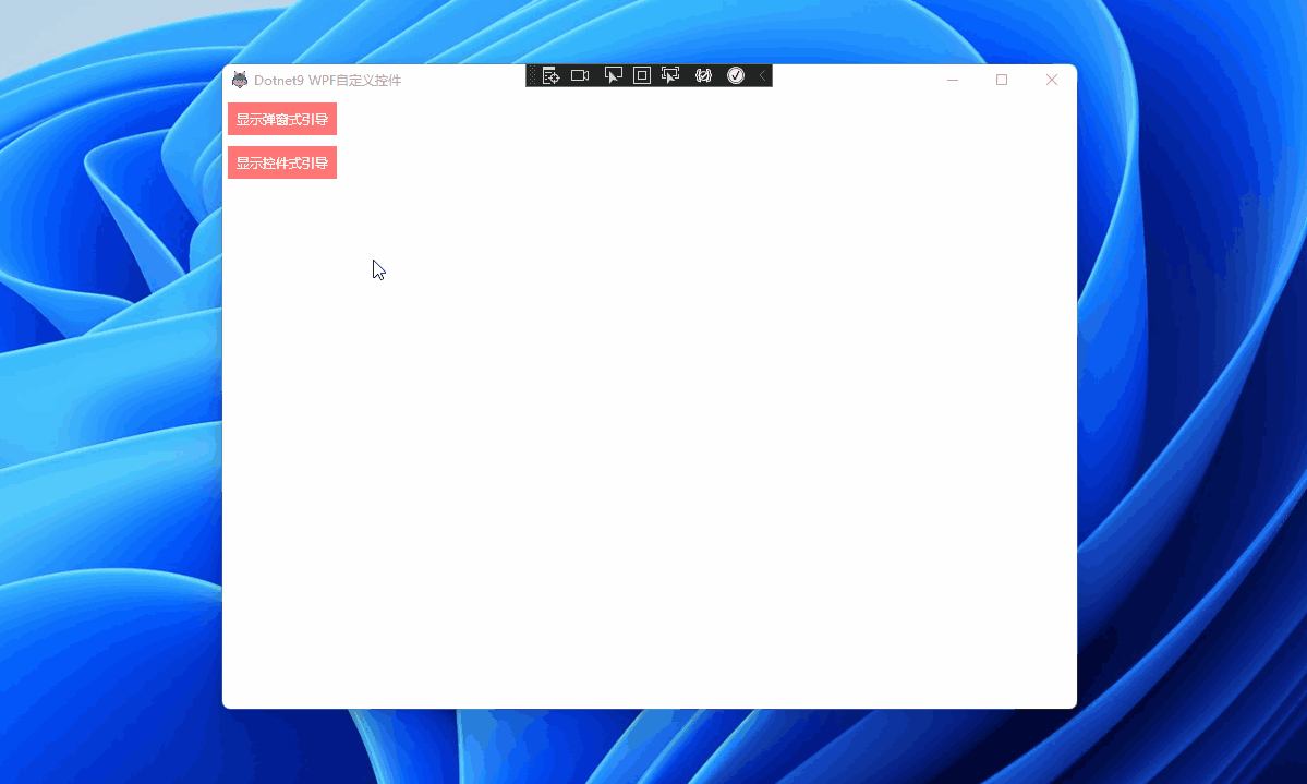
Demo 代码完毕,直接运行项目,效果如下,源码在这 NewbieGuideDemo:
3. 控件如何开发的?
关于原理,WPF 简易新手引导 这篇介绍的不错,可以先看看。
关于本示例的实现方式,暂时不做太多说明,详细请直接查看源码 Dotnet9WPFControls,本文后半截大概提一下。
代码组织结构如下:
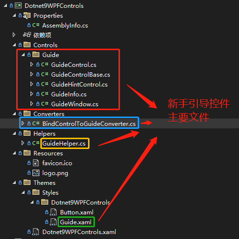
- GuideInfo:定义引导信息类,如标题、内容、下一步按钮显示内容。
- GuideHintControl:引导提示框控件,显示引导标题、引导内容、下一步按钮,即
GuideInfo绑定的控件。 - GuideControl:引导控件,用于目标控件无法获取到自己的窗体这种(即无法获取在窗体中的位置),比如您开发的程序为第三方程序插件这种,上面的代码即是使用此引导控件实现的效果。
- GuideWindow:引导窗体,
GuideControl引导控件的相互补充。 - GuideControlBase:引导控件辅助类
- BindControlToGuideConverter:引导信息与引导的目标控件绑定转换器
- GuideHelper:引导帮助类,绑定目标控件的引导信息使用,外加一个显示 引导窗体 的静态命令。
- Guide.xaml:定义引导遮罩层(
GuideControl和GuideWindow)、引导提示框(GuideHintControl)样式的资源文件,定义外观请改这个文件
重点:
a) GuideControlBase
GuideControlBase 是 GuideControl 和 GuideWindow 的辅助类,因为这两个类实现的功能是类似的,所以封装大部分功能在 GuideControlBase 中,比如将目标控件区域从遮罩层 Clip 出来,并将 GuideHintControl 提示框控件添加到遮罩层之上,显示出新手引导的效果。
b) GuideControl 和 GuideWindow
GuideControl 是用于显示在包含目标控件的容器内使用的,GuideControl放置的容器不一定是目标控件的直接容器,可以有嵌套,比如目标控件在ListBox子项ListBoxItem内,而引导控件GuideControl可以在ListBox的外层容器之上;
GuideWindow 用于贴在目标控件所在的窗体上,GuideWindow 作为目标控件窗体的子窗体,Show()在目标控件窗体上,不能使用ShowDialog()的方式(为啥?ShowDialog()会使除引导窗体之外的窗体处于无效状态(disable))。
这两种方式(GuideControl 和 GuideWindow)总体呈现效果是一样的,目标控件所在的窗体是自定义窗体,Demo 能正常显示下面的效果,普通窗体需要对目标控件 Clip 的位置和提示框的位置进行偏移处理,修改位置见 GuideControl 和 GuideWindow的方法 ShowGuide(FrameworkElement? targetControl, GuideInfo guide)。
控件带的两个新手引导 Demo 如下:
新手引导 Demo 一
GuideControl 方式,站长推荐,即以控件的方式显示新手引导,点击看代码:
新手引导 Demo 二
GuideWindow 方式,即以子窗体的方式显示新手引导,点击看代码:
详细开发不展开说了,一切都在代码中。
4. 总结
前面写了不少,其实不多,谢谢开源带来的力量。
- 参考文章:WPF 简易新手引导
- 参考开源项目:AIStudio.Wpf.Controls
- 本文 Demo
NewbieGuideDemo:GitHub、Gitee - Dotnet9Controls 新手引导 Demo 一 源码:GitHub、Gitee
- Dotnet9Controls 新手引导 Demo 二 源码
GuideWindowView:GitHub、Gitee - Dotnet9Controls 控件:GitHub、Gitee