Reading Navigation
- Introduction
- Case One
- Case Two
- Case Three (the approach introduced in this article)
- How to Use?
- How Was the Control Developed?
- Summary
1. Introduction
Case One
The webmaster shared an article WPF Simple Newbie Guide by 眾尋, which demonstrates a nice newbie guide effect, as shown below:
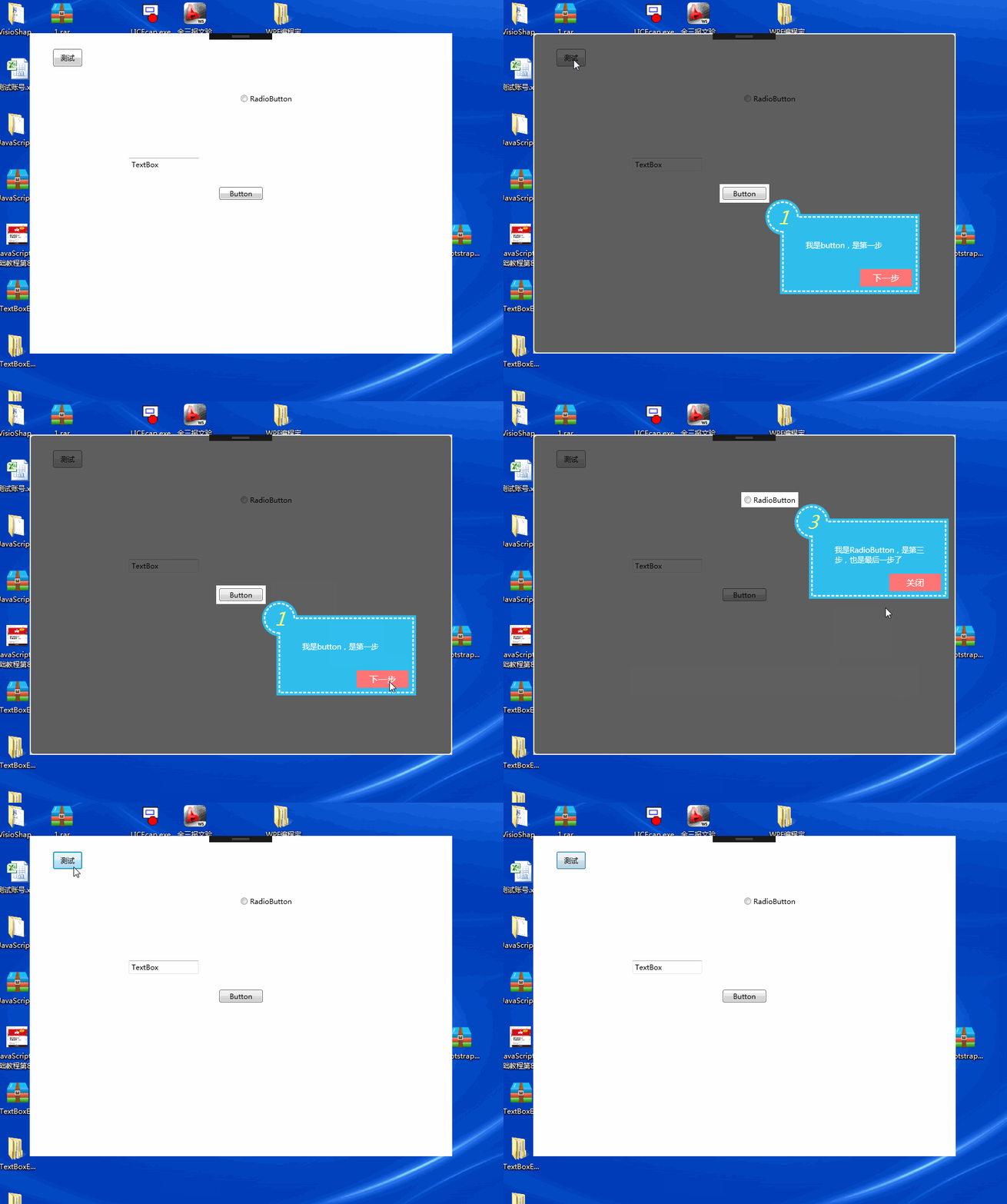
The code provided in that article does not use the MVVM development approach. The tooltip uses a user control, and the mask form’s styles are not separated from the code-behind. However, it provides a reference for developing a newbie guide feature.
Case Two
The open-source project AIStudio.Wpf.Controls implements a newbie guide effect as shown below:
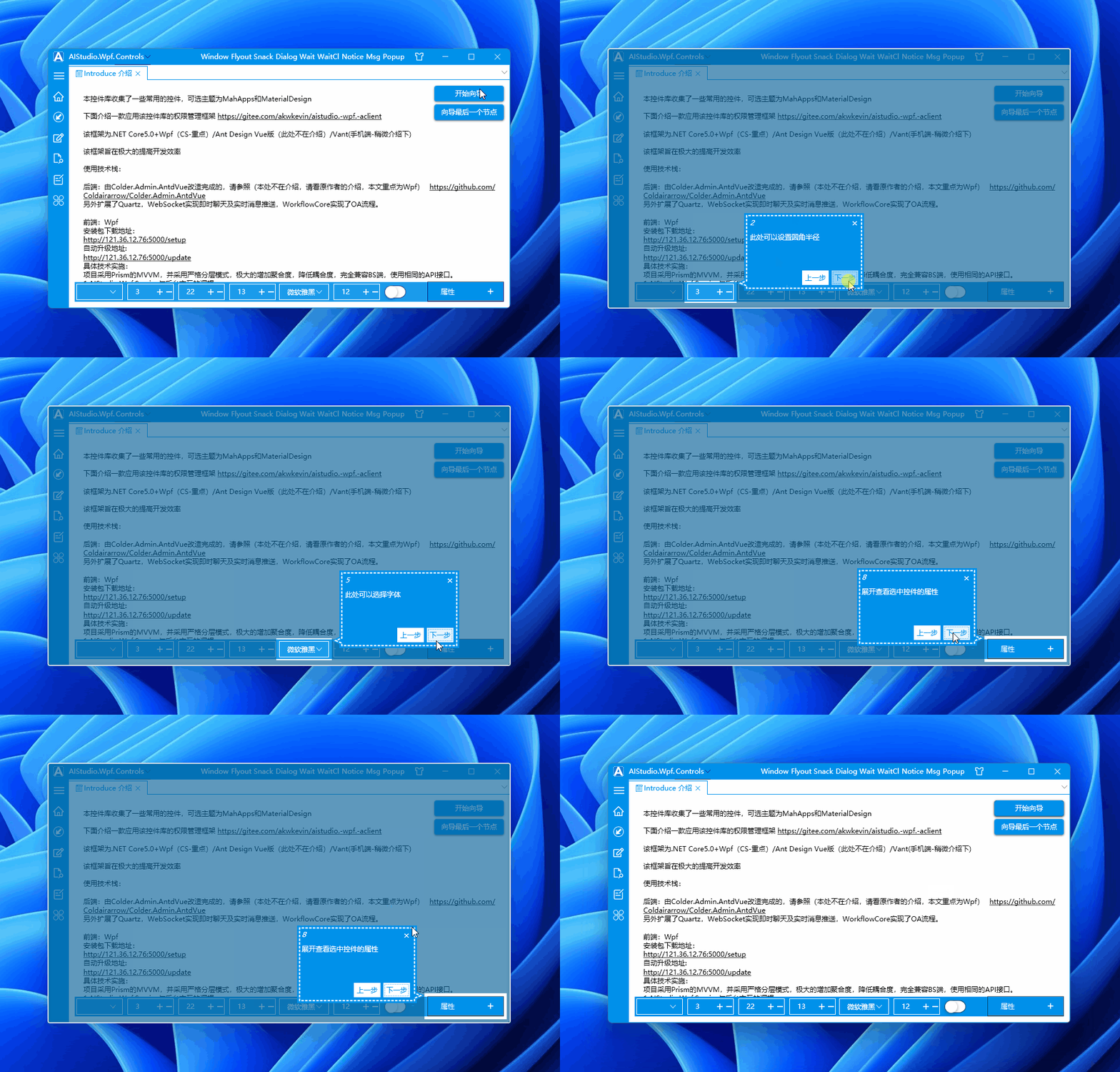
This open-source project also references the above article (WPF Simple Newbie Guide) and refactors it into the MVVM version for easier binding.
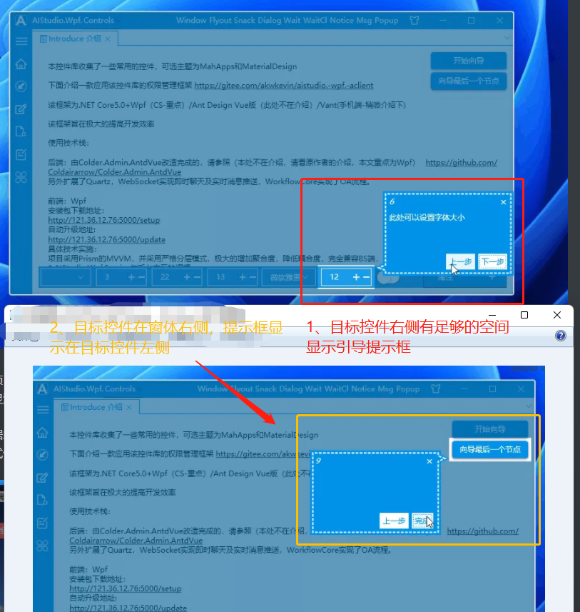
Additionally, the position of the tooltip adapts flexibly based on the target control’s location in the main window, ensuring it never displays outside the mask form, as shown below:
When there is enough space on the right side of the target control, the tooltip appears to the right; when space is insufficient, it displays on the left:
Case Three (the approach introduced in this article)
Based on the open-source project AIStudio.Wpf.Controls, the webmaster created their own version: Dotnet9WPFControls. This version removes the previous-step button, adds title binding, binds the next-button content, and modifies the tooltip style. The effect is shown below:

The following sections will introduce how to use Dotnet9WPFControls to add a newbie guide feature and briefly mention the development details of this custom control. The main principles can still be found in the article WPF Simple Newbie Guide.
We hope this will be helpful for those who need to add a newbie guide feature to their own projects. Through this article, you can also modify the code to meet your specific needs.
2. How to Use?
2.1 Create a WPF Project
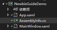
Create a WPF solution named "NewbieGuideDemo" using .NET 6|7:
2.2 Add NuGet Packages
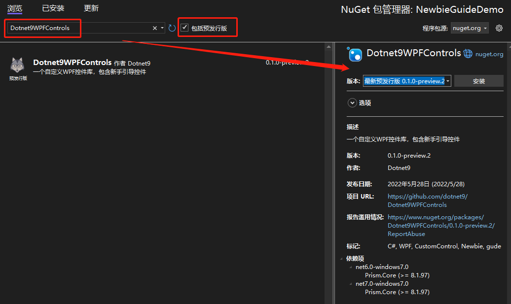
- Add NuGet Package 1: Dotnet9WPFControls
This package provides the guide control and its styles. Remember to check "Include prerelease" and click Install.
- Add NuGet Package 2: Prism.DryIoc
This package is used primarily to leverage the MVVM and IOC capabilities encapsulated by Prism, facilitating easier development.
After adding the two NuGet packages, the project file will look like this:
<Project Sdk="Microsoft.NET.Sdk">

  <PropertyGroup>
    <OutputType>WinExe</OutputType>
    <TargetFramework>net6.0-windows</TargetFramework>
    <Nullable>enable</Nullable>
    <UseWPF>true</UseWPF>
  </PropertyGroup>

  <ItemGroup>
    <PackageReference Include="Dotnet9WPFControls" Version="0.1.0-preview.2" />
    <PackageReference Include="Prism.DryIoc" Version="8.1.97" />
  </ItemGroup>

</Project>
2.3 Add the Style File
Open App.xaml and import the default theme file of Dotnet9WPFControls:
<prism:PrismApplication
    x:Class="NewbieGuideDemo.App"
    xmlns="http://schemas.microsoft.com/winfx/2006/xaml/presentation"
    xmlns:x="http://schemas.microsoft.com/winfx/2006/xaml"
    xmlns:prism="http://prismlibrary.com/">
    <prism:PrismApplication.Resources>

        <ResourceDictionary>
            <ResourceDictionary.MergedDictionaries>
                <ResourceDictionary Source="pack://application:,,,/Dotnet9WPFControls;component/Themes/Dotnet9WPFControls.xaml" />
            </ResourceDictionary.MergedDictionaries>
        </ResourceDictionary>
    </prism:PrismApplication.Resources>
</prism:PrismApplication>
Note the root element <prism:PrismApplication />. Also modify App.xaml.cs. We won’t go into details here; please refer to Prism for specific usage:
using Prism.DryIoc;
using Prism.Ioc;
using System.Windows;

namespace NewbieGuideDemo
{
    public partial class App : PrismApplication
    {
        protected override void RegisterTypes(IContainerRegistry containerRegistry)
        {
        }

        protected override Window CreateShell()
        {
            return Container.Resolve<MainWindow>();
        }
    }
}
2.4 Define Guide Information
Add a ViewModel class MainWindowViewModel.cs for the main window MainWindow:
using Dotnet9WPFControls.Controls;
using Prism.Mvvm;
using System.Collections.Generic;

namespace NewbieGuideDemo
{
    public class MainWindowViewModel : BindableBase
    {
        private GuideInfo? _guide;

        public GuideInfo Guide =>
            _guide ??= new GuideInfo("Quickly Add Newbie Guide", "This approach might be more elegant");

        public List<GuideInfo> Guides => new() {Guide};
    }
}
In the ViewModel above, a guide property Guide is defined. This property is bound to the tooltip display:

- The first parameter defines the tooltip title:
"Quickly Add Newbie Guide" - The second parameter defines the tooltip content:
"This approach might be more elegant"
The second property Guides is a list of guide information. You can bind multiple guides; clicking the button will show the next guide. For demonstration purposes, only one guide is defined.
2.5 Bind Guide Information in the UI
First, paste the entire code of MainWindow.xaml:
<Window
    x:Class="NewbieGuideDemo.MainWindow"
    xmlns="http://schemas.microsoft.com/winfx/2006/xaml/presentation"
    xmlns:x="http://schemas.microsoft.com/winfx/2006/xaml"
    xmlns:d="http://schemas.microsoft.com/expression/blend/2008"
    xmlns:prism="http://prismlibrary.com/"
    xmlns:i="http://schemas.microsoft.com/xaml/behaviors"
    xmlns:dotnet9="https://dotnet9.com"
    xmlns:mc="http://schemas.openxmlformats.org/markup-compatibility/2006"
    Title="Dotnet9 WPF Newbie Guide Feature" Width="800" Height="450"
    prism:ViewModelLocator.AutoWireViewModel="True"
    AllowsTransparency="True" Background="Transparent" WindowStyle="None"
    WindowStartupLocation="CenterScreen"
    mc:Ignorable="d">
    <Window.Resources>
        <dotnet9:BindControlToGuideConverter x:Key="BindControlToGuideConverter" />
    </Window.Resources>
    <Border
        Background="White" BorderBrush="#ccc" BorderThickness="1" MouseLeftButtonDown="Border_MouseDown">
        <Grid>
            <Button HorizontalAlignment="Center" VerticalAlignment="Center" Content="Click to Test Newbie Guide">
                <dotnet9:GuideHelper.GuideInfo>
                    <MultiBinding Converter="{StaticResource BindControlToGuideConverter}">
                        <Binding RelativeSource="{RelativeSource Self}" />
                        <Binding Path="Guide" />
                    </MultiBinding>
                </dotnet9:GuideHelper.GuideInfo>
                <i:Interaction.Triggers>
                    <i:EventTrigger EventName="Click">
                        <i:ChangePropertyAction PropertyName="Display" TargetName="GuideControl" Value="True" />
                    </i:EventTrigger>
                </i:Interaction.Triggers>
            </Button>

            <dotnet9:GuideControl x:Name="GuideControl" Guides="{Binding Guides}">
                <i:Interaction.Triggers>
                    <i:EventTrigger EventName="Loaded">
                        <i:ChangePropertyAction PropertyName="Display" Value="True" />
                    </i:EventTrigger>
                </i:Interaction.Triggers>
            </dotnet9:GuideControl>
        </Grid>
    </Border>
</Window>
Now, let's go through it quickly.
2.5.1 Explanation of the Imported Namespaces
In the code above, three namespaces are imported: dotnet9, prism, and i.
dotnet9namespaceUsed to import the guide control
GuideControland the converterBindControlToGuideConverter.prismnamespacePrimarily used for
prism:ViewModelLocator.AutoWireViewModel="True", which binds the viewMainWindow.xamltoMainWindowViewModel.cs. If interested, you can check the Prism source code to understand the convention for how the view discovers its ViewModel.inamespaceUsed for triggers under this namespace, enabling property changes on events.
2.5.2 Brief Explanation of Key Code Sections
The code above demonstrates the usage of the guide control (a custom control). (Webmaster's note: Dotnet9WPFControls also includes a guide window approach, but this article does not cover it to save space. Please refer to the control demo GuideWindowView.
a: Place the guide control at the top of the container
Focus on the lines near the end:
<Grid>
    <!--Omit business control layout here-->
    <dotnet9:GuideControl x:Name="GuideControl" Guides="{Binding Guides}">
        <i:Interaction.Triggers>
            <i:EventTrigger EventName="Loaded">
                <i:ChangePropertyAction PropertyName="Display" Value="True" />
            </i:EventTrigger>
        </i:Interaction.Triggers>
    </dotnet9:GuideControl>
</Grid>
- The guide control is added as the last child in the
Gridcontainer. This ensures the guide control appears on top of all other controls (if multiple controls are added at the same level and overlap, the one added later will appear above the earlier ones, creating a masking effect). - It binds to the guide information list
Guidesdefined inMainWindowViewModel. When the next button (displayed as"I understand"in this article) is clicked, the guide information switches sequentially according to the list order. - The
i:Interaction.Triggersis used to automatically show the guide tooltip when the control is loaded, as shown in the effect of Case Three.
b: Bind the target control to the guide property
The target control’s guide property is bound to the target control reference. When the guide interface displays, it calculates the target control’s position and size based on the target control, accurately identifying the target control and setting the correct tooltip position:
<dotnet9:BindControlToGuideConverter x:Key="BindControlToGuideConverter" />
<Button HorizontalAlignment="Center" VerticalAlignment="Center" Content="Click to Test Newbie Guide">
    <dotnet9:GuideHelper.GuideInfo>
        <MultiBinding Converter="{StaticResource BindControlToGuideConverter}">
            <Binding RelativeSource="{RelativeSource Self}" />
            <Binding Path="Guide" />
        </MultiBinding>
    </dotnet9:GuideHelper.GuideInfo>
    <i:Interaction.Triggers>
        <i:EventTrigger EventName="Click">
            <i:ChangePropertyAction PropertyName="Display" TargetName="GuideControl" Value="True" />
        </i:EventTrigger>
    </i:Interaction.Triggers>
</Button>
As shown above, the BindControlToGuideConverter converter is introduced. This converter is a glue class that adds the target control’s reference to the guide object. The converter is defined as follows:
public class BindControlToGuideConverter : IMultiValueConverter
{
    public object? Convert(object[] values, Type targetType, object parameter, CultureInfo culture)
    {
        if (values.Length < 2)
        {
            return null;
        }

        var element = values[0] as FrameworkElement;
        var guide = values[1] as GuideInfo;
        if (guide != null)
        {
            guide.TargetControl = element;
        }

        return guide;
    }

    public object[] ConvertBack(object value, Type[] targetTypes, object parameter, CultureInfo culture)
    {
        throw new NotImplementedException();
    }
}
The target control’s reference is assigned to the TargetControl property of the guide object.
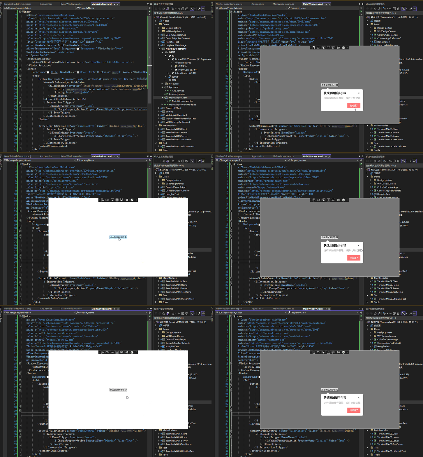
The demo code is complete. Run the project directly, and the effect will be as shown below. Source code is available here: NewbieGuideDemo:
3. How Was the Control Developed?
Regarding the principles, the article WPF Simple Newbie Guide explains them well. You can take a look first.
For the implementation approach of this example, we won't go into too much detail. Please refer directly to the source code of Dotnet9WPFControls. The second half of this article will briefly touch upon it.
The code structure is as follows:
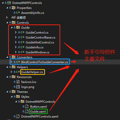
- GuideInfo: Defines a guide information class, including title, content, and the next button display text.
- GuideHintControl: The guide tooltip control that displays the guide title, content, and next button, i.e., the control bound to
GuideInfo. - GuideControl: The guide control used when the target control cannot obtain its own window (i.e., when its position within the window cannot be determined), such as when the program is a third-party plugin. The code above implements the effect using this guide control.
- GuideWindow: The guide window, complementary to
GuideControl. - GuideControlBase: An auxiliary class for the guide control.
- BindControlToGuideConverter: A converter that binds the guide information to the target control.
- GuideHelper: A guide helper class used for binding the target control's guide information, plus a static command to display the guide window.
- Guide.xaml: A resource file defining styles for the guide mask layer (
GuideControlandGuideWindow) and the guide tooltip (GuideHintControl). Modify this file to change the appearance.
Key Points:
a) GuideControlBase
GuideControlBase is an auxiliary class for GuideControl and GuideWindow. Since these two classes implement similar functionality, most of the functionality is encapsulated in GuideControlBase, such as clipping the target control area from the mask layer using Clip and overlaying the GuideHintControl tooltip on top of the mask layer to display the newbie guide effect.
b) GuideControl and GuideWindow
GuideControl is used within a container that contains the target control. The container where GuideControl is placed does not have to be the direct container of the target control; nesting is allowed. For example, the target control might be inside a ListBoxItem within a ListBox, and the guide control GuideControl could be placed on the outer container of the ListBox.
GuideWindow is used to be attached to the window where the target control resides. GuideWindow acts as a child window of the target control’s window and is displayed using Show() on the target control’s window, not ShowDialog() (why? Because ShowDialog() would disable all other windows except the guide window).
Overall, both approaches (GuideControl and GuideWindow) achieve the same effect. When the target control’s window is a custom window, the Demo can display the following effect correctly. For standard windows, the coordinates for clipping the target control and the tooltip position need to be offset accordingly. The position adjustment can be found in the ShowGuide(FrameworkElement? targetControl, GuideInfo guide) methods of GuideControl and GuideWindow.
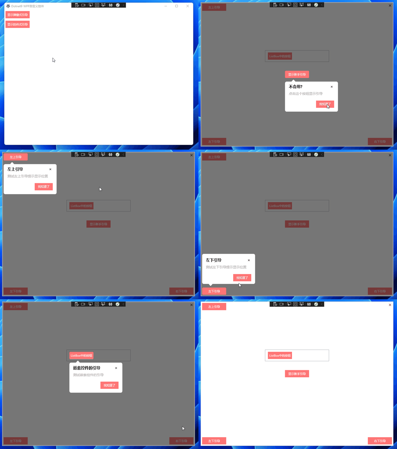
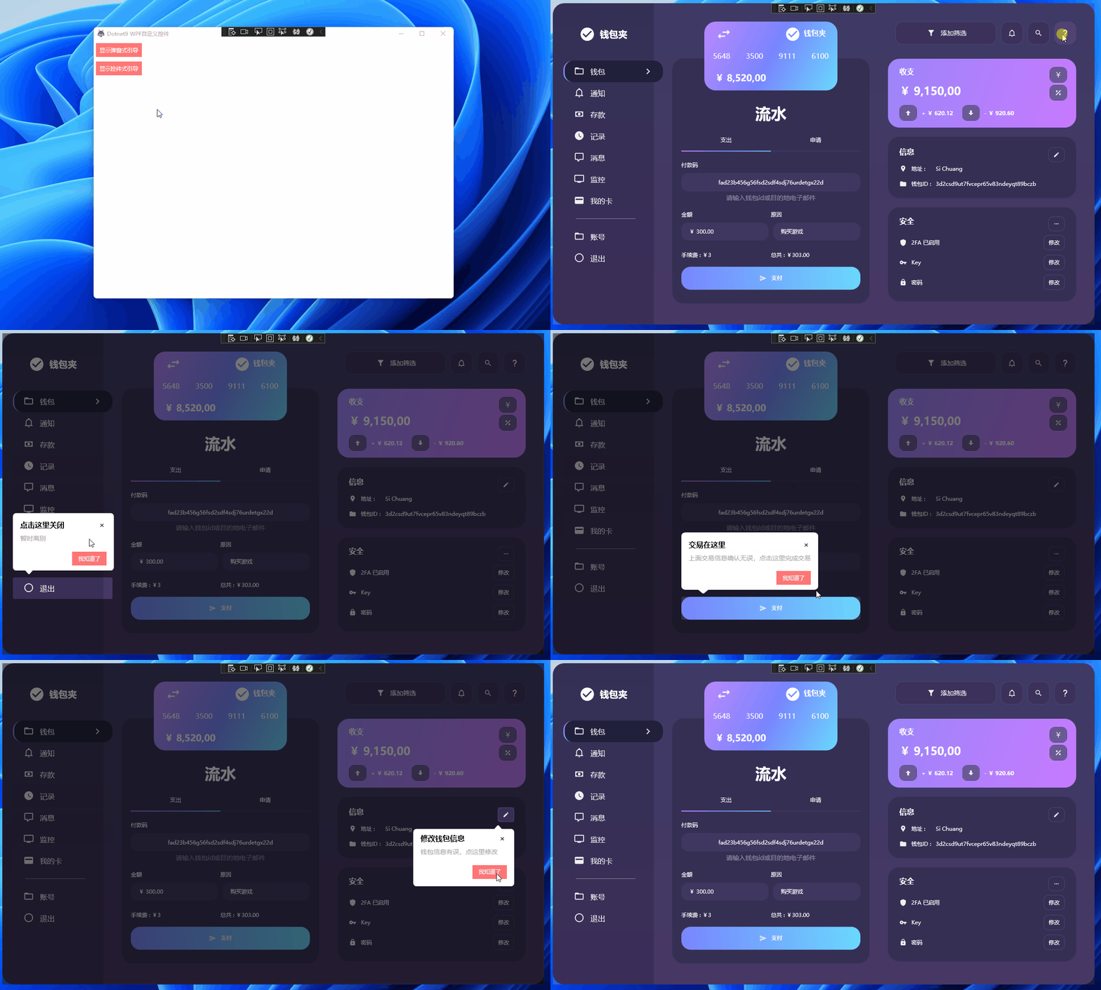
The two newbie guide demos included in the control are as follows:
Newbie Guide Demo One
Using the GuideControl approach, recommended by the webmaster, i.e., displaying the newbie guide as a control. Click to view the code:
Newbie Guide Demo Two
Using the GuideWindow approach, i.e., displaying the newbie guide as a child window. Click to view the code:
We won't expand on the development details here; everything is in the code.
4. Summary
A lot has been written, but not too much. Thanks to the power of open source.
- Reference article: WPF Simple Newbie Guide
- Reference open-source project: AIStudio.Wpf.Controls
- Demo
NewbieGuideDemofor this article: GitHub, Gitee - Source code for Dotnet9Controls Newbie Guide Demo One: GitHub, Gitee
- Source code for Dotnet9Controls Newbie Guide Demo Two
GuideWindowView: GitHub, Gitee - Dotnet9Controls control: GitHub, Gitee