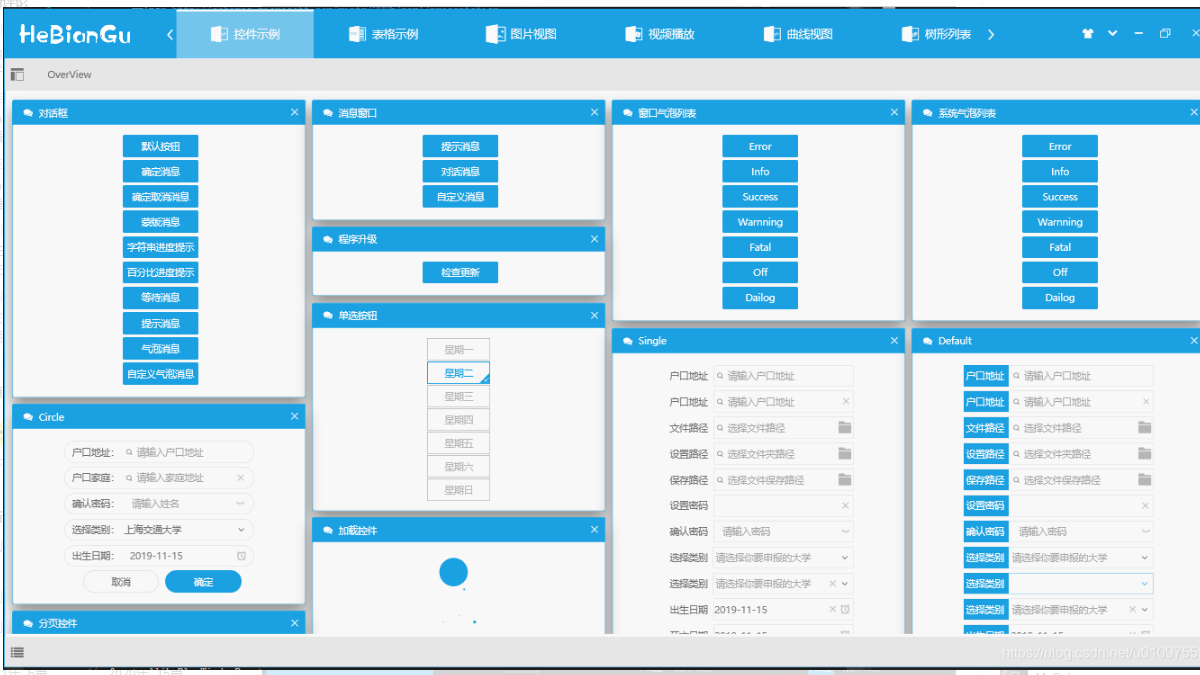
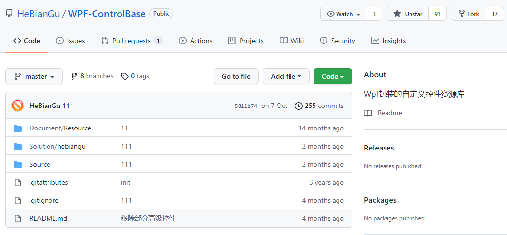
倉庫 README 很素,但看作者 README 貼的幾篇博文介紹,你會喜歡上它的,廢話不多說,上介紹目錄:
- 動畫封裝
https://blog.csdn.net/u010975589/article/details/95974854
- 屬性表單
https://blog.csdn.net/u010975589/article/details/95970200
- 訊息對話
https://blog.csdn.net/u010975589/article/details/95985190
- 在 WPF 中應用 MVC
https://blog.csdn.net/u010975589/article/details/100019431
- 其他功能說明
https://blog.csdn.net/u010975589/article/details/103083605
下面詳細介紹:
1. 動畫封裝
原文標題:示例:WPF中自定義StoryBoarService在程式碼中封裝StoryBoard、Animation用於簡化動畫撰寫
原文連結:https://blog.csdn.net/u010975589/article/details/95974854
1.1 目的:透過對 StoryBoard 和 Animation 的封裝來簡化動畫的撰寫
1.2 範例

說明:漸隱藏是 WPF 中比較常用的動畫,上圖是透過 StoryBoarService 封裝後的效果,在程式碼中只要執行如下程式碼即可:
DoubleStoryboardEngine.Create(1, 0, 1, "Opacity").Start(element);
上面的關閉效果可以定義一個命令如下:
public class CollapsedOfOpacityCommand : ICommand
{

    public bool CanExecute(object parameter) => true;

    public void Execute(object parameter)
    {
        if(parameter is UIElement element)
        {
            var engine = DoubleStoryboardEngine.Create(1, 0, 1, "Opacity");

            engine.Start(element);
        }
    }

    public event EventHandler CanExecuteChanged;
}
在 Xaml 中呼叫如下命令即可完成關閉漸隱藏的效果
Command="{x:Static base:CommandService.CollapsedOfOpacityCommand}"
CommandParameter="{Binding RelativeSource={RelativeSource
AncestorType=GroupBox}}"
傳入的 CommandParmeter 將會在執行命令時漸隱藏
其中動畫效果的程式碼只需一句程式碼即可,簡化了動畫在程式碼中繁瑣的編碼過程
DoubleStoryboardEngine.Create(1, 0, 1, "Opacity").Start(element);
1.3 程式碼:
目前只實現 DoubleAnimation 的封裝,後續將會對其他類型進行封裝
1.3.1 封閉修改基底類別
/// <summary> 動畫引擎基底類別 </summary>
public abstract class StoryboardEngineBase : IDisposable
{
    protected Storyboard storyboard = new Storyboard();

    public EventHandler CompletedEvent { get; set; }

    public EasingFunctionBase Easing { get; set; } = EasingFunctionFactroy.PowerEase;

    public PropertyPath PropertyPath { get; set; }

    public Duration Duration { get; set; }

    public void Dispose()
    {
        storyboard.Completed -= CompletedEvent;
    }

    public abstract StoryboardEngineBase Start(UIElement element);

    public abstract StoryboardEngineBase Stop();

    public StoryboardEngineBase(int second, string property)
    {
        this.PropertyPath = new PropertyPath(property);
        this.Duration = new Duration(TimeSpan.FromSeconds(second));
    }

}

/// <summary> 動畫泛型引擎基底類別 </summary>
public abstract class StoryboardEngineBase<T> : StoryboardEngineBase
{
    public StoryboardEngineBase(T from, T to, int second, string property) : base(second, property)
    {
        this.FromValue = from;
        this.ToValue = to;
    }

    public T FromValue { get; set; }

    public T ToValue { get; set; }

    //public RepeatBehavior RepeatBehavior { get; set; };

}
1.3.2 開放擴充 DoubleStoryboardEngine
/// <summary> DoubleAnimation動畫引擎 </summary>
public class DoubleStoryboardEngine : StoryboardEngineBase<double>
{
    public static DoubleStoryboardEngine Create(double from, double to, int second, string property)
    {
        return new DoubleStoryboardEngine(from, to, second, property);
    }

    public DoubleStoryboardEngine(double from, double to, int second, string property) : base(from, to, second, property)
    {

    }

    public override StoryboardEngineBase Start(UIElement element)
    {
        //  Do:時間軸
        DoubleAnimation animation = new DoubleAnimation(1, 0, this.Duration);

        if (this.Easing != null)
            animation.EasingFunction = this.Easing;

        //if (this.RepeatBehavior != default(RepeatBehavior))
        //    animation.RepeatBehavior = (RepeatBehavior);

        //  Do:屬性動畫
        storyboard.Children.Add(animation);
        Storyboard.SetTarget(animation, element);
        Storyboard.SetTargetProperty(animation, this.PropertyPath);

        if (CompletedEvent != null)
            storyboard.Completed += CompletedEvent;
        storyboard.Begin();

        return this;
    }

    public override StoryboardEngineBase Stop()
    {
        this.storyboard.Stop();

        return this;
    }
}
1.3.3 轉場效果工廠
/// <summary> 說明:https://docs.microsoft.com/zh-cn/dotnet/framework/wpf/graphics-multimedia/easing-functions </summary>
public static class EasingFunctionFactroy
{
    /// <summary> PowerEase:建立加速和/或減速使用的公式的動畫f(t) = tp其中 p 等於Power屬性。 </summary>
    public static PowerEase PowerEase { get; set; } = new PowerEase();
    /// <summary> BackEase:略微收回動畫的動作,然後再開始進行動畫處理指示的路徑中。 </summary>
    public static BackEase BackEase { get; set; } = new BackEase();
    /// <summary> ElasticEase:建立類似於彈簧來回直到靜止的動畫 </summary>
    public static ElasticEase ElasticEase { get; set; } = new ElasticEase();
    /// <summary> BounceEase:建立彈跳效果。 </summary>
    public static BounceEase BounceEase { get; set; } = new BounceEase();
    /// <summary> CircleEase:建立加速和/或減速使用循環函數的動畫。 </summary>
    public static CircleEase CircleEase { get; set; } = new CircleEase();

    /// <summary> QuadraticEase:建立加速和/或減速使用的公式的動畫f(t) = t2。 </summary>
    public static QuadraticEase QuadraticEase { get; set; } = new QuadraticEase();

    /// <summary> CubicEase:建立加速和/或減速使用的公式的動畫f(t) = t3。 </summary>
    public static CubicEase CubicEase { get; set; } = new CubicEase();
    /// <summary> QuarticEase:建立加速和/或減速使用的公式的動畫f(t) = t4。 </summary>
    public static QuarticEase QuarticEase { get; set; } = new QuarticEase();
    /// <summary> QuinticEase:建立加速和/或減速使用的公式的動畫f(t) = t5。 </summary>
    public static QuinticEase QuinticEase { get; set; } = new QuinticEase();

    /// <summary> ExponentialEase:建立加速和/或減速使用指數公式的動畫。 </summary>
    public static ExponentialEase ExponentialEase { get; set; } = new ExponentialEase();

    /// <summary> SineEase:建立加速和/或減速使用正弦公式的動畫。 </summary>
    public static SineEase SineEase { get; set; } = new SineEase();

}
1.3.4 使用方法
/// <summary> 建構方法 </summary>
/// <param name="from"> 起始值</param>
/// <param name="to"> 結束值 </param>
/// <param name="second"> 間隔時間秒 </param>
/// <param name="property"> 修改屬性名稱 </param>
///
public static DoubleStoryboardEngine Create(double from, double to, int second, string property)
{
    return new DoubleStoryboardEngine(from, to, second, property);
}
2. 屬性表單
原文標題:示例:WPF開發的簡單ObjectProperyForm用來綁定實體表單
原文連結:https://blog.csdn.net/u010975589/article/details/95970200
2.1 目的:自訂控制項,用來直接綁定實體資料,簡化開發週期
2.2 實作
- 綁定實體物件
- 透過特性顯示屬性名稱
- 透過特性增加驗證條件
- 已經實現 String、Int、Double、DateTime、Bool 幾種簡單類型的 DataTemplate 範本,其他範本支援擴充
- 其他後續更新...
2.3 範例

實體定義如下:
public class Student
{
    [Display("姓名")]
    [Required]
    public string Name { get; set; }

    [Display("班級")]
    [Required]
    public string Class { get; set; }

    [Display("地址")]
    [Required]
    public string Address { get; set; }

    [Display("郵箱")]
    [Required]
    public string Emall { get; set; }

    [Display("可用")]
    [Required]
    public bool IsEnbled { get; set; }

    [Display("時間")]
    [Required]
    public DateTime time { get; set; }

    [Display("年齡")]
    [Required]
    public int Age { get; set; }

    [Display("平均分")]
    public double Score { get; set; }

    [Display("電話號碼")]
    [Required]
    [RegularExpression(@"^1[3|4|5|7|8][0-9]{9}$", ErrorMessage = "手機號碼不合法!")]
    public string Tel { get; set; }
}
- DisplayAttribute:用來標示顯示名稱
- RequiredAttribute:用來標示資料不能為空
- RegularExpression:引用正則表達式驗證資料是否匹配
- 其他特性後續更新...
應用方式:
<UserControl.Resources>
  <local:Student
    x:Key="S.Student.HeBianGu"
    Name="河邊骨"
    Address="四川省成都市高新區"
    Class="四年級"
    Emall="7777777777@QQ.com"
    Age="33"
    Score="99.99"
    IsEnbled="True"
    time="2019-09-09"
  />
</UserControl.Resources>

<wpfcontrollib:ObjectPropertyForm
  Grid.Row="1"
  Title="學生資訊"
  SelectObject="{StaticResource S.Student.HeBianGu}"
>
  <base:Interaction.Behaviors>
    <base:MouseDragElementBehavior ConstrainToParentBounds="True" />
    <base:SelectZIndexElementBehavior /> </base:Interaction.Behaviors
></wpfcontrollib:ObjectPropertyForm>
2.4 程式碼
2.4.1 透過反射取得屬性和特性
ObservableCollection<ObjectPropertyItem> PropertyItemSource
{
    get { return (ObservableCollection<ObjectPropertyItem>)GetValue(PropertyItemSourceProperty); }
    set { SetValue(PropertyItemSourceProperty, value); }
}

// Using a DependencyProperty as the backing store for MyProperty.  This enables animation, styling, binding, etc...
public static readonly DependencyProperty PropertyItemSourceProperty =
    DependencyProperty.Register("PropertyItemSource", typeof(ObservableCollection<ObjectPropertyItem>), typeof(ObjectPropertyForm), new PropertyMetadata(new ObservableCollection<ObjectPropertyItem>(), (d, e) =>
      {
          ObjectPropertyForm control = d as ObjectPropertyForm;

          if (control == null) return;

          ObservableCollection<ObjectPropertyItem> config = e.NewValue as ObservableCollection<ObjectPropertyItem>;

      }));


void RefreshObject(object o)
{
    Type type = o.GetType();

    var propertys = type.GetProperties();

    this.PropertyItemSource.Clear();

    foreach (var item in propertys)
    {
        var from = ObjectPropertyFactory.Create(item, o);

        this.PropertyItemSource.Add(from);
    }

    this.ItemsSource = this.PropertyItemSource;
}
2.4.2 定義類型基底類別、擴充之類和工廠方法
/// <summary> 類型基底類別 </summary>
public class ObjectPropertyItem : NotifyPropertyChanged
{
    public string Name { get; set; }
    public PropertyInfo PropertyInfo { get; set; }

    public object Obj { get; set; }
    public ObjectPropertyItem(PropertyInfo property, object obj)
    {
        PropertyInfo = property;


        var display = property.GetCustomAttribute<DisplayAttribute>();

        Name = display == null ? property.Name : display.Name;

        Obj = obj;
    }


}

/// <summary> 泛型類型基底類別 </summary>
public class ObjectPropertyItem<T> : ObjectPropertyItem
{
    private T _value;
    /// <summary> 說明 </summary>
    public T Value
    {
        get { return _value; }
        set
        {

            this.Message = null;

            //  Do:檢驗資料有效性
            if (Validations != null)
            {
                foreach (var item in Validations)
                {
                    if (!item.IsValid(value))
                    {
                        this.Message = item.ErrorMessage;
                    }
                }
            }

            _value = value;

            RaisePropertyChanged("Value");

            this.SetValue(value);
        }
    }

    void SetValue(T value)
    {
        this.PropertyInfo.SetValue(Obj, value);
    }

    List<ValidationAttribute> Validations { get; }

    public ObjectPropertyItem(PropertyInfo property, object obj) : base(property, obj)
    {
        Value = (T)property.GetValue(obj);

        Validations = property.GetCustomAttributes<ValidationAttribute>()?.ToList();

        if(Validations!=null&& Validations.Count>0)
        {
            this.Flag = "*";
        }
    }


    private string _message;
    /// <summary> 說明 </summary>
    public string Message
    {
        get { return _message; }
        set
        {
            _message = value;
            RaisePropertyChanged("Message");
        }
    }

    public string Flag { get; set; }

}

/// <summary> 字串屬性類型 </summary>
public class StringPropertyItem : ObjectPropertyItem<string>
{
    public StringPropertyItem(PropertyInfo property, object obj) : base(property, obj)
    {
    }
}

/// <summary> 時間屬性類型 </summary>
public class DateTimePropertyItem : ObjectPropertyItem<DateTime>
{
    public DateTimePropertyItem(PropertyInfo property, object obj) : base(property, obj)
    {
    }
}

/// <summary> Double屬性類型 </summary>
public class DoublePropertyItem : ObjectPropertyItem<double>
{
    public DoublePropertyItem(PropertyInfo property, object obj) : base(property, obj)
    {
    }
}

/// <summary> Int屬性類型 </summary>

public class IntPropertyItem : ObjectPropertyItem<int>
{
    public IntPropertyItem(PropertyInfo property, object obj) : base(property, obj)
    {
    }
}

/// <summary> Bool屬性類型 </summary>
public class BoolPropertyItem : ObjectPropertyItem<bool>
{
    public BoolPropertyItem(PropertyInfo property, object obj) : base(property, obj)
    {
    }
}
類型工廠:
public class ObjectPropertyFactory
{
    public static ObjectPropertyItem Create(PropertyInfo info, object obj)
    {
        if (info.PropertyType == typeof(int))
        {
            return new IntPropertyItem(info, obj);
        }
        else if (info.PropertyType == typeof(string))
        {
            return new StringPropertyItem(info, obj);
        }
        else if (info.PropertyType == typeof(DateTime))
        {
            return new DateTimePropertyItem(info, obj);
        }
        else if (info.PropertyType == typeof(double))
        {
            return new DoublePropertyItem(info, obj);
        }
        else if (info.PropertyType == typeof(bool))
        {
            return new BoolPropertyItem(info, obj);
        }

        return null;
    }
}
2.4.3 樣式範本
<DataTemplate DataType="{x:Type base:StringPropertyItem}">
<Grid
Width="{Binding RelativeSource={RelativeSource AncestorType=local:ObjectPropertyForm},Path=Width-5}"
Height="35"
Margin="5,0"
>
<Grid.ColumnDefinitions>
<ColumnDefinition Width="*" />
<ColumnDefinition Width="Auto" />
<ColumnDefinition Width="2*" />
<ColumnDefinition Width="30" />
</Grid.ColumnDefinitions>
<TextBlock
Text="{Binding Name}"
FontSize="14"
HorizontalAlignment="Center"
VerticalAlignment="Center"
/>
<TextBlock
Text="{Binding Flag}"
Grid.Column="1"
Margin="5,0"
FontSize="14"
Foreground="{DynamicResource S.Brush.Red.Notice}"
HorizontalAlignment="Right"
VerticalAlignment="Center"
/>
<local:FTextBox
Text="{Binding Value,UpdateSourceTrigger=PropertyChanged}"
Style="{DynamicResource DefaultTextBox}"
FontSize="14"
Width="Auto"
CaretBrush="Black"
Grid.Column="2"
Height="30"
base:ControlAttachProperty.FIcon=""
VerticalContentAlignment="Center"
HorizontalAlignment="Stretch"
VerticalAlignment="Center"
/>
<TextBlock
Text=""
Grid.Column="3"
Style="{DynamicResource FIcon }"
Foreground="{DynamicResource S.Brush.Red.Notice}"
Visibility="{Binding Message,Converter={x:Static base:XConverter.VisibilityWithOutStringConverter},ConverterParameter={x:Null},Mode=TwoWay}"
FontSize="14"
TextTrimming="CharacterEllipsis"
ToolTip="{Binding Message}"
HorizontalAlignment="Center"
VerticalAlignment="Center"
/>
</Grid>
</DataTemplate>
<DataTemplate DataType="{x:Type base:BoolPropertyItem}">
<Grid
Width="{Binding RelativeSource={RelativeSource AncestorType=local:ObjectPropertyForm},Path=Width-5}"
Height="35"
Margin="5,0"
>
<Grid.ColumnDefinitions>
<ColumnDefinition Width="*" />
<ColumnDefinition Width="Auto" />
<ColumnDefinition Width="2*" />
<ColumnDefinition Width="30" />
</Grid.ColumnDefinitions>
<TextBlock
Text="{Binding Name}"
FontSize="14"
HorizontalAlignment="Center"
VerticalAlignment="Center"
/>
<TextBlock
Text="{Binding Flag}"
Grid.Column="1"
Margin="5,0"
FontSize="14"
Foreground="{DynamicResource S.Brush.Red.Notice}"
HorizontalAlignment="Right"
VerticalAlignment="Center"
/>
<CheckBox
IsChecked="{Binding Value}"
FontSize="14"
Grid.Column="2"
Height="30"
VerticalContentAlignment="Center"
HorizontalAlignment="Left"
VerticalAlignment="Center"
/>
<TextBlock
Text=""
Grid.Column="3"
Style="{DynamicResource FIcon }"
Foreground="{DynamicResource S.Brush.Red.Notice}"
Visibility="{Binding Message,Converter={x:Static base:XConverter.VisibilityWithOutStringConverter},ConverterParameter={x:Null}}"
FontSize="14"
TextTrimming="CharacterEllipsis"
ToolTip="{Binding Message}"
HorizontalAlignment="Center"
VerticalAlignment="Center"
/>
</Grid>
</DataTemplate>
<DataTemplate DataType="{x:Type base:DateTimePropertyItem}">
<Grid
Width="{Binding RelativeSource={RelativeSource AncestorType=local:ObjectPropertyForm},Path=Width-5}"
Height="35"
Margin="5,0"
>
<Grid.ColumnDefinitions>
<ColumnDefinition Width="*" />
<ColumnDefinition Width="Auto" />
<ColumnDefinition Width="2*" />
<ColumnDefinition Width="30" />
</Grid.ColumnDefinitions>
<TextBlock
Text="{Binding Name}"
FontSize="14"
HorizontalAlignment="Center"
VerticalAlignment="Center"
/>
<TextBlock
Text="{Binding Flag}"
Grid.Column="1"
Margin="5,0"
FontSize="14"
Foreground="{DynamicResource S.Brush.Red.Notice}"
HorizontalAlignment="Right"
VerticalAlignment="Center"
/>
<DatePicker
SelectedDate="{Binding Value}"
FontSize="14"
Grid.Column="2"
Height="30"
VerticalContentAlignment="Center"
Width="Auto"
HorizontalAlignment="Stretch"
VerticalAlignment="Center"
/>
<TextBlock
Text=""
Grid.Column="3"
Style="{DynamicResource FIcon }"
Foreground="{DynamicResource S.Brush.Red.Notice}"
Visibility="{Binding Message,Converter={x:Static base:XConverter.VisibilityWithOutStringConverter},ConverterParameter={x:Null}}"
FontSize="14"
TextTrimming="CharacterEllipsis"
ToolTip="{Binding Message}"
HorizontalAlignment="Center"
VerticalAlignment="Center"
/>
</Grid>
</DataTemplate>
<DataTemplate DataType="{x:Type base:IntPropertyItem}">
<Grid
Width="{Binding RelativeSource={RelativeSource AncestorType=local:ObjectPropertyForm},Path=Width-5}"
Height="35"
Margin="5,0"
>
<Grid.ColumnDefinitions>
<ColumnDefinition Width="*" />
<ColumnDefinition Width="Auto" />
<ColumnDefinition Width="2*" />
<ColumnDefinition Width="30" />
</Grid.ColumnDefinitions>
<TextBlock
Text="{Binding Name}"
FontSize="14"
HorizontalAlignment="Center"
VerticalAlignment="Center"
/>
<TextBlock
Text="{Binding Flag}"
Grid.Column="1"
Margin="5,0"
FontSize="14"
Foreground="{DynamicResource S.Brush.Red.Notice}"
HorizontalAlignment="Right"
VerticalAlignment="Center"
/>
<Slider
Value="{Binding Value}"
FontSize="14"
Grid.Column="2"
Height="30"
VerticalContentAlignment="Center"
HorizontalAlignment="Stretch"
VerticalAlignment="Center"
/>
<TextBlock
Text=""
Grid.Column="3"
Style="{DynamicResource FIcon }"
Foreground="{DynamicResource S.Brush.Red.Notice}"
Visibility="{Binding Message,Converter={x:Static base:XConverter.VisibilityWithOutStringConverter},ConverterParameter={x:Null}}"
FontSize="14"
TextTrimming="CharacterEllipsis"
ToolTip="{Binding Message}"
HorizontalAlignment="Center"
VerticalAlignment="Center"
/>
</Grid>
</DataTemplate>
<DataTemplate DataType="{x:Type base:DoublePropertyItem}">
<Grid
Width="{Binding RelativeSource={RelativeSource AncestorType=local:ObjectPropertyForm},Path=Width-5}"
Height="35"
Margin="5,0"
>
<Grid.ColumnDefinitions>
<ColumnDefinition Width="*" />
<ColumnDefinition Width="Auto" />
<ColumnDefinition Width="2*" />
<ColumnDefinition Width="30" />
</Grid.ColumnDefinitions>
<TextBlock
Text="{Binding Name}"
FontSize="14"
HorizontalAlignment="Center"
VerticalAlignment="Center"
/>
<TextBlock
Text="{Binding Flag}"
Grid.Column="1"
Margin="5,0"
FontSize="14"
Foreground="{DynamicResource S.Brush.Red.Notice}"
HorizontalAlignment="Right"
VerticalAlignment="Center"
/>
<Slider
Value="{Binding Value}"
FontSize="14"
Grid.Column="2"
Height="30"
VerticalContentAlignment="Center"
HorizontalAlignment="Stretch"
VerticalAlignment="Center"
/>
<TextBlock
Text=""
Grid.Column="3"
Style="{DynamicResource FIcon }"
Foreground="{DynamicResource S.Brush.Red.Notice}"
Visibility="{Binding Message,Converter={x:Static base:XConverter.VisibilityWithOutStringConverter},ConverterParameter={x:Null}}"
FontSize="14"
TextTrimming="CharacterEllipsis"
ToolTip="{Binding Message}"
HorizontalAlignment="Center"
VerticalAlignment="Center"
/>
</Grid>
</DataTemplate>
<style TargetType="local:ObjectPropertyForm">
<Setter Property="Background" Value="{DynamicResource S.Brush.TextBackgroud.Default}"/>
<Setter Property="BorderThickness" Value="0"/>
<!--<Setter Property="BorderBrush" Value="{x:Null}"/>-->
<Setter Property="HorizontalAlignment" Value="Stretch"/>
<Setter Property="VerticalAlignment" Value="Center"/>
<Setter Property="HorizontalContentAlignment" Value="Center"/>
<Setter Property="VerticalContentAlignment" Value="Center"/>
<!--<Setter Property="FocusVisualStyle" Value="{x:Null}"/>-->
<Setter Property="Padding" Value="0" />
<Setter Property="Width" Value="500" />
<Setter Property="Height" Value="Auto" />
<Setter Property="ItemsSource" Value="{Binding PropertyItemSource,Mode=TwoWay}" />
<Setter Property="ItemsPanel">
<Setter.Value>
<ItemsPanelTemplate>
<StackPanel/>
</ItemsPanelTemplate>
</Setter.Value>
</Setter>
<Setter Property="Template">
<Setter.Value>
<ControlTemplate TargetType="local:ObjectPropertyForm">
<GroupBox Header="{TemplateBinding Title}">
<Border HorizontalAlignment="{TemplateBinding HorizontalAlignment}"
VerticalAlignment="{TemplateBinding VerticalAlignment}"
Background="{TemplateBinding Background}"
BorderBrush="{TemplateBinding BorderBrush}"
BorderThickness="{TemplateBinding BorderThickness}">
<ItemsPresenter/>
</Border>
</GroupBox>
</ControlTemplate>
</Setter.Value>
</Setter>
</style>
2.4.4 開放擴充
2.4.4.1 只需定義一個擴充類型,如:
/// <summary> 字串屬性類型 </summary>
public class StringPropertyItem : ObjectPropertyItem<string>
{
    public StringPropertyItem(PropertyInfo property, object obj) : base(property, obj)
    {
    }
}
2.4.4.2 再新增一個 DataTmeplate,如:
<DataTemplate DataType="{x:Type base:StringPropertyItem}">
<Grid
Width="{Binding RelativeSource={RelativeSource AncestorType=local:ObjectPropertyForm},Path=Width-5}"
Height="35"
Margin="5,0"
>
<Grid.ColumnDefinitions>
<ColumnDefinition Width="*" />
<ColumnDefinition Width="Auto" />
<ColumnDefinition Width="2*" />
<ColumnDefinition Width="30" />
</Grid.ColumnDefinitions>
<TextBlock
Text="{Binding Name}"
FontSize="14"
HorizontalAlignment="Center"
VerticalAlignment="Center"
/>
<TextBlock
Text="{Binding Flag}"
Grid.Column="1"
Margin="5,0"
FontSize="14"
Foreground="{DynamicResource S.Brush.Red.Notice}"
HorizontalAlignment="Right"
VerticalAlignment="Center"
/>
<local:FTextBox
Text="{Binding Value,UpdateSourceTrigger=PropertyChanged}"
Style="{DynamicResource DefaultTextBox}"
FontSize="14"
Width="Auto"
CaretBrush="Black"
Grid.Column="2"
Height="30"
base:ControlAttachProperty.FIcon=""
VerticalContentAlignment="Center"
HorizontalAlignment="Stretch"
VerticalAlignment="Center"
/>
<TextBlock
Text=""
Grid.Column="3"
Style="{DynamicResource FIcon }"
Foreground="{DynamicResource S.Brush.Red.Notice}"
Visibility="{Binding Message,Converter={x:Static base:XConverter.VisibilityWithOutStringConverter},ConverterParameter={x:Null},Mode=TwoWay}"
FontSize="14"
TextTrimming="CharacterEllipsis"
ToolTip="{Binding Message}"
HorizontalAlignment="Center"
VerticalAlignment="Center"
/>
</Grid>
</DataTemplate>
3. 訊息對話
原文標題:示例:WPF中自定義MessageService應用DialogHost、Snackbar、NotifyIcon顯示各種場景提示訊息
原文連結:https://blog.csdn.net/u010975589/article/details/95985190
3.1 目的
不同互動場景需要提示不同的訊息,不同的訊息需要用不同的效果來展示,應用 DialogHost(對話框)、NotifyIcon(訊息提示)、Snackbar(氣泡訊息)顯示各種場景提示訊息,應用在 ViewModel 中
3.2 實作
- 等待對話框
- 確定對話框
- 確定與取消對話框
- 百分比進度和文字進度對話框
- 氣泡提示訊息(NotifyIcon)
- 提示訊息(Snackbar)
3.3 範例

說明:
- 對話框:常規對話訊息如上圖,等待對話框、訊息對話、進度對話框;
(目前只封裝如上這幾種,自訂對話框只需建立使用者控制項呼叫通用載入方法即可,後續更新...)
提示訊息:當進度儲存成功時需要一個提示訊息,顯示 2s 自動隱藏即可(如圖中友情提示部分分) ;
氣泡訊息:當程式處於隱藏或某種狀態時需要應用氣泡提示訊息;
3.4 程式碼
[ViewModel("Loyout")]
class LoyoutViewModel : MvcViewModelBase
{


    /// <summary> 命令通用方法 </summary>
    protected override async void RelayMethod(object obj)

    {
        string command = obj?.ToString();

        //  Do:對話訊息
        if (command == "Button.ShowDialogMessage")
        {
            await MessageService.ShowSumitMessge("這是訊息對話框?");

        }
        //  Do:等待訊息
        else if (command == "Button.ShowWaittingMessge")
        {

            await MessageService.ShowWaittingMessge(() => Thread.Sleep(2000));

        }
        //  Do:百分比進度對話框
        else if (command == "Button.ShowPercentProgress")
        {
            Action<IPercentProgress> action = l =>
                {
                    for (int i = 0; i < 100; i++)
                    {
                        l.Value = i;

                        Thread.Sleep(50);
                    }

                    Thread.Sleep(1000);

                    MessageService.ShowSnackMessageWithNotice("載入完成!");
                };
            await MessageService.ShowPercentProgress(action);

        }
        //  Do:文字進度對話框
        else if (command == "Button.ShowStringProgress")
        {
            Action<IStringProgress> action = l =>
            {
                for (int i = 1; i <= 100; i++)
                {
                    l.MessageStr = $"正在提交目前頁第{i}份資料,共100份";

                    Thread.Sleep(50);
                }

                Thread.Sleep(1000);

                MessageService.ShowSnackMessageWithNotice("提交完成:成功100條,失敗0條!");
            };

            await MessageService.ShowStringProgress(action);

        }
        //  Do:確認取消對話框
        else if (command == "Button.ShowResultMessge")
        {
            Action<object, DialogClosingEventArgs> action = (l, k) =>
            {
                if ((bool)k.Parameter)
                {
                    MessageService.ShowSnackMessageWithNotice("你點擊了取消");
                }
                else
                {
                    MessageService.ShowSnackMessageWithNotice("你點擊了確定");
                }
            };

            MessageService.ShowResultMessge("確認要退出系統?", action);


        }
        //  Do:提示訊息
        else if (command == "Button.ShowSnackMessage")
        {
            MessageService.ShowSnackMessageWithNotice("這是提示訊息?");
        }
        //  Do:氣泡訊息
        else if (command == "Button.ShowNotifyMessage")
        {
            MessageService.ShowNotifyMessage("你有一條報警資訊需要處理,請檢查", "Notify By HeBianGu");
        }
    }
}
4. 在 WPF 中應用 MVC
原文標題:封裝:簡要介紹自訂開發基於WPF的MVC框架
原文連結:https://blog.csdn.net/u010975589/article/details/100019431
4.1 目的
在使用 ASP.NET Core 時,深感 MVC 框架作為頁面跳轉資料處理的方便,但 WPF 中似乎沒有現成的 MVC 框架,由此自訂開發一套 MVC 的框架,在使用過程中也體會到框架的優勢,下面簡要介紹一下這套基於 MVVM 的 MVC 框架
4.2 專案結構
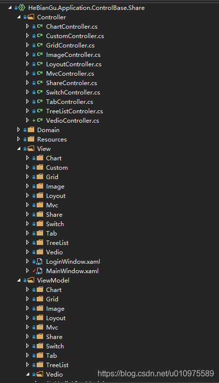
主要有三部分組成:Controller、View、ViewModel
其中 View 和 ViewModel 就是傳統 WPF 中的 MVVM 模式
不同地方在於頁面的跳轉應用到 Controller 做控制,如下範例 Controller 的定義
4.3 Controller 的結構和定義
4.3.1 定義 LoyoutController
[Route("Loyout")]
class LoyoutController : Controller
{

    public LoyoutController(ShareViewModel shareViewModel) : base(shareViewModel)
    {

    }

    public async Task<IActionResult> Center()
    {
        return View();
    }

    [Route("OverView/Button")]
    public async Task<IActionResult> Mdi()
    {
        return View();
    }

    public async Task<IActionResult> Left()
    {
        return View();
    }

    public async Task<IActionResult> Right()
    {
        return View();
    }

    public async Task<IActionResult> Top()
    {
        return View();
    }

    public async Task<IActionResult> Bottom()
    {
        return View();
    }

    [Route("OverView/Toggle")]
    public async Task<IActionResult> Toggle()
    {
        return View();
    }

    [Route("OverView/Carouse")]
    public async Task<IActionResult> Carouse()
    {
        return View();
    }

    [Route("OverView/Evaluate")]
    public async Task<IActionResult> Evaluate()
    {
        return View();
    }

    [Route("OverView/Expander")]
    public async Task<IActionResult> Expander()
    {
        return View();
    }

    [Route("OverView/Gif")]
    public async Task<IActionResult> Gif()
    {
        return View();
    }

    [Route("OverView/Message")]
    public async Task<IActionResult> Message()
    {
        return View();
    }

    [Route("OverView/Upgrade")]
    public async Task<IActionResult> Upgrade()
    {
        return View();
    }

    [Route("OverView/Property")]
    public async Task<IActionResult> Property()
    {
        return View();
    }

    [Route("OverView/ProgressBar")]
    public async Task<IActionResult> ProgressBar()
    {
        return View();
    }

    [Route("OverView/Slider")]
    public async Task<IActionResult> Slider()
    {
        return View();
    }

    [Route("OverView/Tab")]
    public async Task<IActionResult> Tab()
    {
        return View();
    }

    [Route("OverView/Tree")]
    public async Task<IActionResult> Tree()
    {
        return View();
    }

    [Route("OverView/Observable")]
    public async Task<IActionResult> Observable()
    {
        return View();
    }

    [Route("OverView/Brush")]
    public async Task<IActionResult> Brush()
    {
        return View();
    }

    [Route("OverView/Shadow")]
    public async Task<IActionResult> Shadow()
    {
        return View();
    }

    [Route("OverView/Button")]
    public async Task<IActionResult> Button()
    {
        await MessageService.ShowWaittingMessge(() => Thread.Sleep(500));

        this.ViewModel.ButtonContentText = DateTime.Now.ToString();

        return View();

    }


    [Route("OverView/Grid")]
    public async Task<IActionResult> Grid()
    {
        return View();
    }

    [Route("OverView/Combobox")]
    public async Task<IActionResult> Combobox()
    {
        return View();
    }

    [Route("OverView")]
    public async Task<IActionResult> OverView()
    {
        await MessageService.ShowWaittingMessge(() => Thread.Sleep(500));

        MessageService.ShowSnackMessageWithNotice("OverView");

        return View();
    }

    [Route("OverView/TextBox")]
    public async Task<IActionResult> TextBox()
    {
        return View();
    }

    [Route("OverView/Book")]
    public async Task<IActionResult> Book()
    {
        return View();
    }

    [Route("OverView/Xaml")]
    public async Task<IActionResult> Xaml()
    {
        return View();
    }

    [Route("OverView/Dimension")]
    public async Task<IActionResult> Dimension()
    {
        return View();
    }

    [Route("OverView/Geometry")]
    public async Task<IActionResult> Geometry()
    {
        return View();
    }

    [Route("OverView/Panel")]
    public async Task<IActionResult> Panel()
    {
        return View();
    }
    [Route("OverView/Transform3D")]
    public async Task<IActionResult> Transform3D()
    {
        return View();
    }

    [Route("OverView/Drawer")]
    public async Task<IActionResult> Drawer()
    {
        return View();
    }
}
4.3.2 前端的頁面
如下,其中紅色部分對應 Controller 裡面的要跳轉的 Route
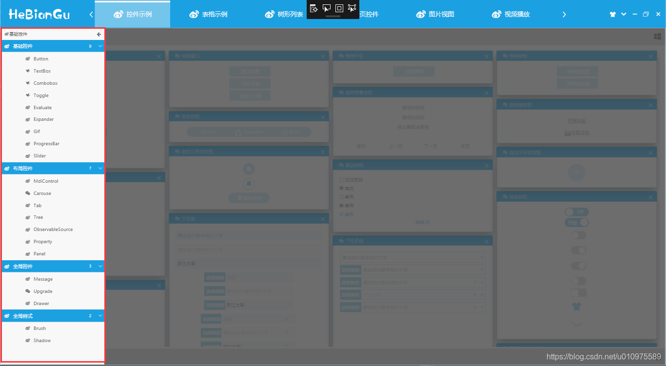
如:選擇了紅色部分的 Button,首先會呼叫Button()方法,跳轉到目前 Controller 對應的 View 檔案加下的ButtonControl.xaml 頁面
[Route("OverView/Button")]
public async Task<IActionResult> Button()
{
    await MessageService.ShowWaittingMessge(() => Thread.Sleep(500);

    this.ViewModel.ButtonContentText = DateTime.Now.ToString();

    return View();

}
可以在 Button()方法中,寫一些業務邏輯,如對目前 ViewModel 的增刪改查等常規操作,其中目前 Controller 成員 ViewModel 是內部封裝好的 ViewModel,對應 ViewModel 檔案下面的目前 Controller 的 ViewModel
4.3.3 範例
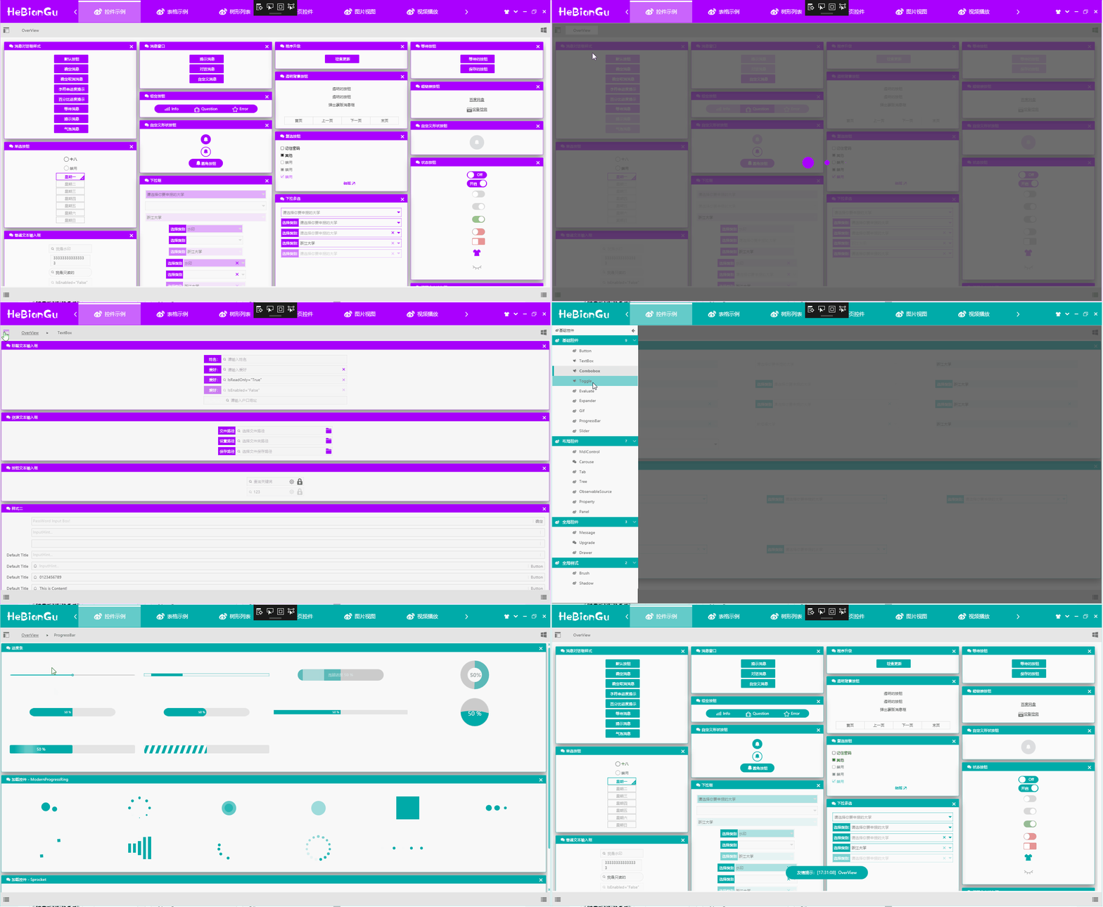
4.3.4 左側的 Xaml 列表可以定義成如下形式
<Grid>
<wpfcontrollib:LinkGroupExpander
ScrollViewer.HorizontalScrollBarVisibility="Disabled"
x:Name="selectloyout"
SelectedLink="{Binding SelectLink,Mode=TwoWay}"
Command="{x:Static wpfcontrollib:DrawerHost.CloseDrawerCommand}"
CommandParameter="{x:Static Dock.Left}"
>
<wpfcontrollib:LinkActionGroup DisplayName="基礎控制項" Logo="">
<wpfcontrollib:LinkActionGroup.Links>
<wpfcontrollib:LinkAction
DisplayName="Button"
Logo=""
Controller="Loyout"
Action="Button"
/>
<wpfcontrollib:LinkAction
DisplayName="TextBox"
Logo=""
Controller="Loyout"
Action="TextBox"
/>
<wpfcontrollib:LinkAction
DisplayName="Combobox"
Logo=""
Controller="Loyout"
Action="Combobox"
/>
<wpfcontrollib:LinkAction
DisplayName="Toggle"
Logo=""
Controller="Loyout"
Action="Toggle"
/>
<wpfcontrollib:LinkAction
DisplayName="Evaluate"
Logo=""
Controller="Loyout"
Action="Evaluate"
/>
<wpfcontrollib:LinkAction
DisplayName="Expander"
Logo=""
Controller="Loyout"
Action="Expander"
/>
<wpfcontrollib:LinkAction
DisplayName="Gif"
Logo=""
Controller="Loyout"
Action="Gif"
/>
<wpfcontrollib:LinkAction
DisplayName="ProgressBar"
Logo=""
Controller="Loyout"
Action="ProgressBar"
/>
<wpfcontrollib:LinkAction
DisplayName="Slider"
Logo=""
Controller="Loyout"
Action="Slider"
/>
</wpfcontrollib:LinkActionGroup.Links>
</wpfcontrollib:LinkActionGroup>
<wpfcontrollib:LinkActionGroup DisplayName="版面配置控制項" Logo="">
<wpfcontrollib:LinkActionGroup.Links>
<wpfcontrollib:LinkAction
DisplayName="MdiControl"
Logo=""
Controller="Loyout"
Action="Mdi"
/>
<wpfcontrollib:LinkAction
DisplayName="Carouse"
Logo=""
Controller="Loyout"
Action="Carouse"
/>
<wpfcontrollib:LinkAction
DisplayName="Tab"
Logo=""
Controller="Loyout"
Action="Tab"
/>
<wpfcontrollib:LinkAction
DisplayName="Tree"
Logo=""
Controller="Loyout"
Action="Tree"
/>
<wpfcontrollib:LinkAction
DisplayName="ObservableSource"
Logo=""
Controller="Loyout"
Action="Observable"
/>
<wpfcontrollib:LinkAction
DisplayName="Property"
Logo=""
Controller="Loyout"
Action="Property"
/>
<wpfcontrollib:LinkAction
DisplayName="Panel"
Logo=""
Controller="Loyout"
Action="Panel"
/>
</wpfcontrollib:LinkActionGroup.Links>
</wpfcontrollib:LinkActionGroup>
<wpfcontrollib:LinkActionGroup DisplayName="全域控制項" Logo="">
<wpfcontrollib:LinkActionGroup.Links>
<wpfcontrollib:LinkAction
DisplayName="Message"
Logo=""
Controller="Loyout"
Action="Message"
/>
<wpfcontrollib:LinkAction
DisplayName="Upgrade"
Logo=""
Controller="Loyout"
Action="Upgrade"
/>
<wpfcontrollib:LinkAction
DisplayName="Drawer"
Logo=""
Controller="Loyout"
Action="Drawer"
/>
</wpfcontrollib:LinkActionGroup.Links>
</wpfcontrollib:LinkActionGroup>
<wpfcontrollib:LinkActionGroup DisplayName="全域樣式" Logo="">
<wpfcontrollib:LinkActionGroup.Links>
<wpfcontrollib:LinkAction
DisplayName="Brush"
Logo=""
Controller="Loyout"
Action="Brush"
/>
<wpfcontrollib:LinkAction
DisplayName="Shadow"
Logo=""
Controller="Loyout"
Action="Shadow"
/>
</wpfcontrollib:LinkActionGroup.Links>
</wpfcontrollib:LinkActionGroup>
</wpfcontrollib:LinkGroupExpander>
</Grid>
透過 LinkGroupExpander 控制項,封裝 LinkAction 去實現頁面的跳轉,其中只需要定義 LinkAction 的幾個屬性即可達到跳轉到指定頁面的效果,如:
- Controller 屬性:用來指示要跳轉到哪個 Controller
- Action 屬性:用來指示跳轉到哪個方法
- DisplayName 屬性:在 UI 中顯示的名稱
- Logo 屬性:在 UI 中顯示的圖示
如下,Controller 中的 Button()方法對應的跳轉配置如下
[Route("OverView/Button")]
public async Task<IActionResult> Button()
<wpfcontrollib:LinkAction
DisplayName="Button"
Logo=""
Controller="Loyout"
Action="Button"
/>
4.3.5 Controller 基底類別的定義 ControllerBase
主要方法是IActionResult View([CallerMemberName] string name = ""),這個方法是 MVC 實現的核心功能,主要透過反射去動態載入組件,載入專案結構中的 View、ViewModel 去產生 IActionResult 回傳給主頁面進行頁面跳轉,程式碼如下:
public abstract class ControllerBase : IController
{
    protected virtual IActionResult View([CallerMemberName] string name = "")
    {
        var route = this.GetType().GetCustomAttributes(typeof(RouteAttribute), true).Cast<RouteAttribute>();

        string controlName = null;

        if (route.FirstOrDefault() == null)
        {
            controlName = this.GetType().Name;
        }
        else
        {
            controlName = route.FirstOrDefault().Name;
        }

        var ass = Assembly.GetEntryAssembly().GetName();

        string path = $"/{ass.Name};component/View/{controlName}/{name}Control.xaml";

        Uri uri = new Uri(path, UriKind.RelativeOrAbsolute);

        var content = Application.Current.Dispatcher.Invoke(() =>
        {
            return Application.LoadComponent(uri);
        });

        ActionResult result = new ActionResult();

        result.Uri = uri;
        result.View = content as ContentControl;

        Type type = Assembly.GetEntryAssembly().GetTypeOfMatch<NotifyPropertyChanged>(l => l.Name == controlName + "ViewModel");

        result.ViewModel = ServiceRegistry.Instance.GetInstance(type);

        Application.Current.Dispatcher.Invoke(() =>
        {
            (result.View as FrameworkElement).DataContext = result.ViewModel;

        });

        return result;
    }


    protected virtual IActionResult LinkAction([CallerMemberName] string name = "")
    {
        var route = this.GetType().GetCustomAttributes(typeof(RouteAttribute), true).Cast<RouteAttribute>();

        string controlName = null;

        if (route.FirstOrDefault() == null)
        {
            controlName = this.GetType().Name;
        }
        else
        {
            controlName = route.FirstOrDefault().Name;
        }

        var ass = Assembly.GetEntryAssembly().GetName();

        string path = $"/{ass.Name};component/View/{controlName}/{name}Control.xaml";

        Uri uri = new Uri(path, UriKind.RelativeOrAbsolute);

        var content = Application.Current.Dispatcher.Invoke(() =>
        {
            return Application.LoadComponent(uri);
        });

        ActionResult result = new ActionResult();

        result.Uri = uri;
        result.View = content;

        Type type = Assembly.GetEntryAssembly().GetTypeOfMatch<NotifyPropertyChanged>(l => l.Name == controlName + "ViewModel");

        result.ViewModel = ServiceRegistry.Instance.GetInstance(type);

        Application.Current.Dispatcher.Invoke(() =>
        {
            (result.View as FrameworkElement).DataContext = result.ViewModel;
        });

        return result;
    }

}
說明:
- 透過 Application.LoadComponent(uri);來載入產生 Control
- 透過反射 ViewModel 基底類別 NotifyPropertyChanged 去找到對應 ViewModel,繫結到 View 中
- 將 View 和 ViewModel 封裝到 IActionResult 中回傳給主頁面進行載入
其中 Controller 中的方法回傳類型是 async Task
4.4 View 中的結構和定義
其中 View 在專案中的定義就是根據 Controller 中的方法對應,在 MVC 中要嚴格按照結構定義[View/Loyout],好處是可以減少程式碼量,同時使格式統一程式碼整齊,結構如下:
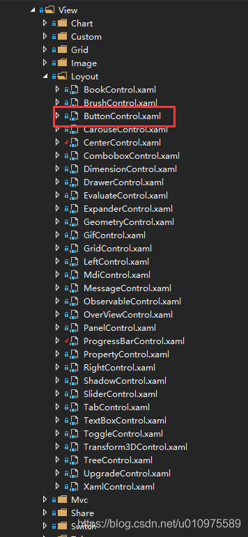
其中紅色 ButtonControl.xaml 即是 Controller 中 Button()方法要跳轉的頁面,其他頁面同理
4.5 ViewModel 的結構和定義
其中 LoyoutViewModel 即是 LoyoutController 和整個 View/Loyout 下所有頁面對應的 ViewModel

4.6 整體 MVC 結構實現的效果如下

以上就是 MVC 應用在 WPF 中的簡要範例,具體內容和範例可從如下連結中下載程式碼查看
程式碼位址:https://github.com/HeBianGu/WPF-ControlBase.git
另一個應用 Sqlite 資料庫的範例以下
程式碼位址:https://github.com/HeBianGu/WPF-ExplorerManager.git
5. 其他功能說明
原文標題:範例:自訂WPF底層控制項UI庫 HeBianGu.General.WpfControlLib V2.0版本
原文連結:https://blog.csdn.net/u010975589/article/details/103083605
5.1 目的
封裝了一些控制項到自訂的控制項庫中,方便快速開發
5.2 實現功能
- 基本實現常用基礎控制項,滿足常規軟體快速開發
- 同時支援框架.NET Core 3.0 + ,.Net FrameWork 4.5+
5.3 整體概覽

5.3.1 登入頁面

登入頁面只需要繼承 LoginWindowBase 基底類別,並且設定樣式 Style=""即可
5.3.2 主頁面
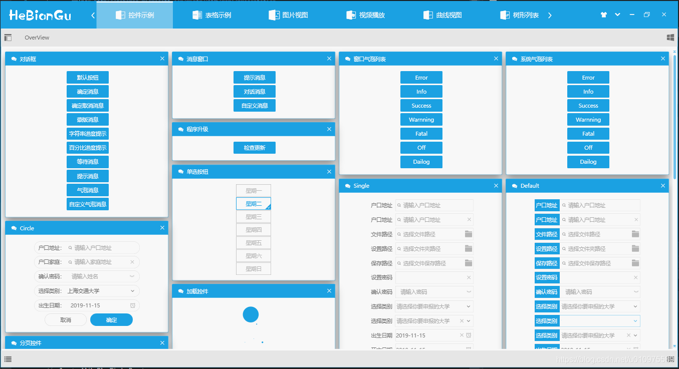
主頁面只需繼承 LinkWindowBase 基底類別,並且設定樣式 Style=""即可
整體主視窗採用 ViewBox 方式載入,當縮放視窗或應用到其他解析度裝置都會相容
5.3.3 主題設定資訊儲存
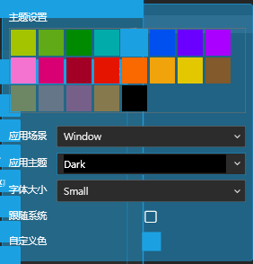
主題設定資訊已經封裝在 ApplicationBase 中,會自動在退出時儲存設定好的設定資訊(如:主題顏色、字型大小等)
總結: 應用此模式可以達到復用的目的,將通用部分封裝到底層,如需修改樣式只需修改 Style 樣式檔案或修改相依屬性即可滿足功能修改
5.4 主題設定

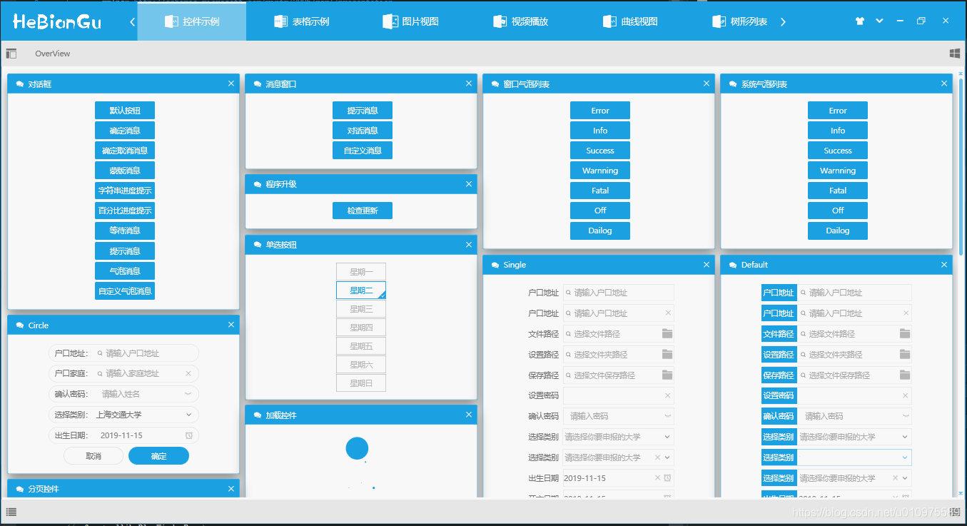
淺色主題範例以下:
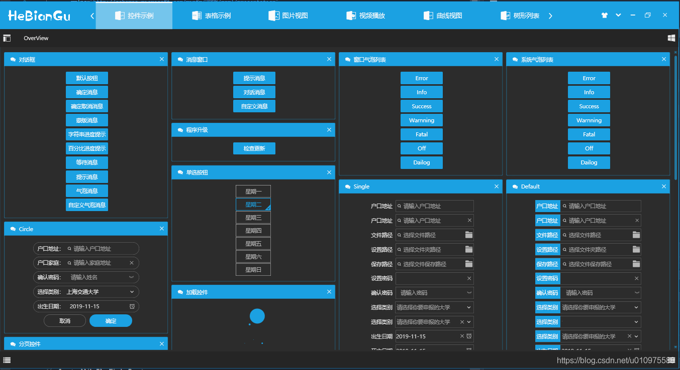
深色主題範例下圖:
主題設定功能主要包括:
- 設定主題主顏色
主題顏色主要用來標示要突出顯示的部分,目前可以選擇內建顏色、可以選擇跟隨系統主題顏色、可以自訂選擇顏色、可以使用動態主題(即設定主題每隔指定時間自動變化)
- 設定主題
主題目前實現四中主題,分別是淺色主題、深色主題、灰色主題、主顏色為主題
- 設定字型大小
字型大小目前內建兩種,分別是 Large 和 Small,其中這兩種顏色採用注入的方式載入,即可以在程式載入時設定著兩種字型的初始值
- 其他配置
包括中英文、設定標準行高等等可以在程式載入時進行初始化設定,這裡不做過多介紹
**總結:**這樣設計的目的是審美因人而異,使用自訂配置的方式可以盡可能多的滿足多變的需求
5.5 其他基礎控制項
5.5.1 資料表格
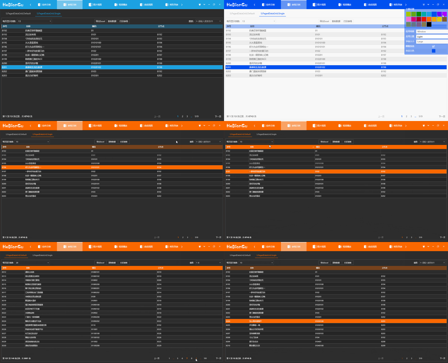
- a 相容主題字型和主題設定,後面將要提到的所有控制項均已應用主題設定,不做再說明
- b 每頁顯示筆數
可以設定每頁要顯示的筆數
- c 搜尋
可以設定搜尋篩選條件,包含指定搜尋項的條目才會顯示
- d 頁面跳轉
可以上一頁、下一頁、第一頁、最後一頁、指定頁
- e 頁面資訊
目前頁屬於資料來源的第幾條至第幾條,資料來源的總筆數
- f 兩種風格的網格頁面
**總結:**以上功能封裝在控制項 PagedDataGrid 中,只需繫結資料來源即可實現以上功能,其中列印、匯出等功能暫時沒有實現
5.5.2 樹狀列表
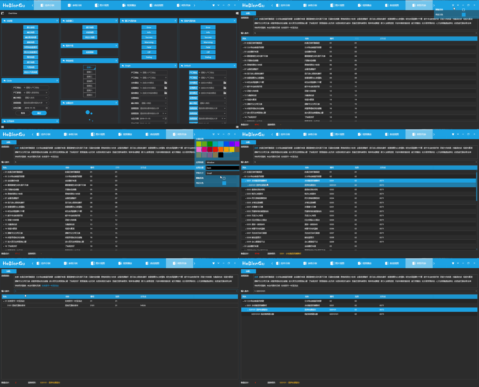
- a 支援依類別篩選
如上圖、選擇指定類型來過濾列表
- b 支援依條件搜尋
如上圖、輸入條件可以過濾指定條件
**總結:**使用方式為繫結資料來源到 TreeListView 控制項中
5.5.3 其他常用控制項
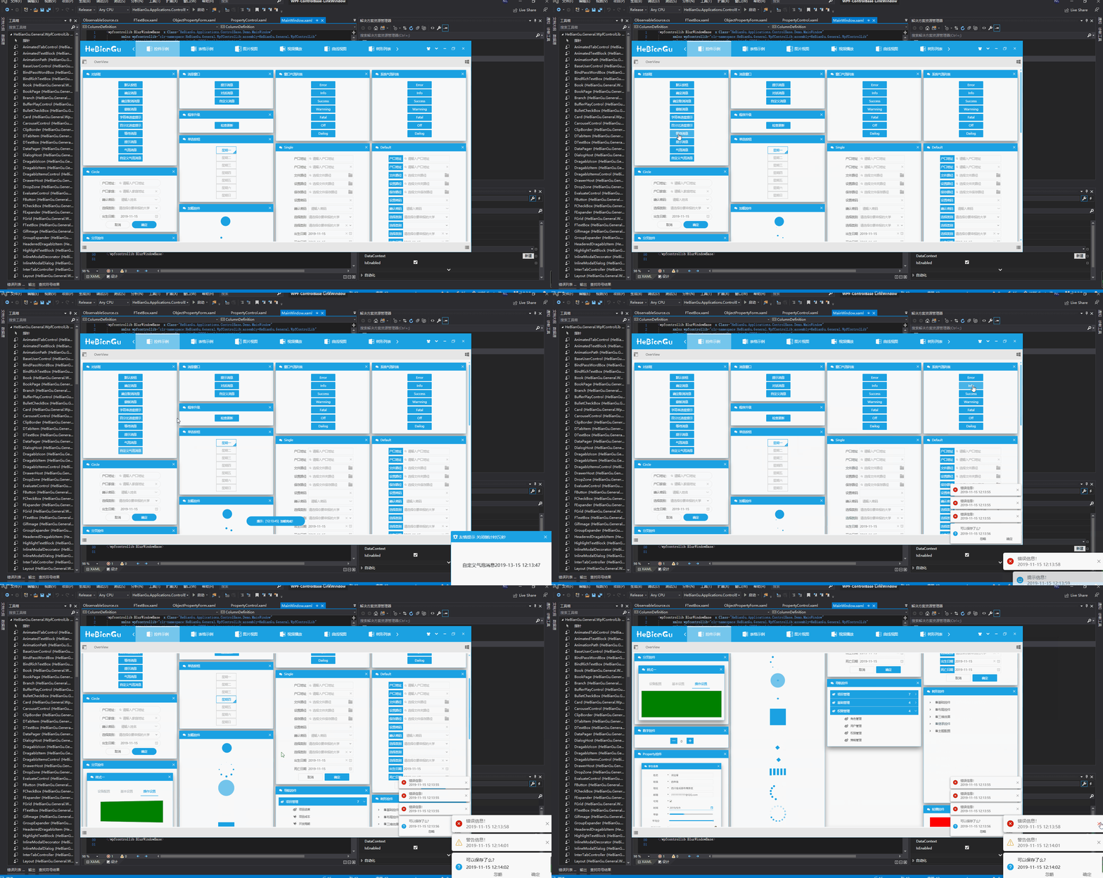

- a 對話框
採用內建對話框,不是應用視窗,只是覆蓋層,可以避免視窗對話框引起的一些問題
- b 對話視窗自訂對話視窗
相對系統對話視窗更美觀,增加顯示和隱藏效果,透過注入的方式可以自訂按鈕個數和功能
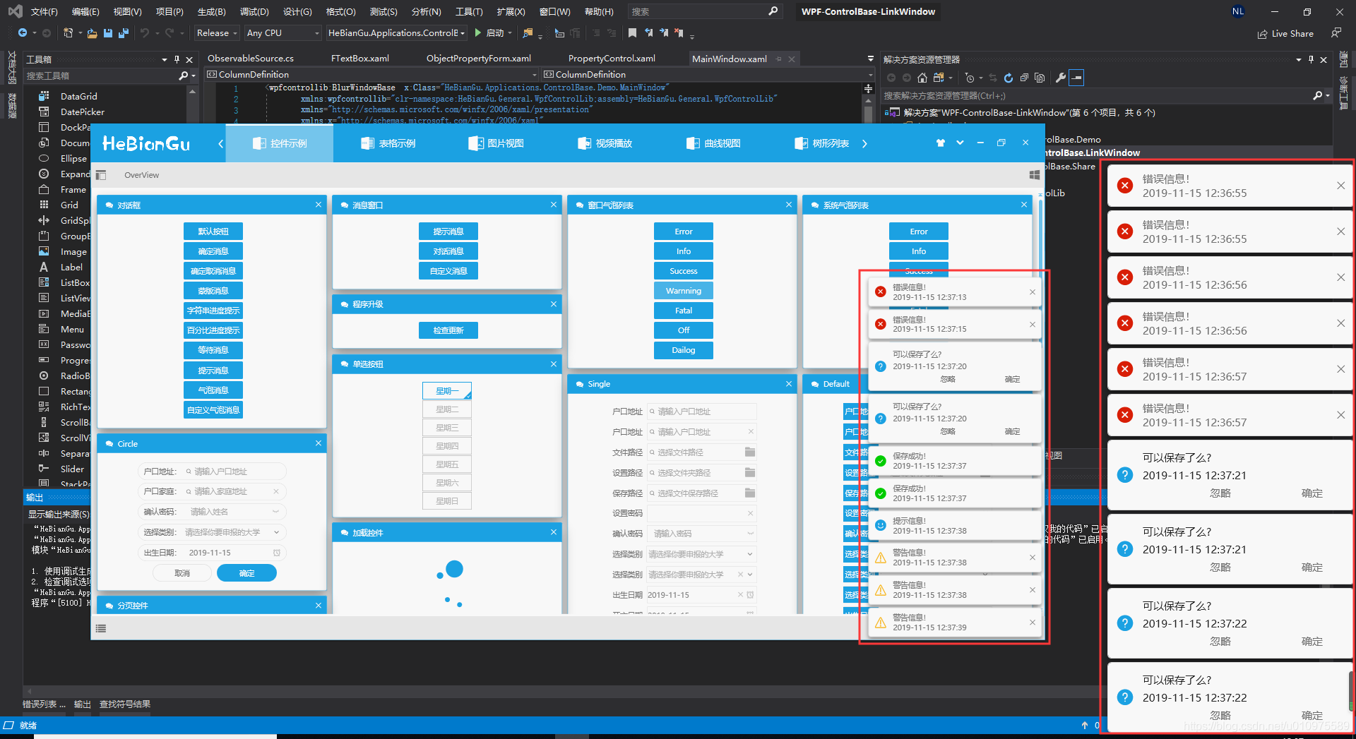
- c 訊息列表
目前有兩種模式,分別是在視窗內顯示和 Window 系統中顯示,可以根據需求自訂顯示方式,範例以下
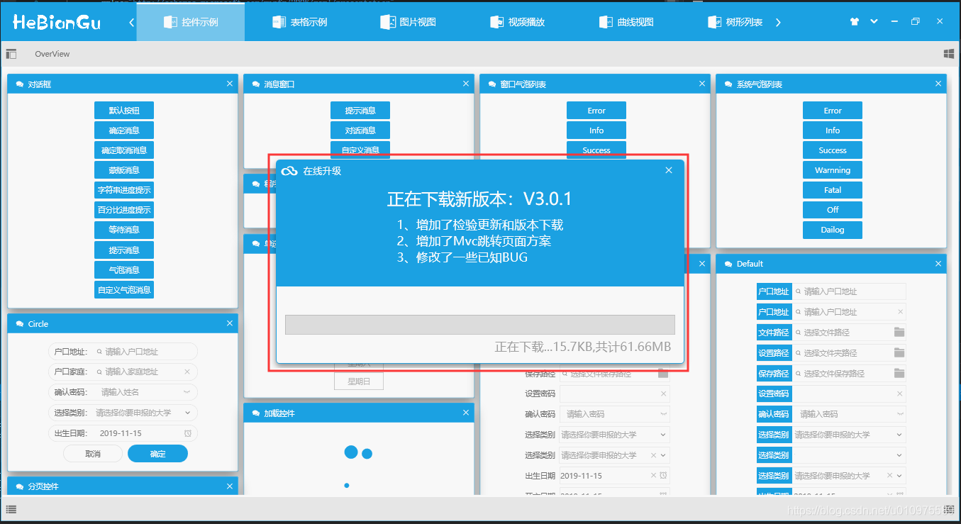
- d 線上更新範例以下
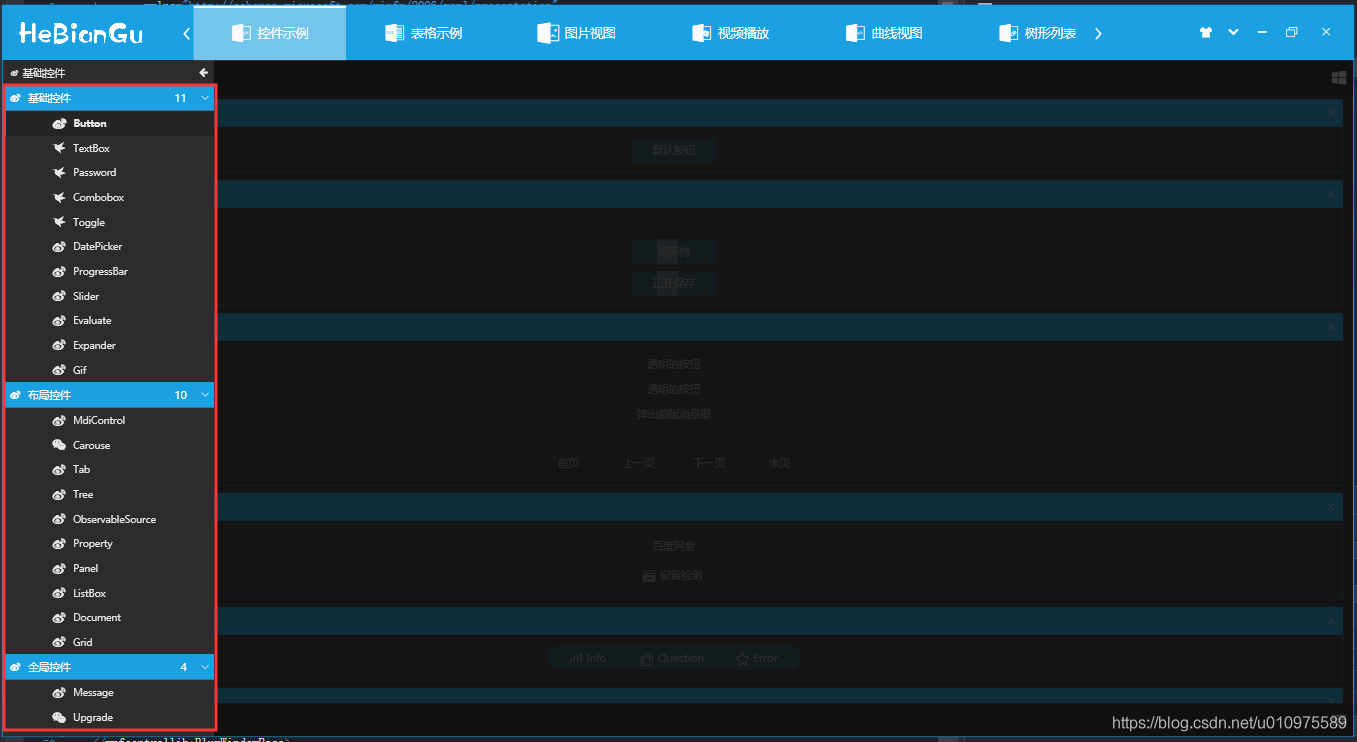
- e 導覽功能表範例以下
- f 其他功能包括
按鈕控制項、文字輸入框控制項、下拉式清單控制項、數字控制項、日期選擇控制項、支援繫結的密碼框控制項、進度列控制項、拖曳控制項、樹狀控制項、分頁控制項以及其他自訂控制項。
以上控制項均已實現主題顏色、字型大小切換等,可以滿足常用軟體的功能
其中整體結構使用的自訂 Mvc 方式載入,參考位址:https://blog.csdn.net/u010975589/article/details/100019431
由於控制項過多不做詳細介紹,有興趣的可以下載原始碼或載入nuget套件
5.6 使用方式
nuget 套件新增如下圖
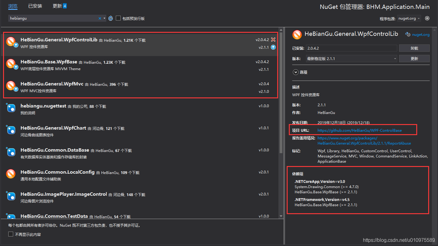
說明:此範例部分功能部分程式碼參考第三方框架,開源只應用於學習和參考,不做商用目的。
應用此框架的其他範例:
- 範例:應用 WPF 開發的仿製 GitHub 用戶端 UI 佈局_HeBianGu 的部落格-CSDN 部落格
- 範例:應用 WPF 開發的仿製百度網盤用戶端 UI 佈局_HeBianGu 的部落格-CSDN 部落格_wpf 網盤
- 範例:應用 WPF 繪製輕量 Chart 圖表之組合圖效果預覽_HeBianGu 的部落格-CSDN 部落格
- 封裝:WPF 基於 Vlc.DotNet.Wpf 封裝的影片播放器_HeBianGu 的部落格-CSDN 部落格
- 範例:WPF 開發的 Image 圖片控制項,支援鳥撖圖、滾輪放大、放大鏡、圈定範圍以及圈定範圍放大等(範例一)_HeBianGu 的部落格-CSDN 部落格
5.7 下載位址
GitHub 下載位址:GitHub - HeBianGu/WPF-ControlBase: Wpf 封裝的自訂控制項資源庫
安裝套件範例下載位址:
- 連結:https://pan.baidu.com/s/1y2UfDKIxoSOffj36gl7fOw
- 提取碼:l2ia
更新:2019.12.16 增加.NET Core 3.0
目前已支援 Core3.0 和.net 4.5 如有解決方案組件無法載入請安裝這兩個框架