
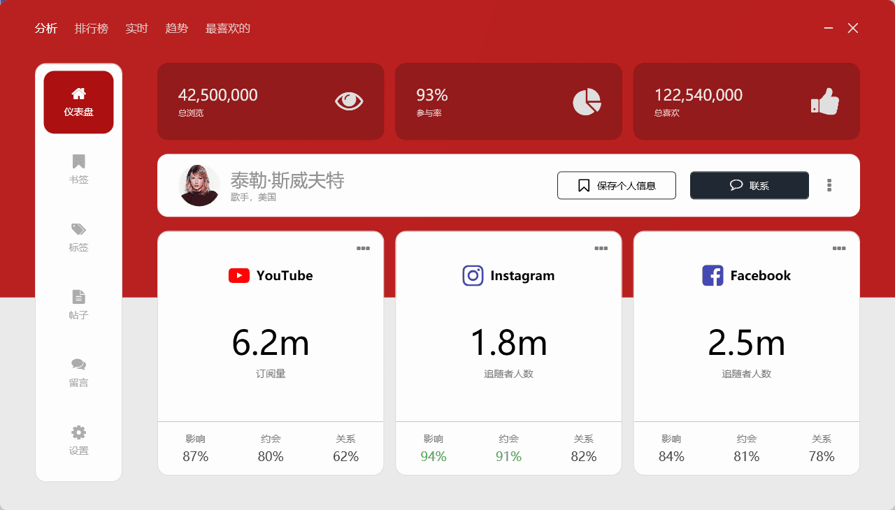
1. 效果展示
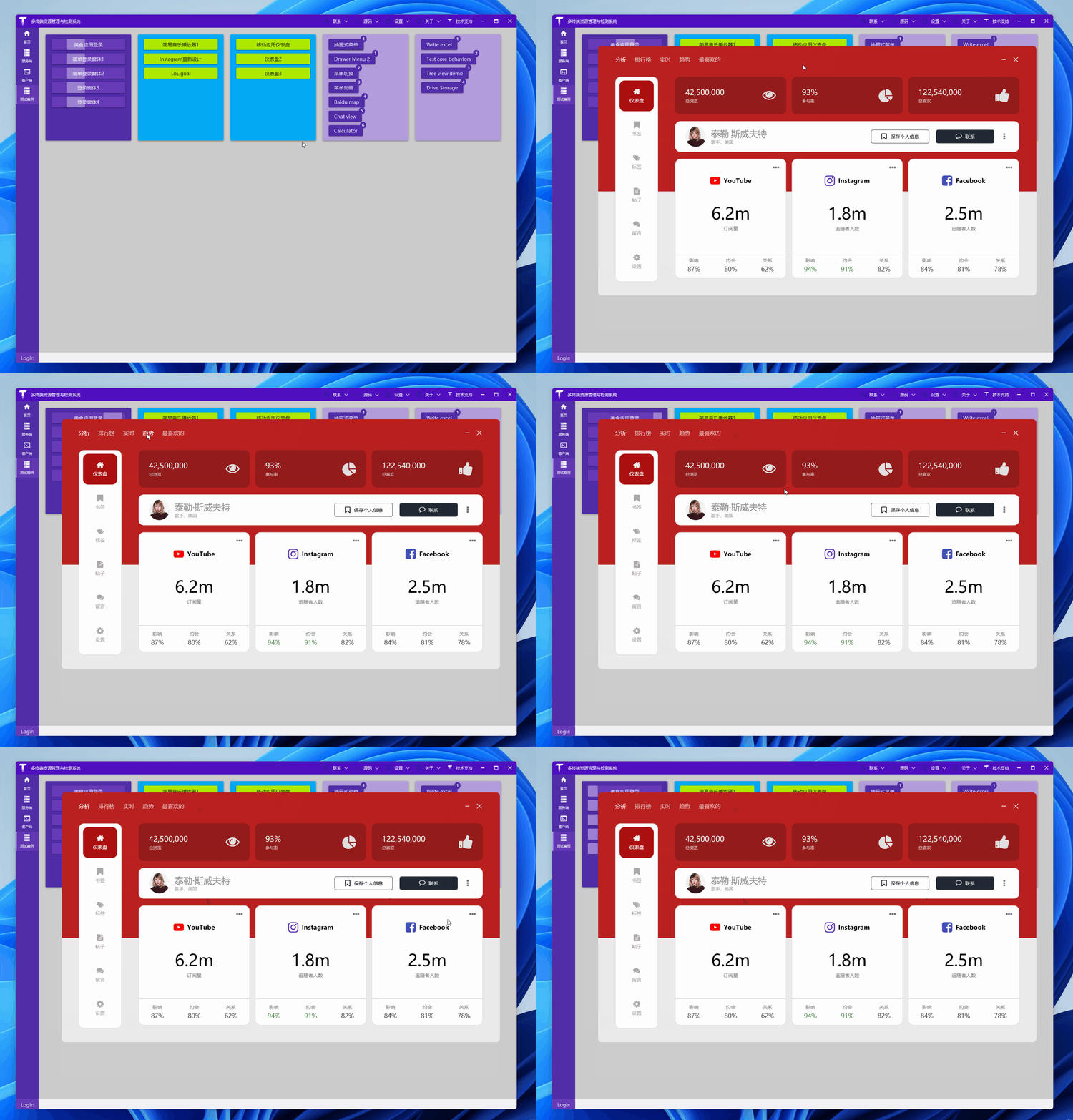
先来直接欣赏效果:
2. 准备
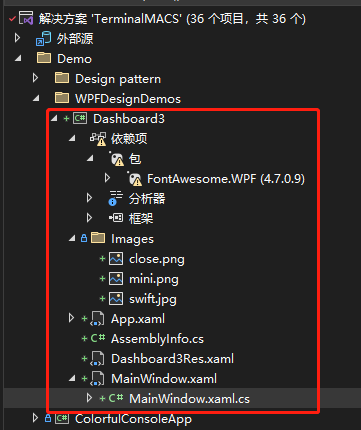
创建一个 WPF 工程,比如站长使用 .NET 7 创建名为 Dashboard3 的 WPF 项目,添加一些图片资源,项目目录如下:
2.1 图片资源
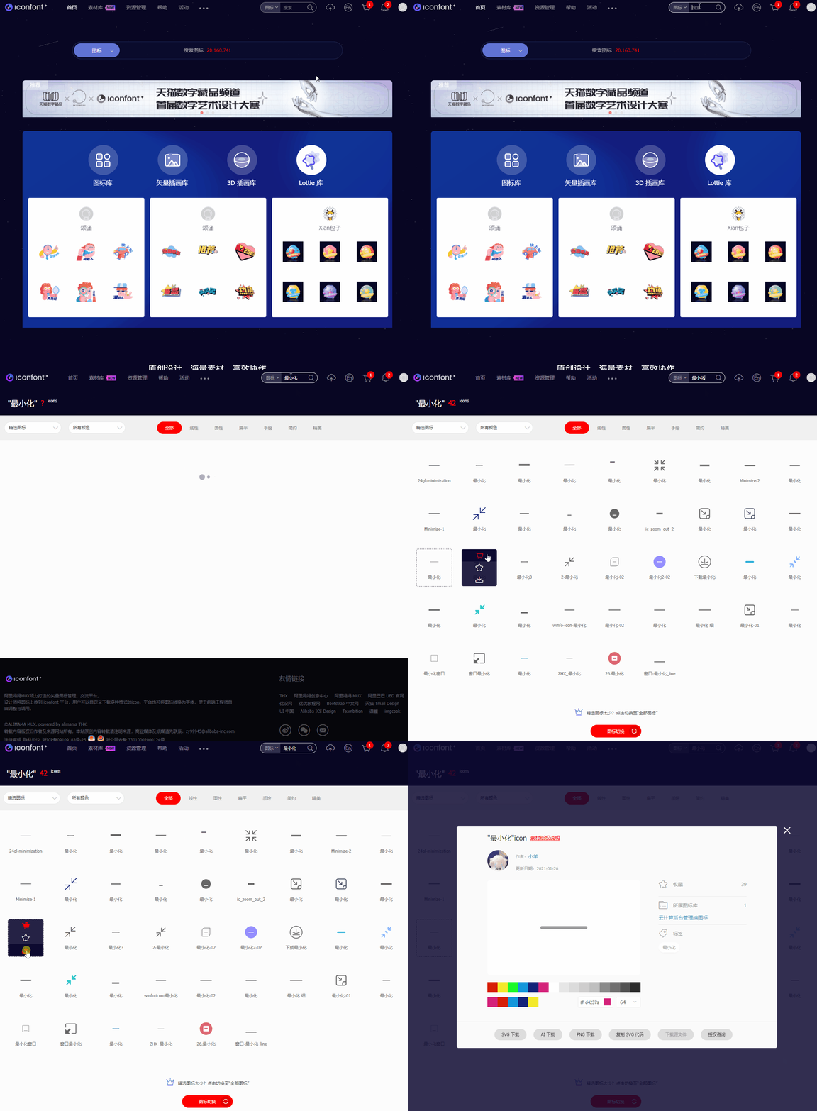
可在网站 iconfont 下载 关闭、最小化 图标,用于窗口右上角显示:
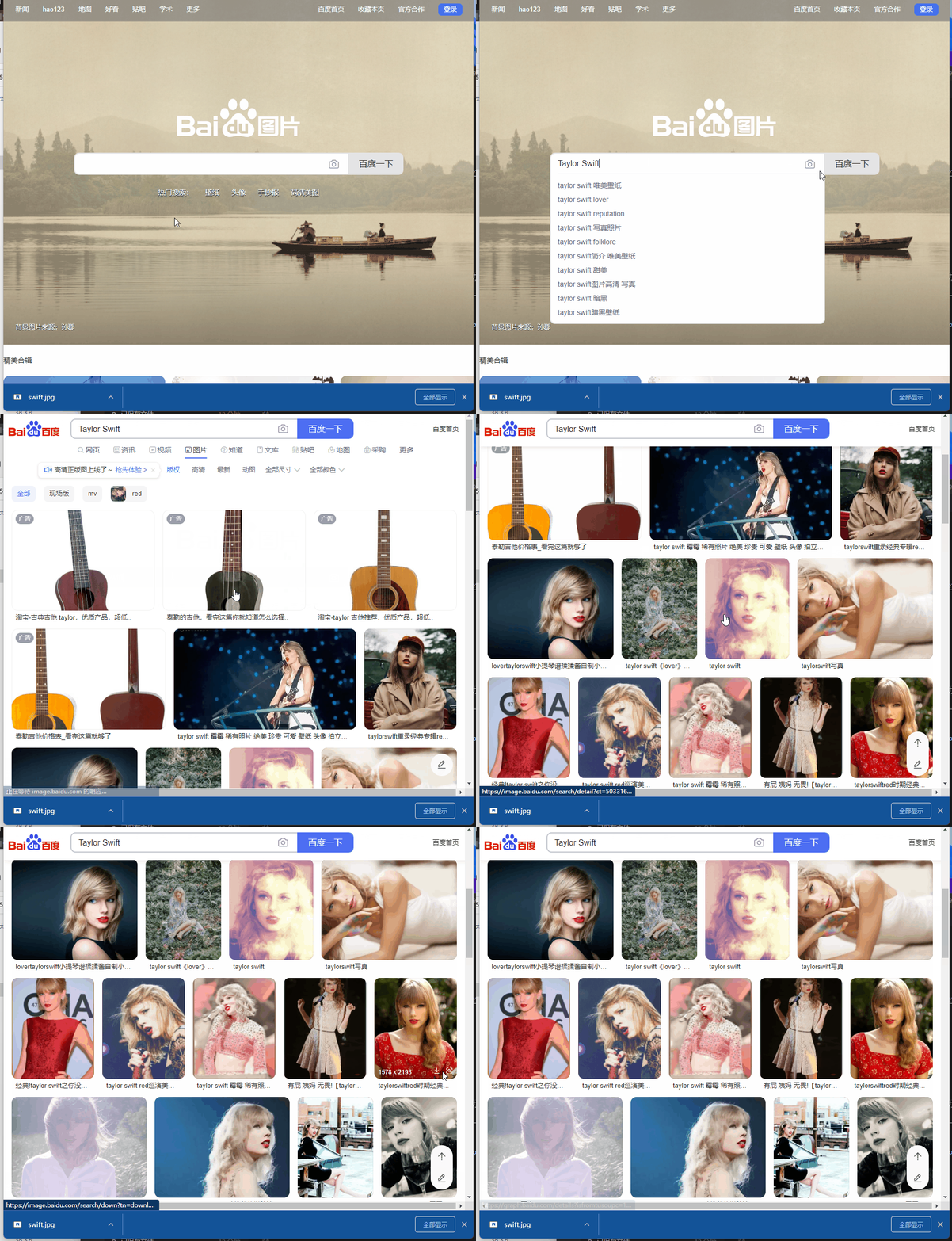
有看到美女图片没?在百度图片或者谷歌图片下载,比如 泰勒·斯威夫特 ,用于界面展示一个人的头像:
2.2 字体图标 NuGet 包:FontAwesome.WPF,该包提供一些图标字体:
<PackageReference Include="FontAwesome.WPF" Version="4.7.0.9" />
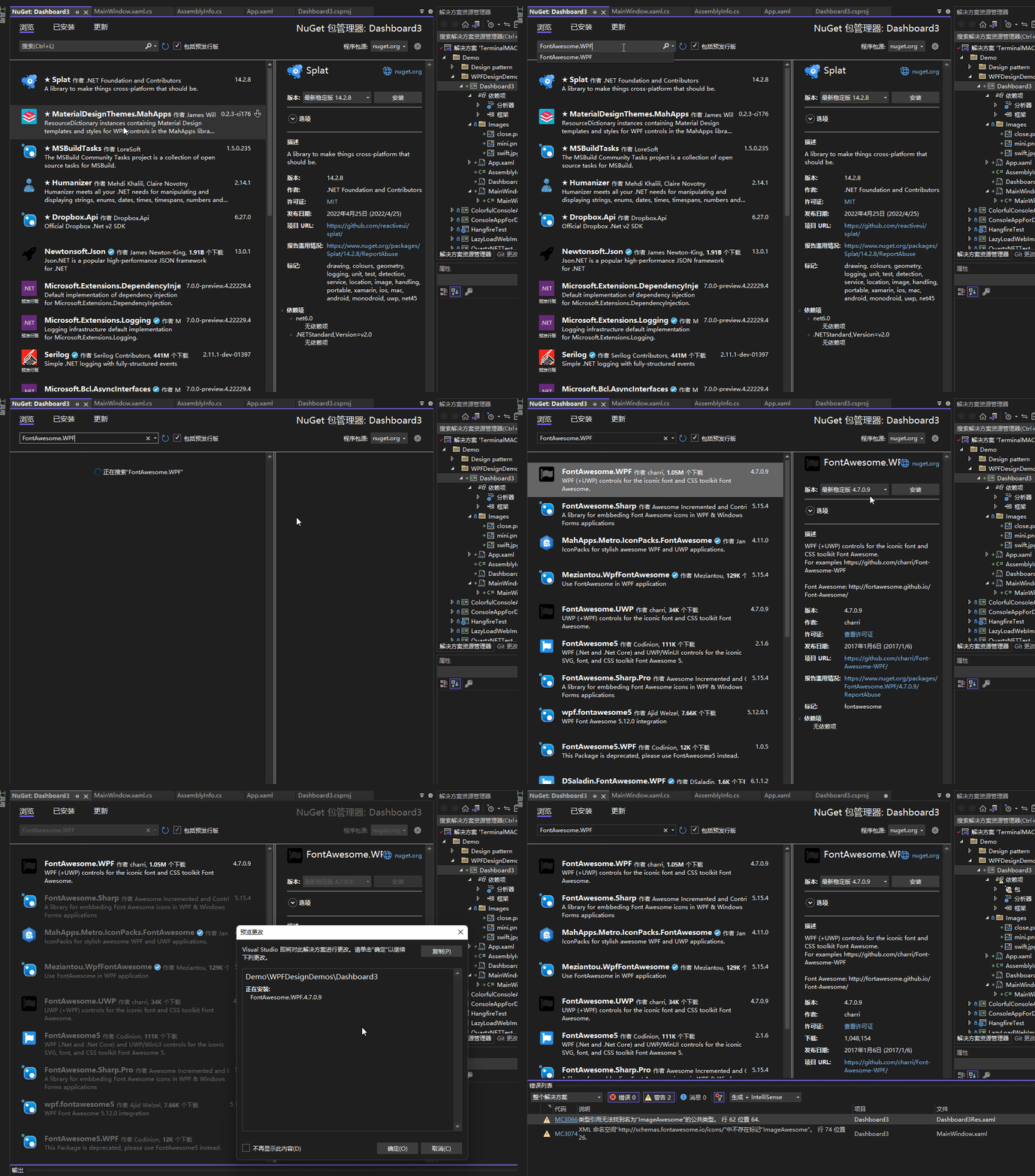
编译时,此包有如下提示:
已使用“.NETFramework,Version=v4.6.1, .NETFramework,Version=v4.6.2, .NETFramework,Version=v4.7, .NETFramework,Version=v4.7.1, .NETFramework,Version=v4.7.2, .NETFramework,Version=v4.8”而不是项目目标框架“net7.0-windows7.0”还原包“FontAwesome.WPF 4.7.0.9”。此包可能与项目不完全兼容。
有.NET Core 版本的字体图标库推荐吗?可在下面留言,谢谢,这里不影响使用。
3. 简单介绍
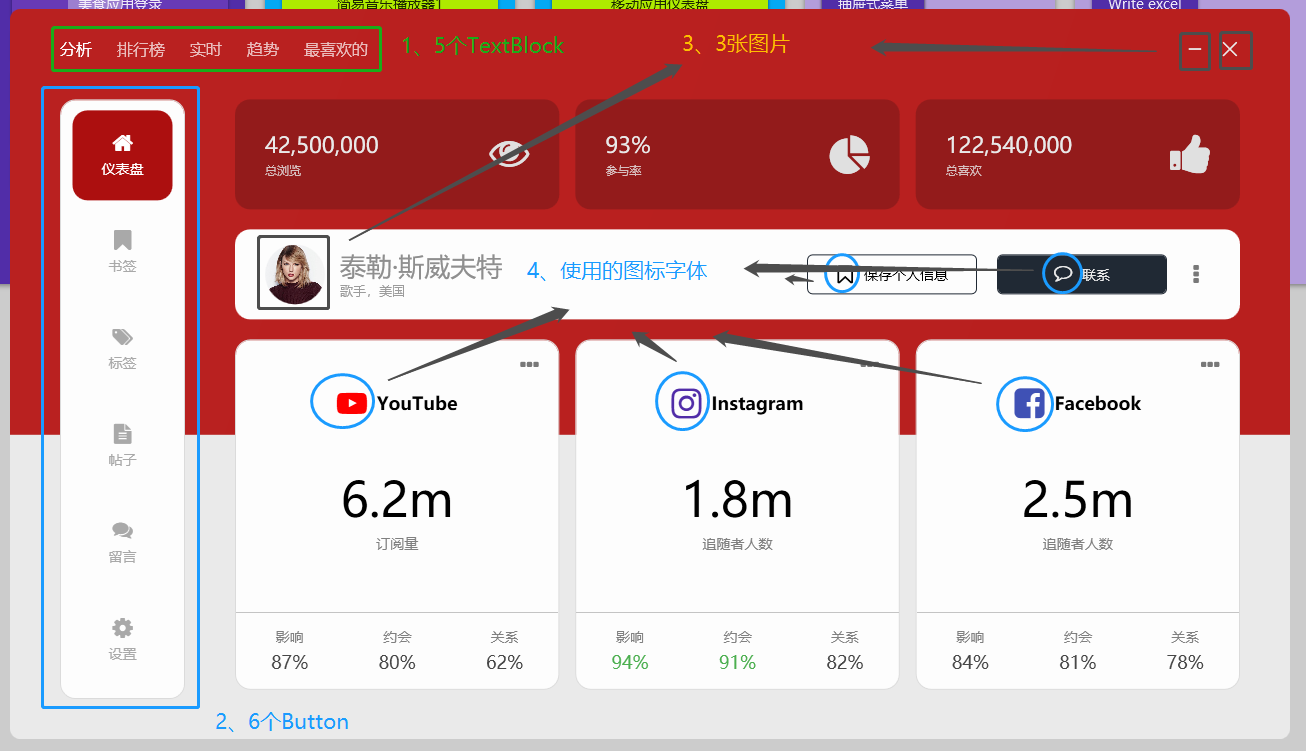
重点提及界面几个地方:
3.1 水平菜单

如上图,水平菜单是几个 TextBlox 标签,默认设置了字体的透明度为 0.7,鼠标悬浮时设置为 1:
<StackPanel Orientation="Horizontal" HorizontalAlignment="Left">
    <TextBlock Text="分析" Opacity="1" Style="{StaticResource menuTitle}" />
    <TextBlock Text="排行榜" Style="{StaticResource menuTitle}" />
    <TextBlock Text="实时" Style="{StaticResource menuTitle}" />
    <TextBlock Text="趋势" Style="{StaticResource menuTitle}" />
    <TextBlock Text="最喜欢的" Style="{StaticResource menuTitle}" />
</StackPanel>
<Style x:Key="menuTitle" TargetType="TextBlock">
    <Setter Property="Margin" Value="0 0 25 0" />
    <Setter Property="FontSize" Value="16" />
    <Setter Property="Opacity" Value="0.7" />
    <Setter Property="Foreground" Value="#FFFFFF" />
    <Style.Triggers>
        <Trigger Property="IsMouseOver" Value="True">
            <Setter Property="Opacity" Value="1" />
        </Trigger>
    </Style.Triggers>
</Style>
3.2 竖直菜单
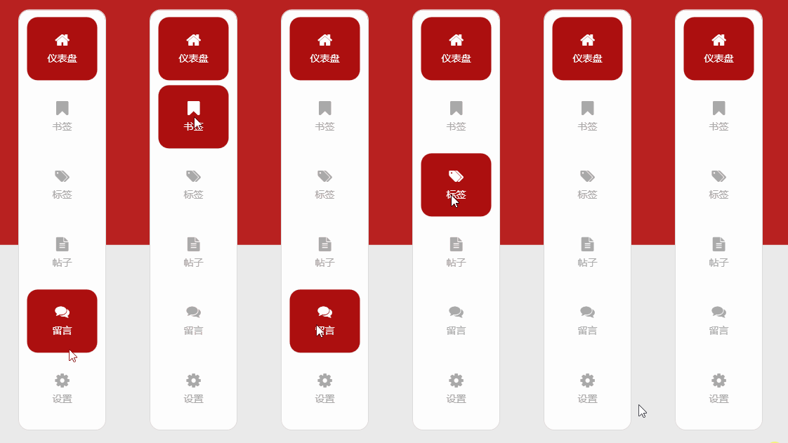
如上图,竖直菜单是几个按钮,按钮内容填充了字体图标和文字,设置一些效果样式:
<Button Style="{StaticResource menuButton}" Margin="0 10 0 0" Background="#AC0F0F" Foreground="#FFFFFF">
    <StackPanel>
        <fa:ImageAwesome Icon="Home" Style="{StaticResource menuButtonIcon}" />
        <TextBlock Text="仪表盘" Style="{StaticResource menuButtonText}" />
    </StackPanel>
</Button>
<Style x:Key="menuButton" TargetType="{x:Type Button}">
    <Setter Property="Margin" Value="0 7 0 0" />
    <Setter Property="FontSize" Value="14" />
    <Setter Property="Width" Value="100" />
    <Setter Property="Height" Value="90" />
    <Setter Property="Background" Value="Transparent" />
    <Setter Property="Foreground" Value="#a9a9a9" />
    <Setter Property="FocusVisualStyle" Value="{x:Null}" />
    <Setter Property="Template">
        <Setter.Value>
            <ControlTemplate TargetType="{x:Type Button}">
                <Border Background="{TemplateBinding Background}" CornerRadius="15" Padding="15">
                    <ContentPresenter HorizontalAlignment="Center" VerticalAlignment="Center" />
                </Border>
            </ControlTemplate>
        </Setter.Value>
    </Setter>
    <Style.Triggers>
        <Trigger Property="IsMouseOver" Value="True">
            <Setter Property="Background" Value="#AC0F0F" />
            <Setter Property="Foreground" Value="#FFFFFF" />
        </Trigger>
        <Trigger Property="IsMouseCaptured" Value="True">
            <Setter Property="Background" Value="#921C1B" />
            <Setter Property="Foreground" Value="#FFFFFF" />
        </Trigger>
    </Style.Triggers>
</Style>


<Style x:Key="menuButtonIcon" TargetType="fa:ImageAwesome">
    <Setter Property="Foreground" Value="{Binding Path=Foreground, RelativeSource={RelativeSource FindAncestor, AncestorType={x:Type Button}}}" />
    <Setter Property="Width" Value="20" />
    <Setter Property="Height" Value="20" />
</Style>


<Style x:Key="menuButtonText" TargetType="TextBlock">
    <Setter Property="Margin" Value="0 7 0 0" />
</Style>
3.3 部分图片和字体图标
这个就不多说了,上面的代码也有字体图标的使用。
4. 结尾
这个面板的效果个人感觉很漂亮,由基本的TextBlock、Button、字体图标、图片等组合、排版布局就能做到很多效果,有兴趣可以看看作者视频(非常推荐),以及下方给出的源码仓库链接:
参考:
- 油管视频作者:C# WPF UI Academy
- 油管视频:C# WPF UI | How to Design Beautiful Social Media Info Dashboard in WPF
- 参考代码:WPF-Social-Media-Info-Dashboard
本文代码:Dashboard3