Today I'd like to introduce an open-source C# WPF control library that's very beautiful—and the key point is, it's open source.
WPF has great advantages for desktop development. Besides the controls that come with Microsoft, there are many third-party control libraries, such as the paid DevExpress for WPF, Telerik for WPF, and free open-source ones on GitHub like MaterialDesignInXAML.
This article mainly introduces the third-party C# WPF open-source control library: MaterialDesignInXAML. How excellent and beautiful this library is—you can click the link to download and check it out, or look at the screenshots I've taken below, which show some of the most distinctive and practical parts.
Navigation:
- Home Page
- Theme Style Switching
- Buttons
- Input Validation Boxes
- Tags (Chips)
- Cards
- Icons
- Group Boxes
- Progress Bars
- Dialogs
- Drawers
- Simple Notifications
1. Home Page
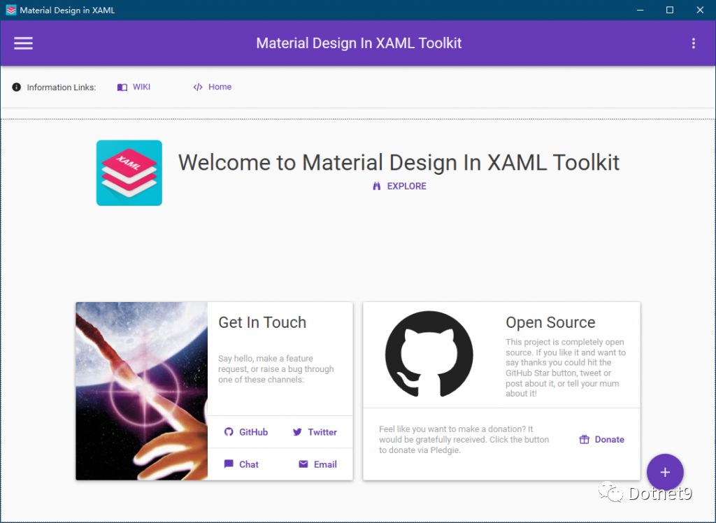
The card layout on the home page feels great, doesn't it? When you have a project interface requirement like this, displaying data in this way is very intuitive.
2. Theme Style Switching
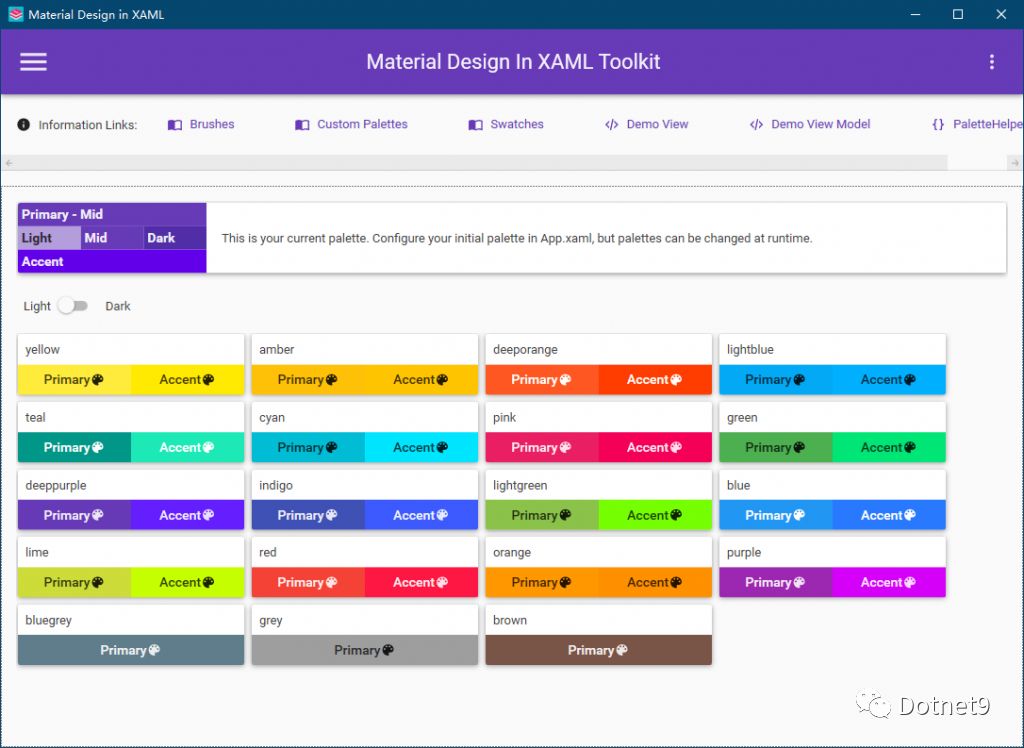
This control library comes with dozens of color styles, meeting most color scheme requirements.
3. Buttons
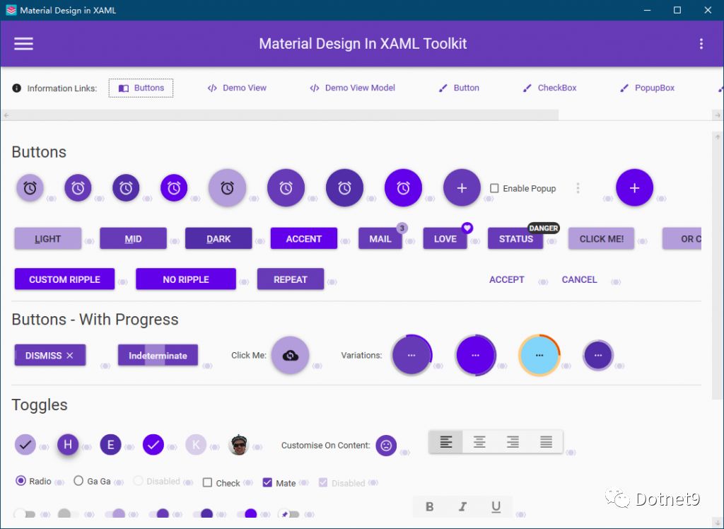
Interactive buttons are used a lot in interface development. Look at the image below: circular buttons, icon buttons, progress buttons, button tooltips, etc. Effects that are common in the web can now be easily used in WPF.
4. Input Validation Boxes
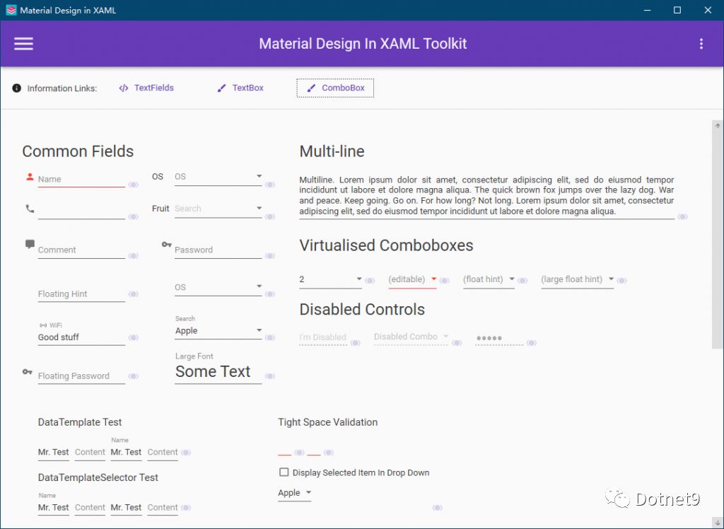
For form validation, the conventional approach is to write business logic validation code in the ViewModel, or write validation expressions in XAML. This control library provides many validators that can be used directly, with simple code and friendly interface hints, similar to input/error prompts on mobile devices.
5. Tags (Chips)
The control is called "Chips" in English, and it can be used for tags. When displaying a lot of data in a list, you can show multiple tags for click-to-filter.

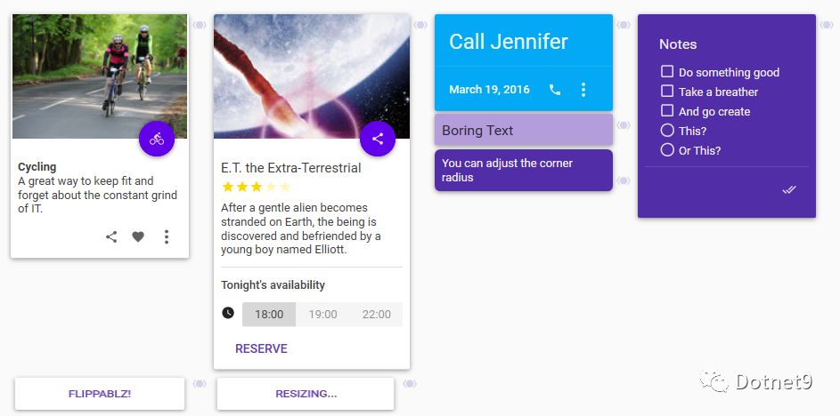
6. Cards
Cards—card-style layout. Displaying data in lists or tables can sometimes be boring, but using cards gives a fresh, clean feel. The data is clear at a glance and can be displayed in a combination of images and text, which is very user-friendly.
7. Icons
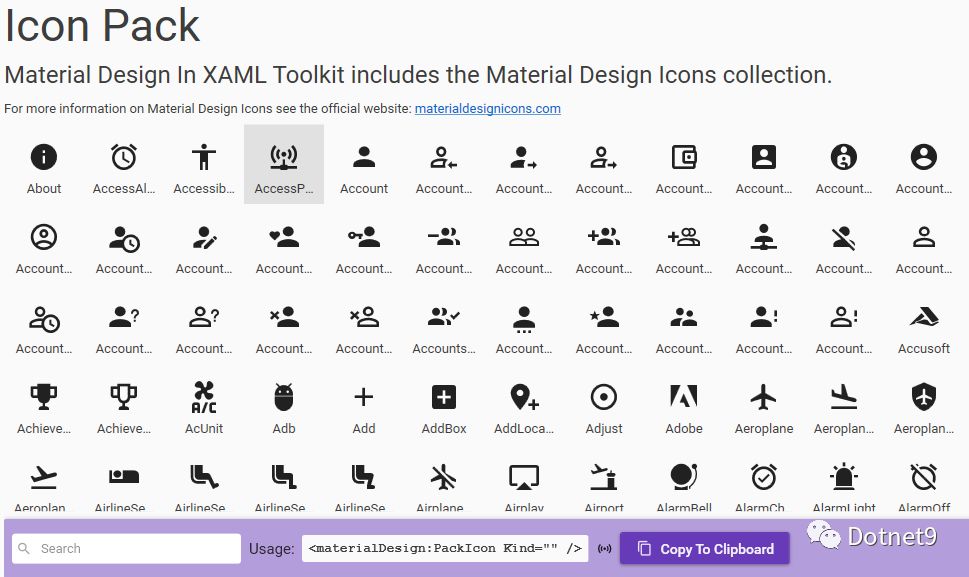
Icon Pack—hundreds of vector icons to choose from, greatly facilitating development. They can be used for menu icons, button icons, etc.
8. Group Boxes
Group boxes are similar to cards, but with a very customizable header—you can even add images.

9. Progress Bars
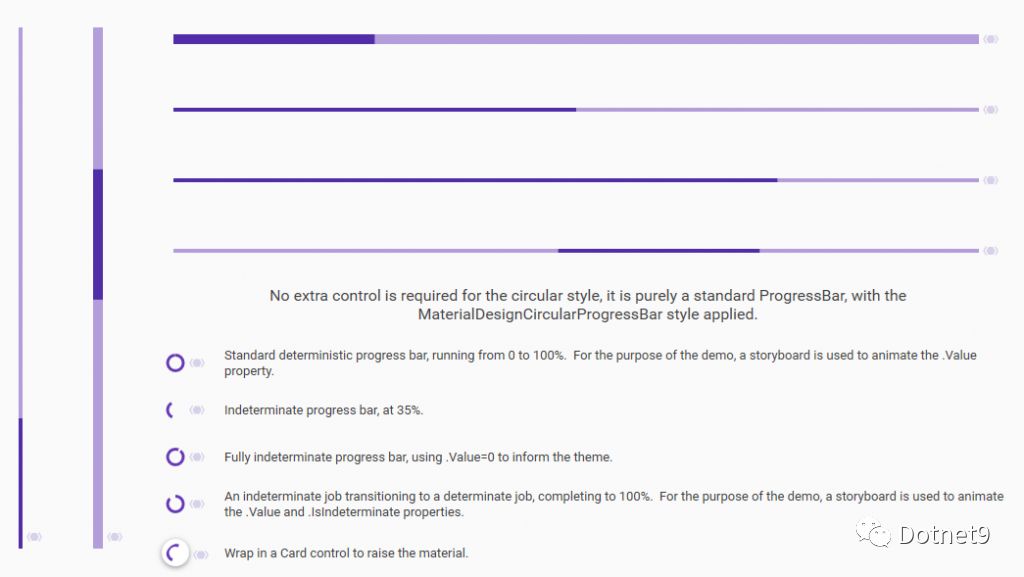
All kinds of progress bars. Still struggling with adjusting every part of a progress bar? This control library provides several styles that meet most general needs. If they're not enough, it's very convenient to modify based on these.
10. Dialogs
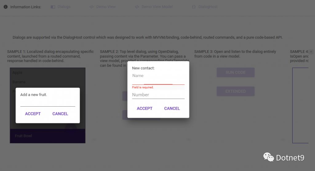
Overlay dialogs—aren't they cool? Supports full-window overlay, as well as partial dialog for user controls (I find this very practical—does it fit your application scenario?).
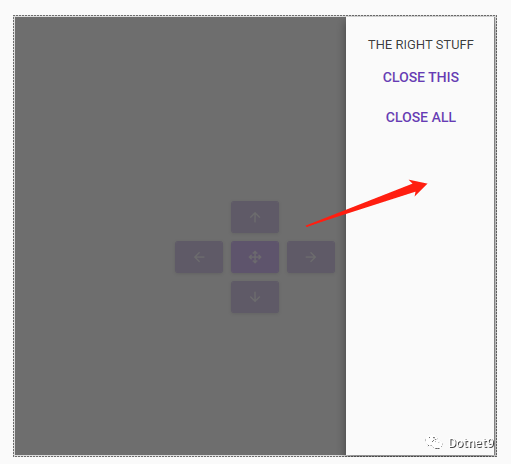
11. Drawers
Drawer control—supports opening drawers from the east, south, west, and north directions.
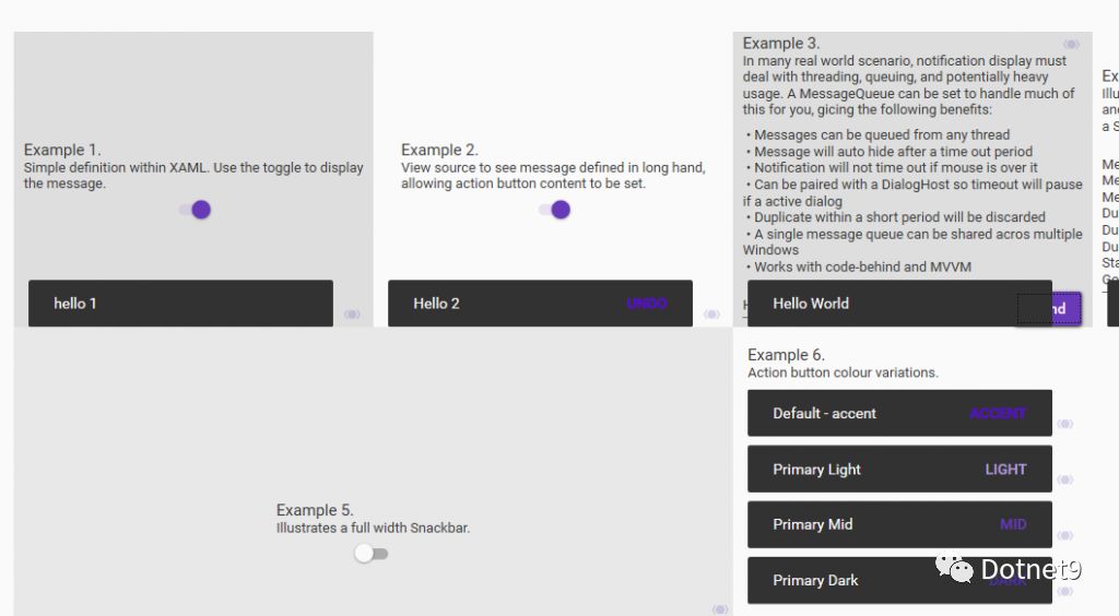
12. Simple Notifications
The last useful feature is notification messages. This way, you don't need a popup (to avoid users having to close it, and even a timed auto-close is not very friendly). It's used for informational messages that you just glance at.
Final Words
There are many open-source WPF control libraries—you can search for them on GitHub. This set of controls is probably the best among open-source ones, in my personal opinion. Feel free to leave comments below, discuss and learn from each other. I also often use this control library in my work—it's really a great convenience.
Official website: http://materialdesigninxaml.net/